I recently started experimenting with AI generated artwork. I am incredibly impressed by what can be done by typing a few words into a text field. It feels like magic.
There’s a lot I want to write about the subject. For this post I’m going tell a story about my first experience with it and walk through an attempt to refine that work.
Update: If you’re curious about how this tech has advanced in the last month, see my post on writing and illustrating a children’s story with AI.
A story
About a month ago Salesloft’s product experience team had an offsite. Which is usually part planning, part discussion and part activity. The activity for this offsite was a startup pitch competition.
First we came up with ideas individually and then were broken out into small groups. Within our group had to decide who had the best idea and develop a pitch around it. While I thought my clothing vending machine idea might have legs, Micah’s armored drone service was more outlandish and interesting. And so that’s what we decided on, armored drones to transport valuables.
We spent most of the remaining time talking about what a future might need to look like for a business like this to flourish. Probably an organized, but low-trust, high-crime environment. It was an interesting conversation. The problem was that we only had 30 minutes to discuss and put together a mini pitch deck. We had spent 25 of those chatting with no sort of deck.
This was technically a hardware startup. So I figured we needed some sort of prototype to show. Short on time I had an idea. Could we use one of those AI generators to design our drone prototype?
After a few google searches I turned to Hugging Face’s Stable Diffusion Demo.
So we’re trying to get a few images for our deck. I type in something like “armored drone prototype” and get back a bunch of things that look almost like CAD renderings of a drone. None of the things make sense or are that usable.
I tried to be more descriptive on my next attempt. I typed something like quadcopter flying away with money.


OK, so maybe there is something here?
The first image was actually pretty good. Maybe I was on to something? The second two were humorous were almost like something out of a meme. The last seemed more like abstract artwork.
I decided that if I could find a good prompt, I could reverse engineer that to make the images better. I found a couple online art galleries for AI generated art and started studying how the prompts were put together.


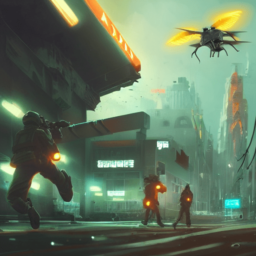
As expected, the next round was much better. We used image 1, 2 and 6 in our pitch deck. Image 6 appeared with INVEST written in Impact across the top. That came off as a humorous and effective slide.
Anyways, we ended up winning the pitch competition with our ridiculous armored drone idea. I’m not certain, but I think our AI imagery had something to do with it.
What is Stable Diffusion?
Some of the things in that story may sound a little ridiculous. I’ll try and clear some of that up.
Hugging Face is partly an AI community and collaboration platform. It also produces tools to help build and scale AI projects. They host interactive demos like the one used in our pitch competition.
Stable Diffusion is an open source text-to-image generation model. You type a handful of words—a prompt—and Stable Diffusion spits out a couple of images that it thinks are closely related to what you’ve typed. It takes a bit of practice and some post-run photoshop clean-up but can produce some amazing images.
Getting better at writing prompts
Now that I’ve got some experience writing prompts for Stable Diffusion, I have some ideas about how to get better images.
First, I’d start by taking a look at some of the various AI art galleries. You might find inspiration for the type of image you want to create. When you find something that resonates, pull the parts of the prompt that you think are contributing to that look.
The second things is the structure of the prompt. The most specific thing should go first—this is the structure of the image something like drone flying away from a city. Next are the details around the image—lighting, camera angle, contrast and things like that. Finally, if you have a particular art style in mind add that artists name. I’ve found good results using Akihiko Yoshida, Greg Rutkowski, and Simon Stalenhag for sci-fi type artwork.
Finding the right image
The pitch competition is over, but I’m wondering how far I can take this thing? I’m going to attempt to put together some sort of image for our armored drone. I’m not entirely sure what I’m looking for right now. Maybe Stable Diffusion can help me figure that out?
Also, I discovered that through DiffusionBee, that I could run Stable Diffusion locally on my M1 Mac. The iterations from here on out use DiffusionBee instead of Hugging Face.
I found an image that had the type of look I was going for, so that’s where this prompt started.
Seed : 75658


armored quadcopter flying away from city, d & d, fantasy, cinematic lighting, highly detailed, digital painting, artstation, concept art, smooth, sharp focus, illustration, warm light, cozy warm tint, magic the gathering artwork, volumetric lighting, 8 k, no gold, no gold colours, art by akihiko yoshida, greg rutkowski
While the previous ones were cool, I think the D&D and fantasy prompts were giving a different feel than I wanted. What I had in my head were the more realistic environments. So I switched removed a bunch of prompts and swapped Akihiko Yoshida for Simon Stalenhag here.
Seed : 59350


armored quadcopter flying away, cinematic lighting, highly detailed, digital painting, artstation, concept art, smooth, sharp focus, illustration, warm light, cozy warm tint, volumetric lighting, by SIMON STÅLENHAG, by Greg Rutkowski
I really like the bottom two results. There are some odd artifacts, but the inclusion of people adds a ton of intrigue. While I like the natural environments, I’m looking for something a little more urban.
Here I’ve adjusted the prompt a bit to have a person looking at a drone. Also I thought I’d be more descriptive about the lighting. I added neon and fog to the prompt in a hope of getting a glowing neon feel. Hopefully, that also gives us images with a more urban setting.
Seed : 66862


person watches an armored quadcopter take off outside, artstation, cinematic lighting, highly detailed, digital painting, foggy, neon, neon signs, sharp focus, smooth, warm light, cozy warm tint, volumetric lighting, retro-futuristic, retro-futurism, SIMON STÅLENHAG, Greg Rutkowski
Now we’re getting somewhere!
The last image is particularly interesting. It appears we have two people. One leaning against a wall and another on some sort of futuristic scooter? The background detail is also pretty amazing—subtle city lights in the distance.
What about playing with some of the other inputs? Here I kept the same prompt, but added more steps—75 instead of 50. This runs the Diffusion model additional times. That should result in a more detailed image.
Seed : 9732


person watches an armored quadcopter take off outside, artstation, cinematic lighting, highly detailed, digital painting, foggy, neon, neon signs, sharp focus, smooth, warm light, cozy warm tint, volumetric lighting, retro-futuristic, retro-futurism, SIMON STÅLENHAG, Greg Rutkowski
There’s definitely more detail here. Although I think that in most of these the additional detail makes these a little more confusing. The exception is image 5, which might be a contender. I love the detail of the drone and this cyborg guy in a trenchcoat.,
Let’s see if we can push it a little more?
Seed : 10689


armored quadcopter takes off, a soldier watches from below, wide angle, cinematic lighting, highly detailed, digital painting, foggy, neon, neon signs, sharp focus, smooth, warm light, cozy warm tint, volumetric lighting, retro-futuristic, retro-futurism, artstation, SIMON STÅLENHAG, Greg Rutkowski, akihiko yoshida
What’s in image 5 here is getting there. What’s in my head is a guard with his back to us watching a drone hover above the street. With a lot of that foggy neon lighting. I added a solider watches from below to the prompt. I thought that might give better results than a guard watches below.
Next I’m going to adjust the guidance scale from 7.5 to 10. This should have the model produce results that are a bit less creative and follow the prompt more closely.
Seed : 72092


armored quadcopter takes off, a soldier watches from below, wide angle, cinematic lighting, highly detailed, digital painting, foggy, neon, neon signs, sharp focus, smooth, warm light, cozy warm tint, volumetric lighting, retro-futuristic, retro-futurism, artstation, SIMON STÅLENHAG, Greg Rutkowski, akihiko yoshida
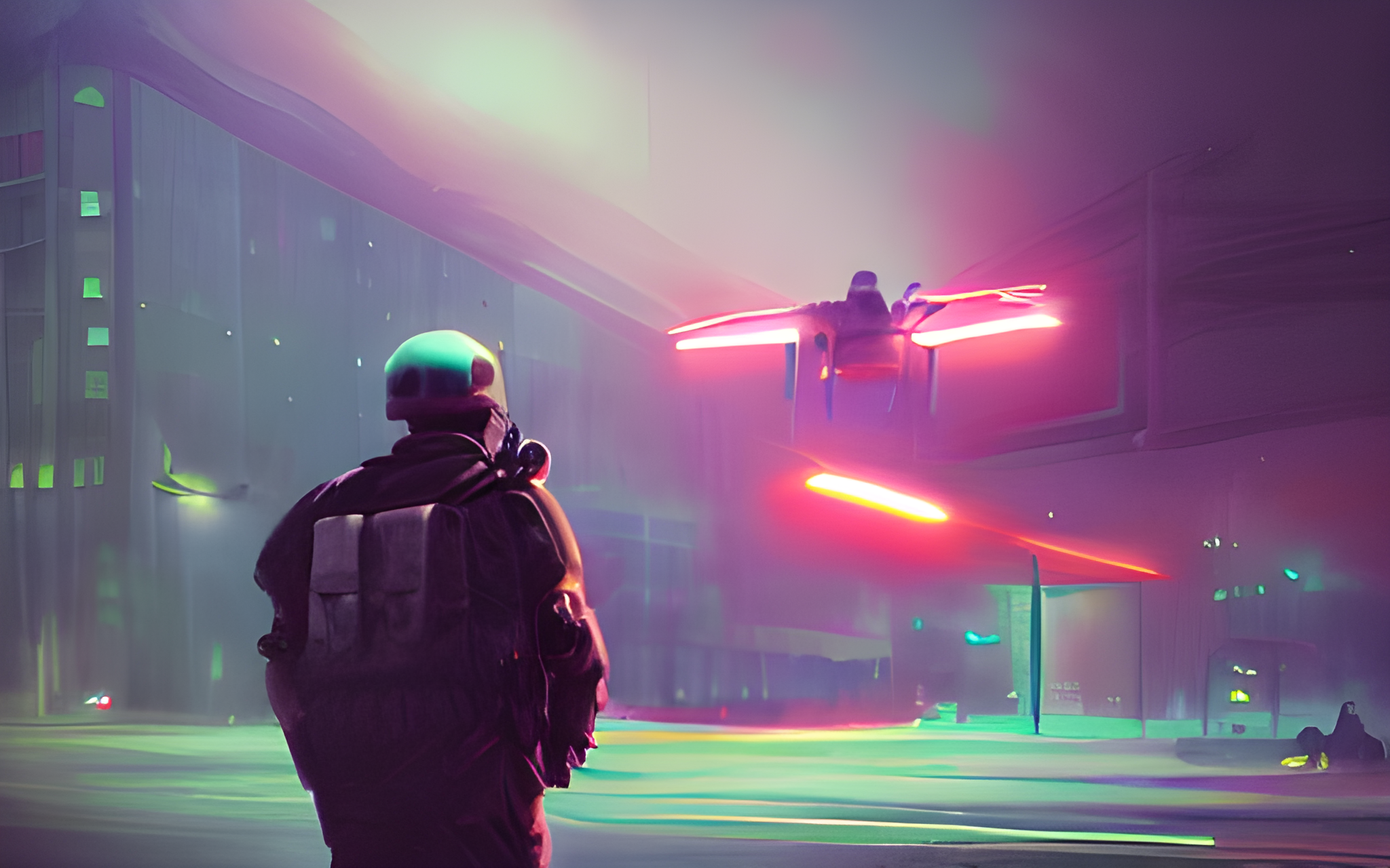
There are a couple options here that match what I was looking for. Image 2 fits the bill, but looks like the drone is about to attack the guard. Image 4 has the right idea, but the perspective is a little off and the details are a little lacking. I think image 5 is our winner here.
A guard has his back to us. The drone has a clear amount of detail. We’re getting that foggy neon city feeling that I was looking for. This is it.
Inpainting
Now that we’ve got a decent looking image of our drone and guard watching it. We could probably be done. We’re going to try a few moth things and See what Stable Diffusion can do.
This image is great, but it’s not flawless. The most glaring issue is what looks like a partially rendered drone in the top left of the image.
Now I could take this to Affinity Designer (I don’t use Photoshop anymore) and try and remove it, but let’s see if DiffusionBee can do that through inpainting. According to the DiffusionBee documentation inpainting allows me to apply a mask and enter a prompt. Once I do that I can run the model again to change the masked section.
I suppose I could add something else here? For the time being I’m going to enter the same prompt and attempt to remove the blob.


Outpainting
Now that we’ve removed the artifact. Let’s see if we can reframe the picture a little bit. I think we’ll be able to do that using outpainting, which should allow me to use the same tool to extend the existing image.
Using the rule of thirds, I’d like the guard to appear in the first third of the image and the drone in the second third. So I’m going to have DiffusionBee paint a third of space to the left of the guard. Also, this will make have the image appear as a landscape, which which I can use in the hero for this post.


This didn’t work perfectly on the first try. It took four or five tries to get something that seemed consistent. Interestingly the guards was always rendered fine. It was the building in the background that had some issues. Maybe because there’s less detail for the model to work off of?
In any case, I think we’re getting pretty close.
Final result
I took the image back to inpainting a couple more times to clean up some of the few odd lines here and there. And sharpen the left side of the solider. Then I used Real-ESRGAN to upscale it.
What do you think?

Overall, I’m incredibly impressed at what this technology can do. I had an idea of what I wanted in my head, but it was fuzzy. Stable Diffusion allowed me to iterate on that idea until I got something that was pretty close. It then allowed me to do some refinements on that original idea.
Hope it was interesting walk through this process with me. Would love to hear your thoughts in the comments.
Update: Stable Diffusion 2.0
The images in this post were all made with Stable Diffusion 1.5. A commenter mentioned that he thought version 2.0 produced worse results. Well, what does our 72092 result look like in the new version?


armored quadcopter takes off, a soldier watches from below, wide angle, cinematic lighting, highly detailed, digital painting, foggy, neon, neon signs, sharp focus, smooth, warm light, cozy warm tint, volumetric lighting, retro-futuristic, retro-futurism, artstation, SIMON STÅLENHAG, Greg Rutkowski, akihiko yoshida
These are definitely a little different, although I’m not sure I’d say they are worse. The renderings seem to contain more detail—or maybe just more contrast? The scale of the people to the environment seems off on a lot of these.
From what I understand 2.0 does not include artist styles. I assume the artists I included in the original prompt are ignored. I’m not sure that has made much of a difference in these results. Perhaps this means that having a good seed makes more of a difference than anything?
Leave a Reply to Jeffery ScottCancel reply