About
Ever since Salesloft’s rebrand I’ve been thinking a lot about accessibility. Our decision to make green our brand color helps us standout in the marketplace. However, it causes issues for our customers affected by colorblindness.
This presentation covers discusses improving accessibility with design tokens. By using tokens to enable theming, we can begin to build colorblind themes.
This is an abbreviated version from July 22, 2022 and given to Salesloft’s Product Leadership, Product Management and Product Experience teams.
Transcript
Good morning everyone.
For those of you I haven’t had the opportunity to meet yet, my name is Sam Solomon. I’m a Staff designer here and I lead design for our platform and workflow pods.
I’d like to talk with you today about improving accessibility with design tokens.
But first, I’d like to talk about a problem.
A problem several of our customers started having about a year ago.
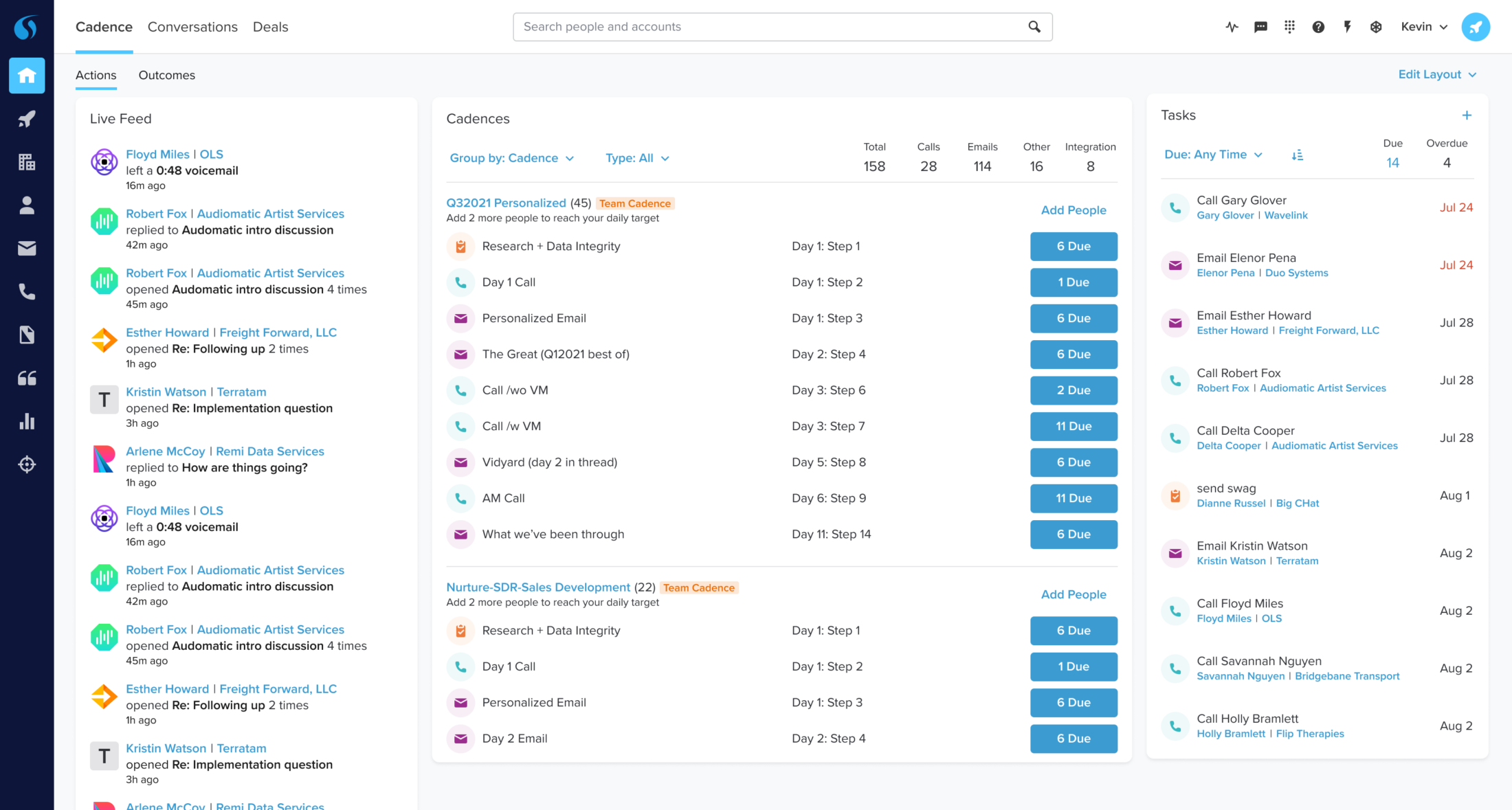
For those of you who have been here longer than a year this page might look familiar—it’s our old homepage, old colors and old brand.
If you login to Salesloft today, this is what you’ll see.
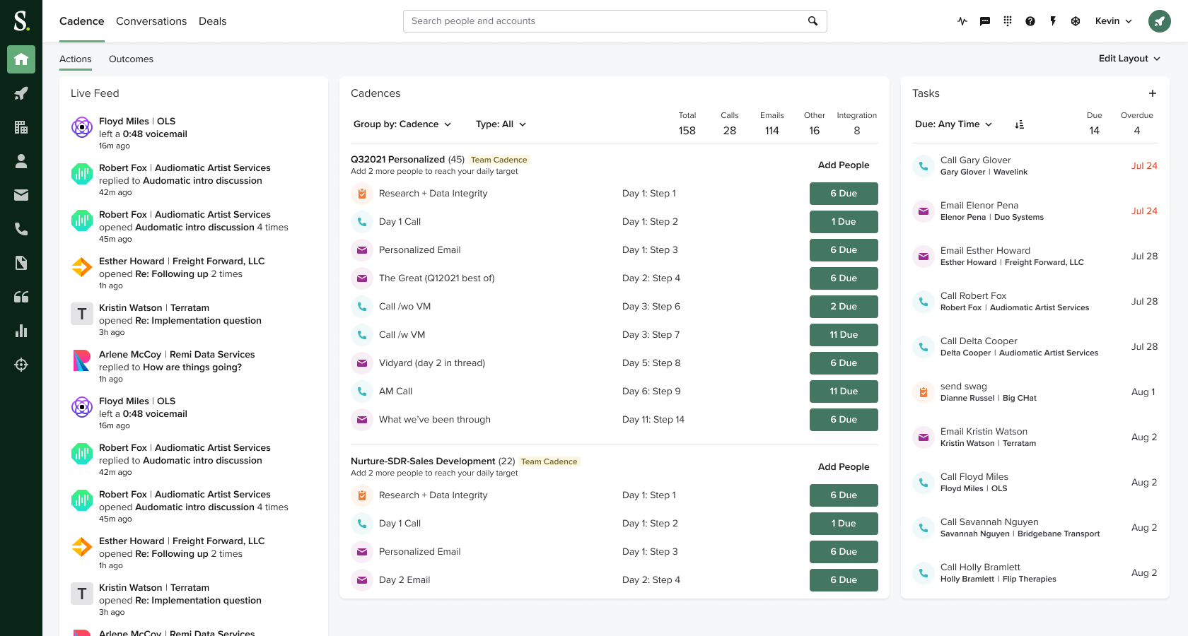
This is the rebranded product—which was a great accomplishment.
It has been well-received by our customers and allowed us to differentiate ourselves in the market.
And as far as rebranding projects go, this went incredibly smoothly.
However, there’s a problem.
Because not everyone got this. Some people got this—
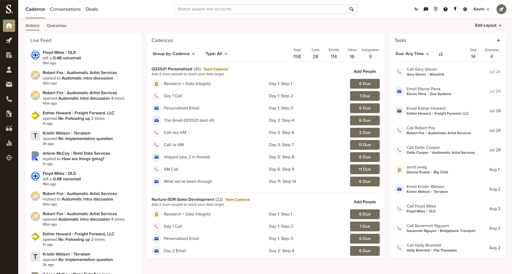
A collection of gray blobs.
Those that got this—of course—are our users affected by colorblindness. Some 4 to 5 percent of the population, and presumably our customers.
And it’s unfortunate.
You know salesloft isn’t a place to go to kill downtime. It’s not a travel website that someone uses once or twice a year.
It’s not a toy.
Salesloft is a professional tool that our customers use 2 to 6 hours each day.
Many depend on it for their livelihoods. If demos don’t get booked or deals aren’t closed, salespeople are going to struggle.
And that’s something I take very seriously.
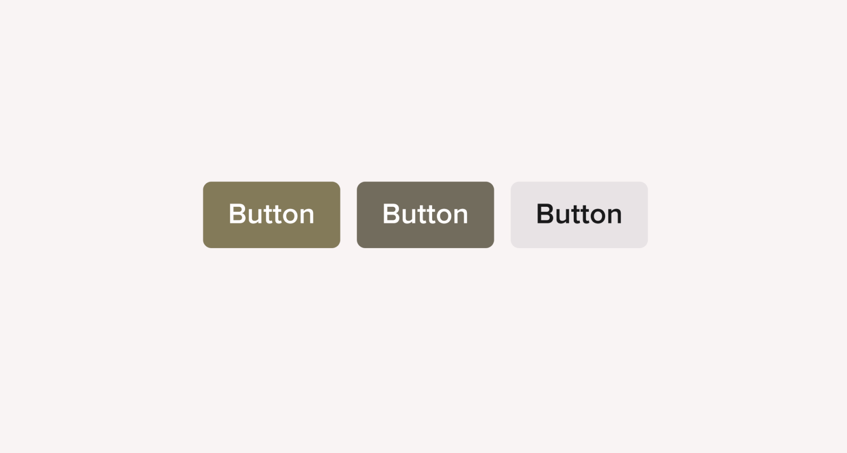
To better illustrate the problem here I have our 3 most common buttons.
Real quick—can you tell which is the destructive one?
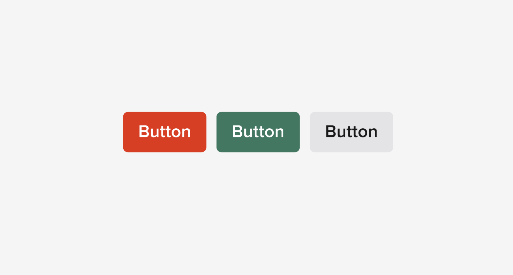
Did you guess right?
Now buttons have labels in the app and we require confirmation for destructive actions. But it’s not super-easy to tell, is it?
—and this is 10 times the size of most of the buttons on our screens.
So what do we do about this?
The answer is to give the user back a bit of control through theming.
So a colorblind user with a colorblind theme might instead see something like this.
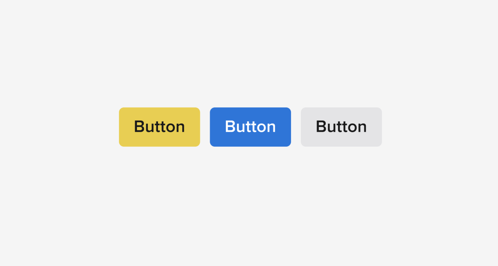
Cool, right? But how do we get there?
We’ll need to need to adjust Salesloft’s design system to move away from standard color variables and towards design tokens.
What exactly does that mean?
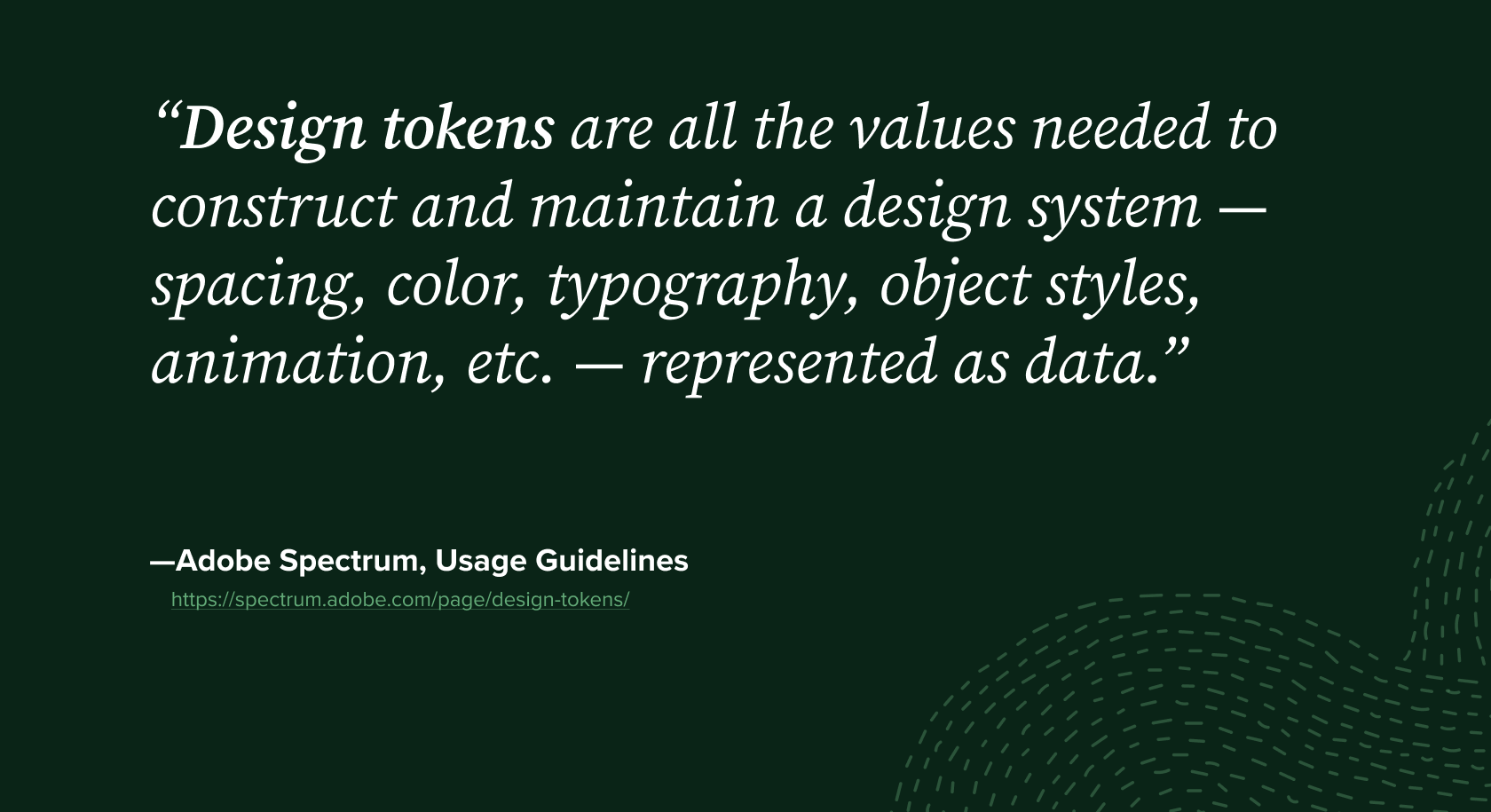
I’ve taken this blurb from Adobe’s Spectrum Design System.
Essentially design tokens take the subtle, overarching patterns that already exist in the design system. It codifies and turns them into variables.
Just to level-set—today we’ll be discussing colors specifically, because that is most impactful to our colorblind users. Just know that there are a lot of other uses for design tokens.
OK, so let’s take a look at how to implement design tokens.
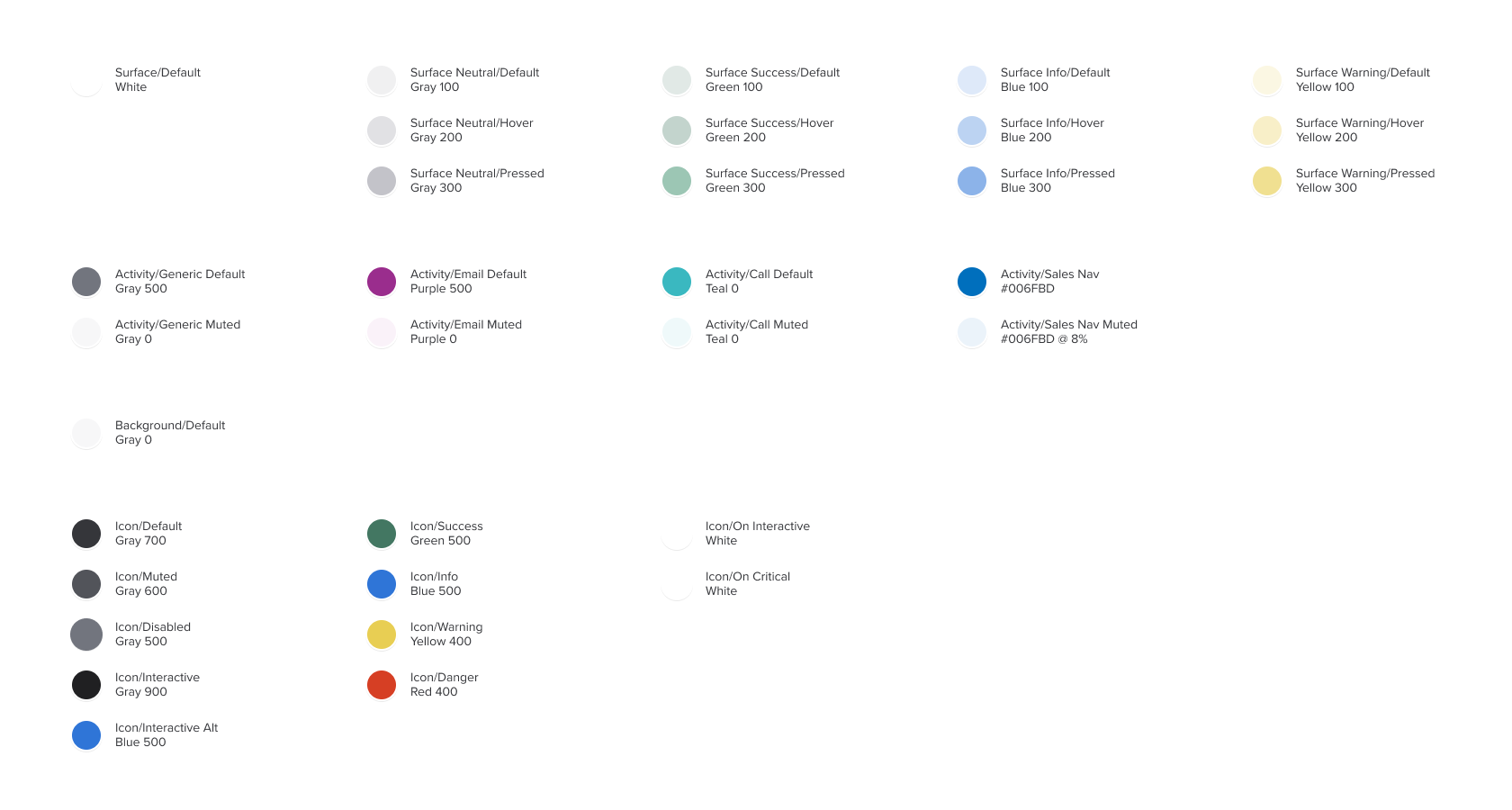
This is a shot from a theme I’m calling Light Default—which is basically our existing theme.
If you look closely you’ll see colors—Green 500, Blue 500—accompanied by a label.
Essentially, what we’re trying to do here is take these colors and apply labels that have meaning and inherit from these colors.
So when we take these labels and start applying them to components, we’ll end up with something like this—
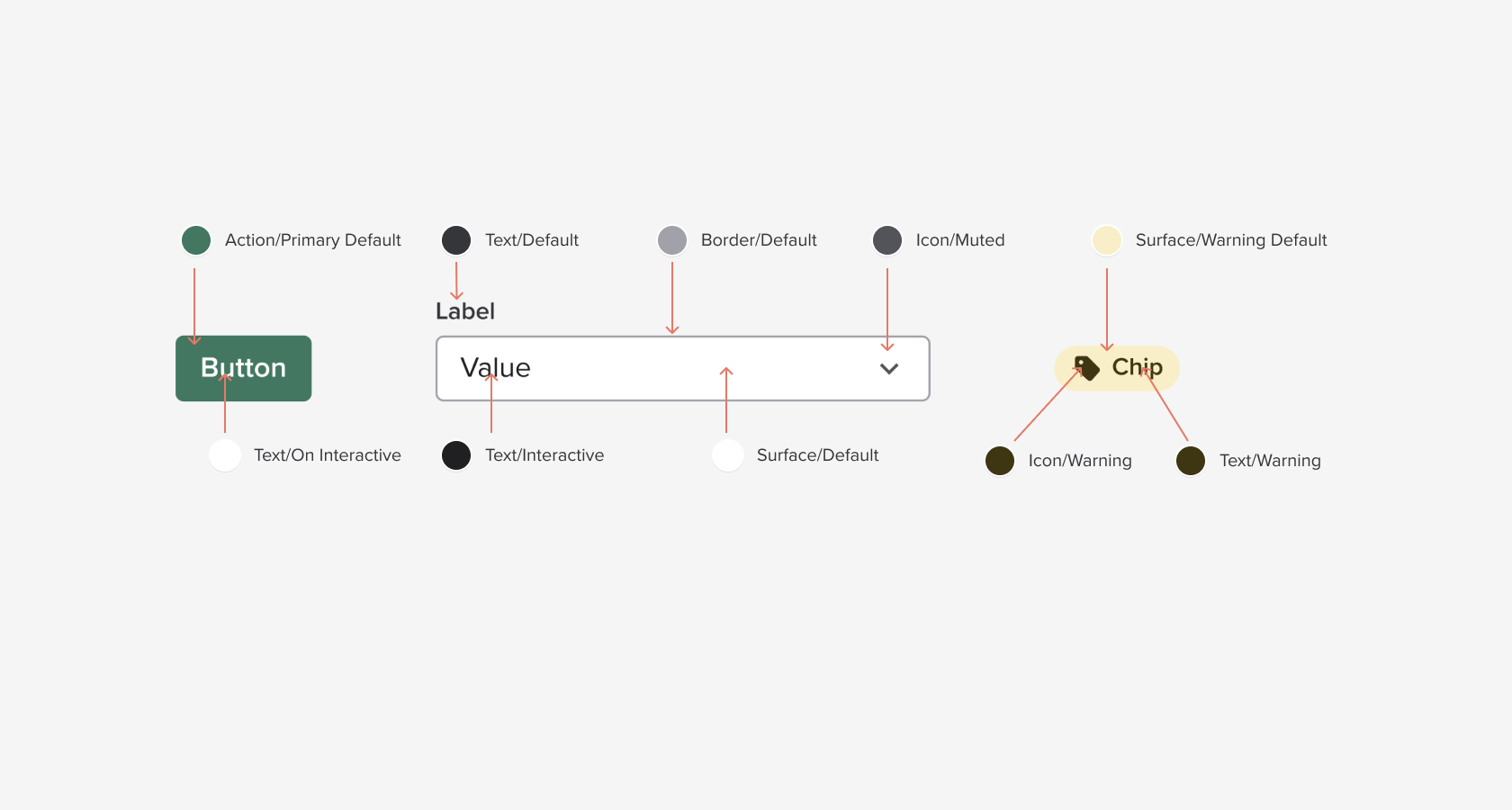
As you can see we’re not applying colors to these components. We’re applying those design tokens.
For the background of the button we’re not applying Base Green or Green 500, we’re applying Action/Primary Default.
For the field border we’re not applying Gray Base, we’re applying Border/Default.
Hopefully the gears are starting to turn. We’re going to keep these tokens, but change the colors that they are associated with them—that’s how we’ll build a theme.
So I have some examples screens I’ve build in Figma using design tokens. Let’s take a look.
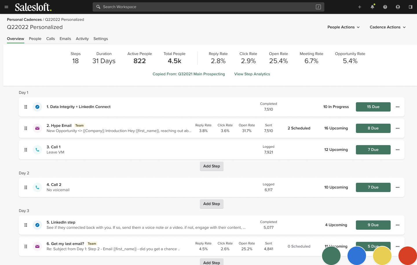
This page should look somewhat familiar to you all. It’s a recreation of our Cadence Detail page.
Notice I’ve put a few large tokens in the corner of each page so you can see how the status colors change—Primary, Info, Warning, Danger.
Now let’s see how this changes with a Red-Green colorblind theme.
Watch the buttons—those are the most notable elements to change.
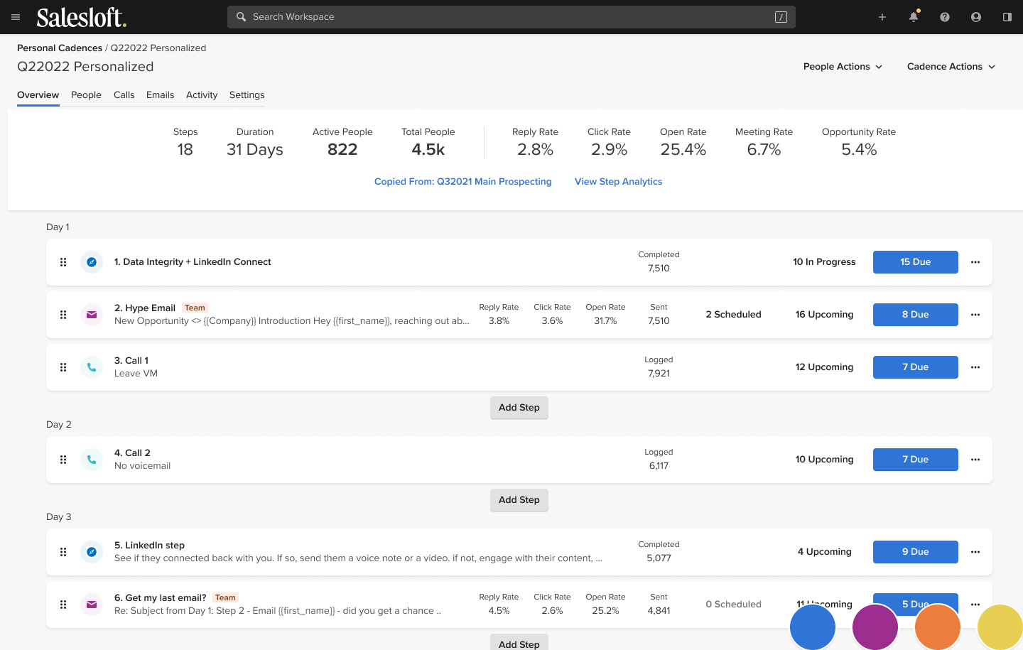
See how the buttons change from green to blue? Also you’ll notice that the error color changed from red to yellow.
Let’s take a look at another colorblind theme.
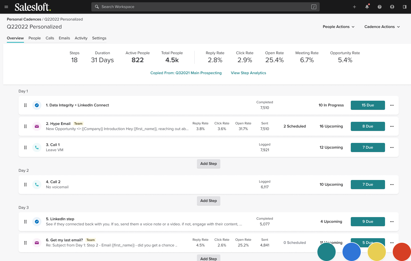
Here the buttons change to teal. To help those affected by yellow-blue colorblindness.
And it’s not just colorblindness. Maybe I have a hard time staring at a bright white screen all day. What can I do about that?
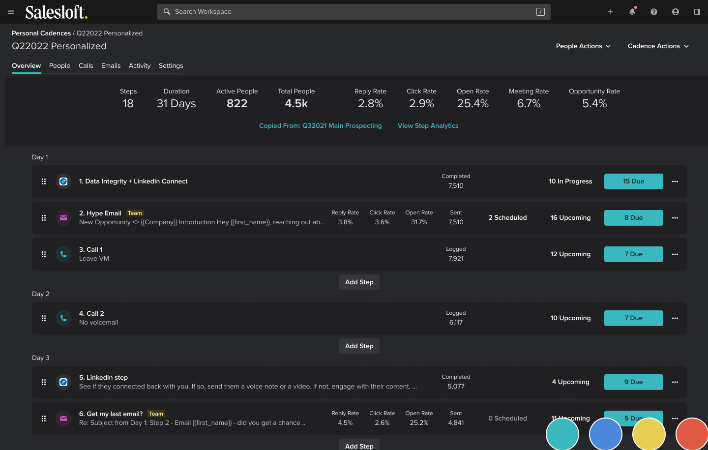
This is a Dark Tritanopia theme. Not only will it help those who are yellow-blue colorblind, but also for those who don’t like the brightness of our largely light theme.
I know I’m running out of time here, so I’m going to cycle through one more example real quick.
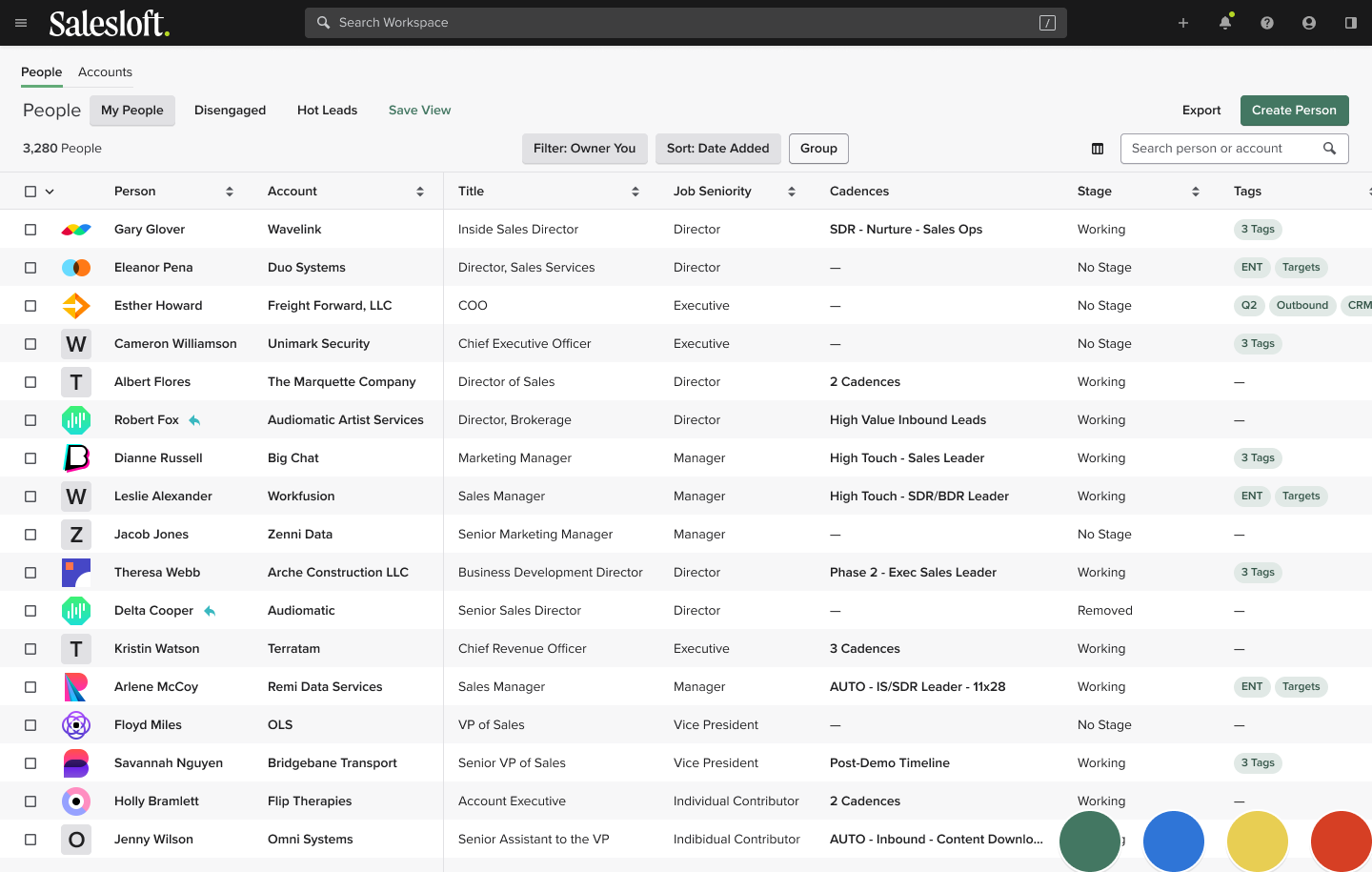
This is the default people list.
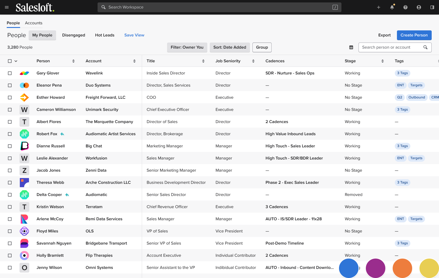
Light Protanopia theme—for red-green colorblindness.
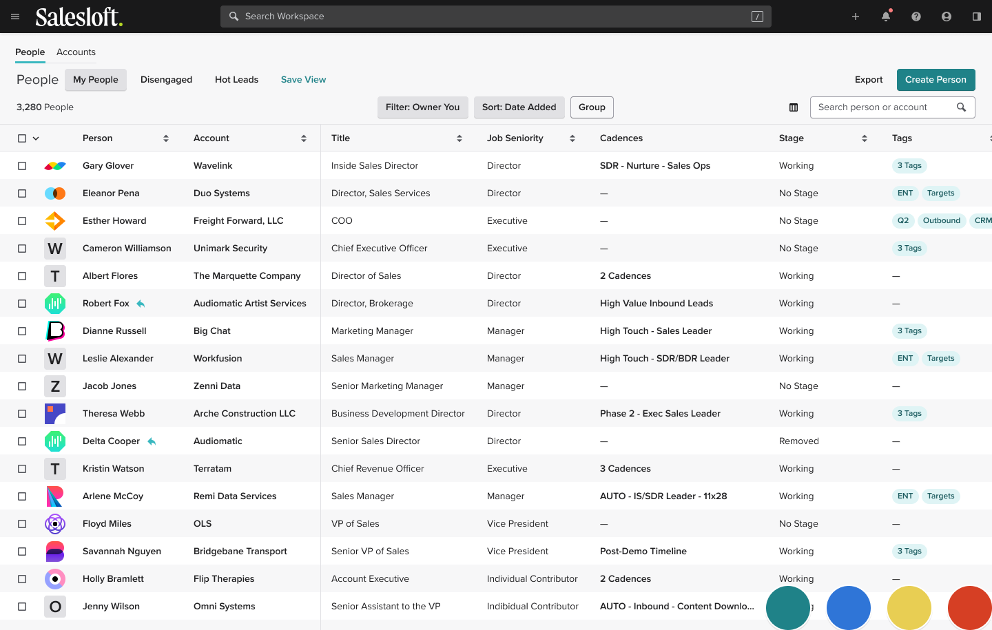
Tritanopia theme for yellow-blue colorblindess.
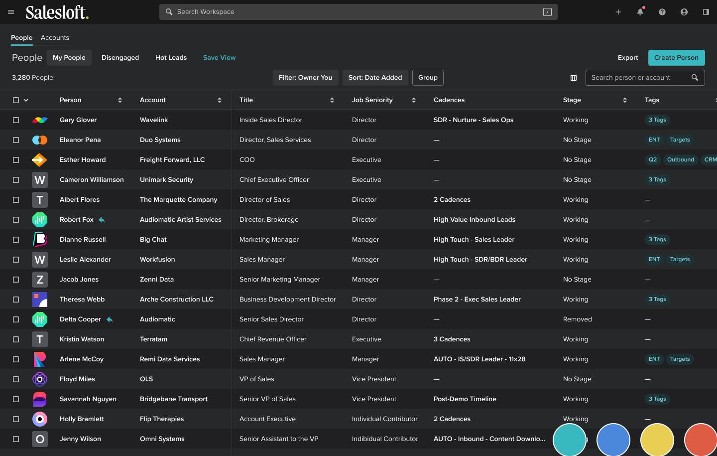
And finally a Dark Tritanopia theme.
We’re nearing time here—I have a couple closing comments.
First, I’d like to thank Andrii, who has been a huge resource. He’s always quick to answer questions or be a sounding board. He’s helped point me in the right direction when I’ve been unsure. So shout out to him.
Finally, I’ve stressed the importance of building an accessible platform for our customers—this isn’t a game. We’ve got real people that count on our efforts. They count on our efforts to make a living.
Let’s not let them down.
Thank you.