• Archive
  • Notes
  • Photos
  • Work
  • About
2026 2024 2021 2019 2017 2016 2015 2014 2013 2012 2010

Famines by Political Regime—Our World in Data

← Notes · May 17, 2018

Some incredibly fascinating charts of famines through history. A few observations: the low end of The Great Leap Forward death estimates are used—the high end is more than 2x (maybe 3x?) that estimate. Also, democracies have had virtually no famines. ourworldindata.org
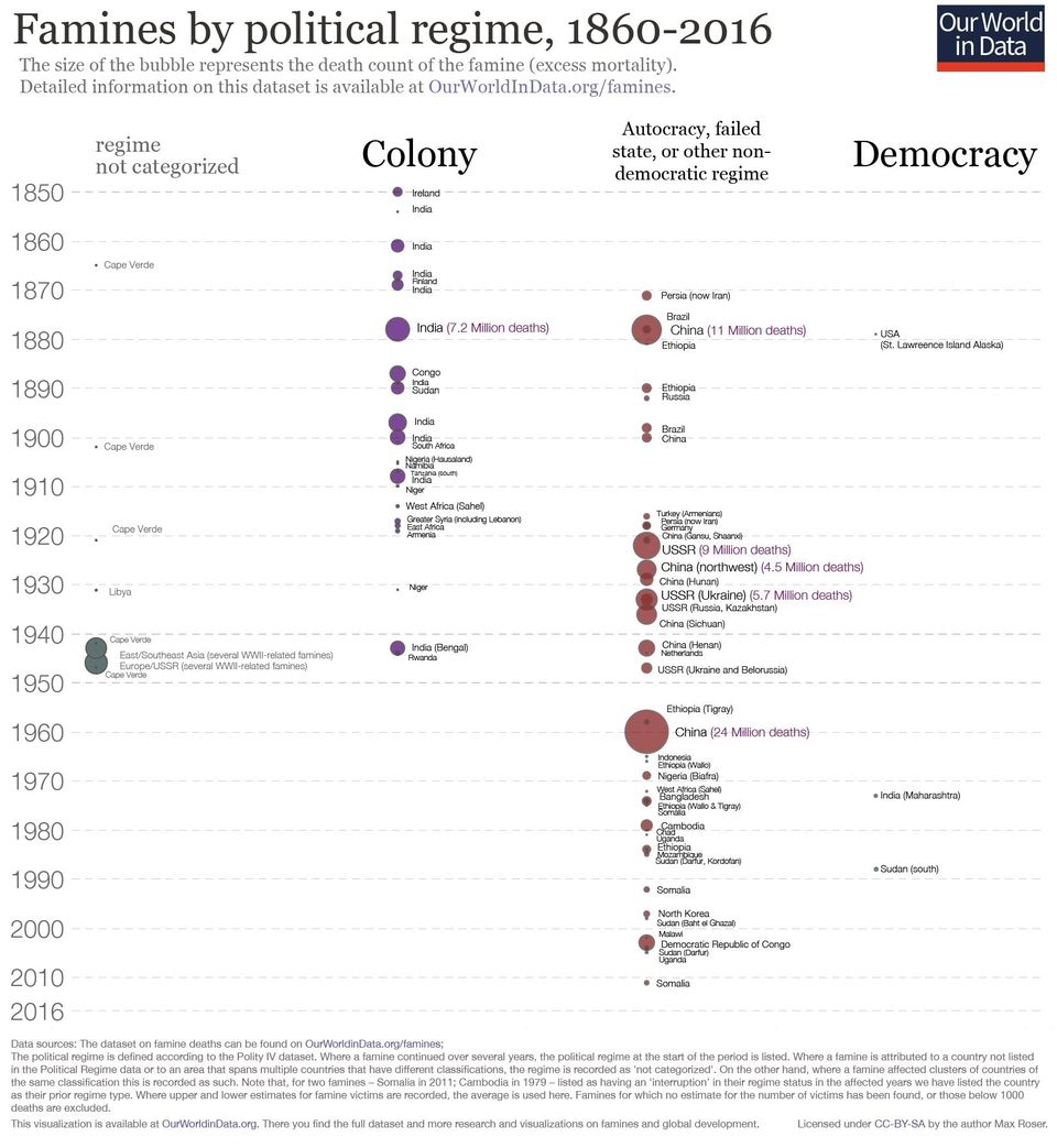
Our World in Data bubble chart of famines 1860–2016 by regime, with nearly none under democracy

Topics HistoryPolitics

Originally posted on X ↗ (opens X) Reply on X ↗ (opens X)

Atlanta, GA, USA
  • Email
  • LinkedIn
  • Instagram
  • X
  • YouTube
  • Links
  • RSS/Atom