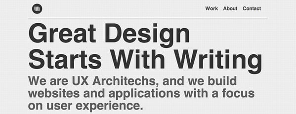
Giant wordmarks in the footer, really are in vogue aren't they?
Notes on Typography
96 notes
Oct 2026
Aug 2026
@designbyaron Honestly, I don't love pixel fonts, but they are great when the theme calls for it. The examples in that vid are fantastic.
Apr 2026
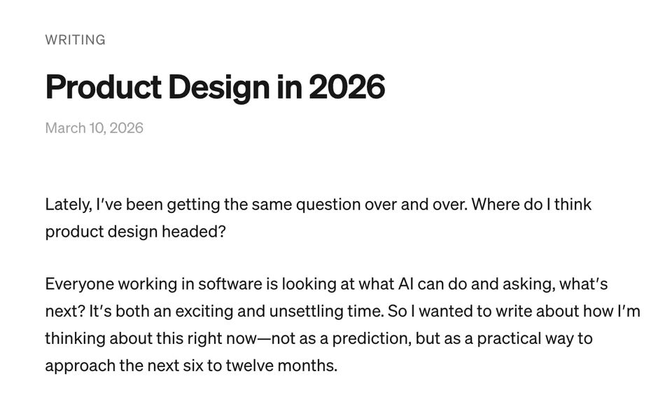
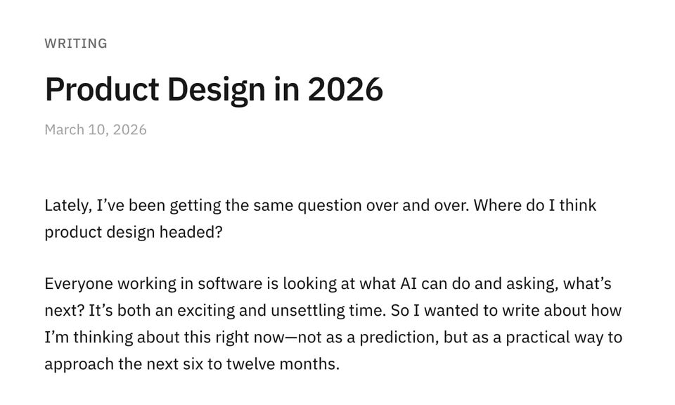
I badly want to use Söhne, but honestly IBM Plex Sans is such a fantastic typeface I just want to use it everywhere.Söhne left, Plex right.
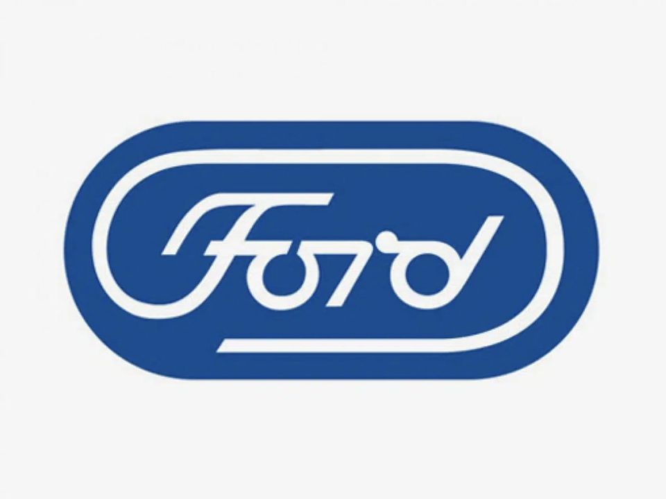
Wow, stumbled upon this unused Paul Rand logo concept for @Ford in the 70s.en.creativosonline.org
Mar 2020
You're forgetting something important—the em dash.
Mark Davis@MarkFonts
− minus sign.
- hyphen.Know the difference.
Nov 2019
May 2018
This is such a spectacular article on using different typefaces—The Value of Multi-Typeface Design buff.ly
Product Sans immediately reminds me of Circular.
Feb 2018
Everything the design team @stripe does is spectacular. Also, I'm a huge sucker for Tiempos.
Jan 2018
I'm digging this Overpass font. Perhaps, a good alternative to Droid or Source Sans Pro?

I think it's mostly looked at as a paragraph typeface, but I love Crimson Text at larger sizes.

Nov 2017
Oct 2017
Suggestion for @googlefonts—I'd love to filter by number of styles. Often families with just one style aren't terribly useful.
Calluna is an underrated typeface.
Aug 2017
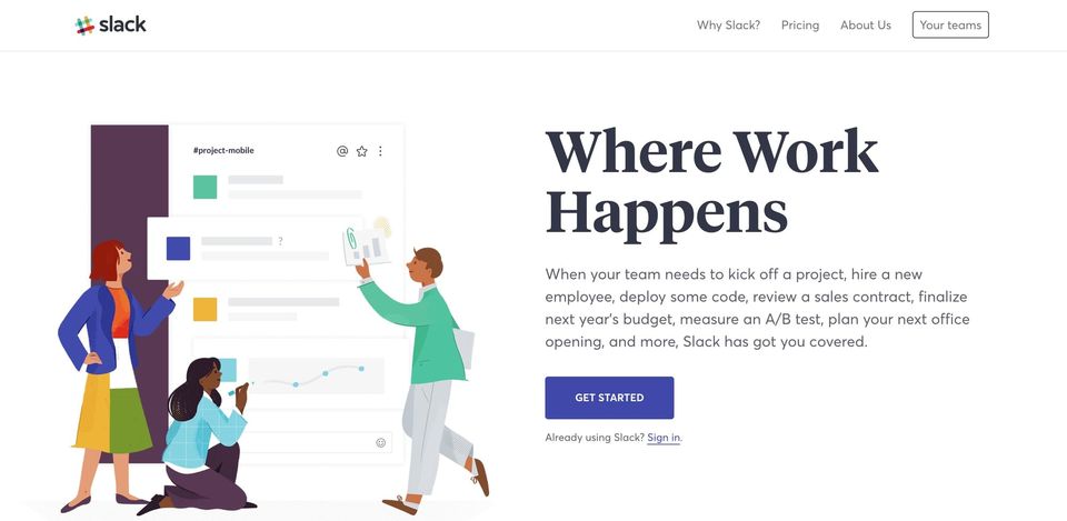
I love the typography and illustration style of @Slack's new homepage, but it feels a little off brand. It's not as colorful as the product.
I wish I could sort @googlefonts by number of styles. There are a lot of great families, but only those with 4 or more styles are practical.
Jul 2017
FF Mark is such a sharp-looking typeface. grapheine.com

Jun 2017
Fantastic type treatment on this site. canlis.com

Mar 2017
Maybe they're trying to be different, but the new Smashing Magazine design is neither intereresting nor legible.

Feb 2017
@dfosco Probably needs to tell people that I write and design stuff—but yeah Adelle Sans and Leitura News FTW!
Why are most of the famous design agency logos simply typeset? buff.ly
For a website largely used by designers, the UX of Typekit is horrendous. I want to use the back button to navigate to the previous page.
Designer friends: what's your favorite serif font?
Tuna: awesome typeface, awesome name—WTF is the deal with the scrolling on this site? tuna-typeface.com
Man the Bold site is sharp.

Jan 2017
Perhaps it's cost cutting, but Trump administration should hire a designer. The typography for everything is terrible. x.com
Nov 2016
Oct 2016
Checkout the latest episode of DN FM—I chat with the incredibly talented @jessicahische. buff.ly
Ha, seems to work. Well, Typekit anyhow.
Sep 2016
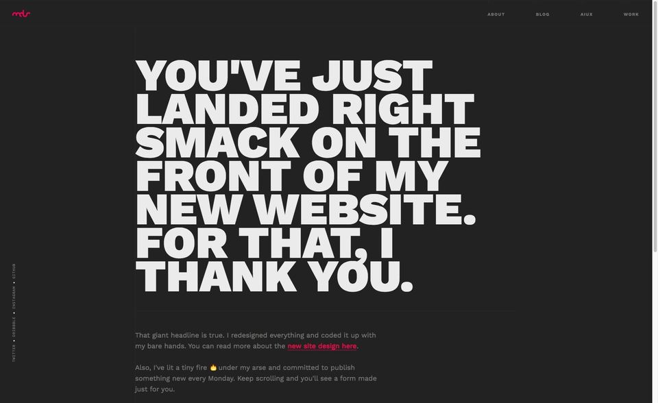
Love this site. Work Sans is such a meaty font.
mds.is
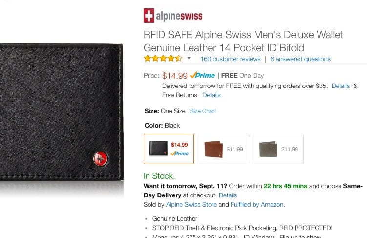
I don't know if Amazon is split testing, but Helvetica Neue Light is not a good choice. Terribly difficult to read.
Aug 2016
These Google Font blank states are hilarious.
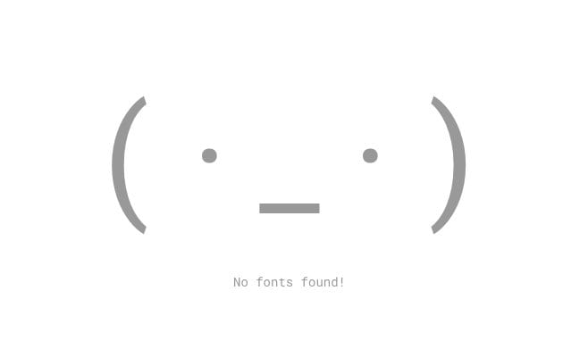
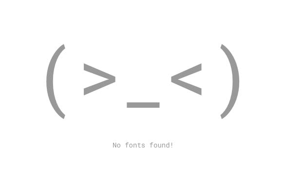
Indeed. Typography is impossible. buff.ly
Why do pull quotes exist on the web?

My one gripe with @iAWriter is that the em dash isn't quite long enough to clearly distinguish it from a hyphen.

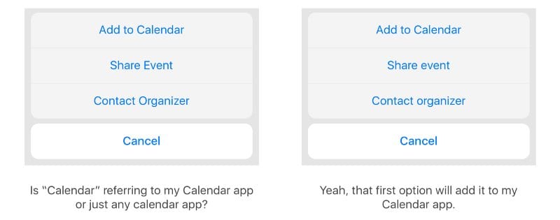
Little details make a big difference. Title case or sentence case? buff.ly
Jul 2016
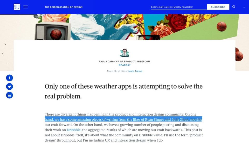
I love the new @Intercom blog design, but at 100 characters per line, this is incredibly difficult to read.
If you liked the Blade Runner Typography Analysis, you'll love this—The Typography of 2001: A Space Odyssey

Jun 2016
I'm a fan of the new UnderConsideration site. My only concern is the headline font is difficult to read.
Mar 2016
The mobile version of Wikipedia is so much easier to read—even on desktop.
Today in typography...
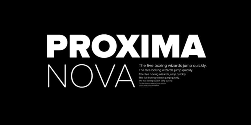
Interesting interview with Mark Simonson, the font designer behind Proxima Nova. buff.ly
My only real gripe with Wikipedia is that there are no max-widths. Making those paragraphs a little narrower would improve readability.
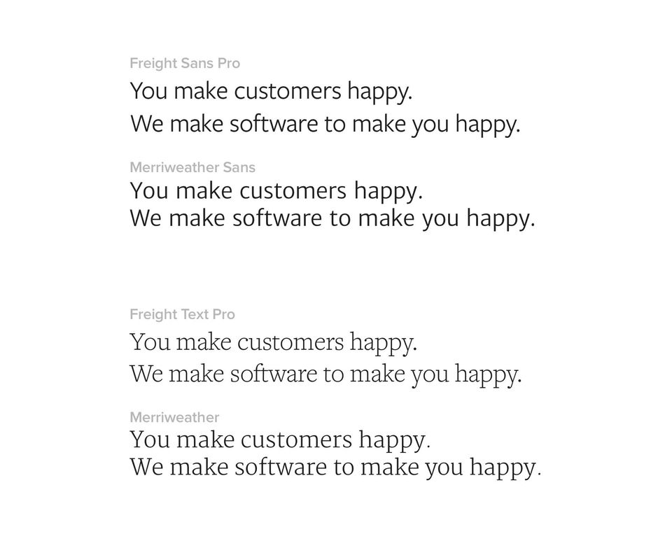
Size adjusted, it is amazing how much the Freight and Merriweather font families look alike.
Jan 2016
This is amazing! Om published a conversation with Erik Spiekermann

Dec 2015
This is cool. An interview with Mark Simonson, the designer behind Proxima Nova. buff.ly
Nov 2015
@andrewliebchen @cap I guess we'll never know until they require everyone to use another 12 point font.
Oct 2015
Sep 2015
Aug 2015
Jun 2015
The SF release is an interesting lesson on typography. Had no idea about cheating on circles and octothorpes.
Still can't get over the design of this site—great typography and punchy copy.
May 2015
Pretty pleased with the updated fonts on @SignalTower.
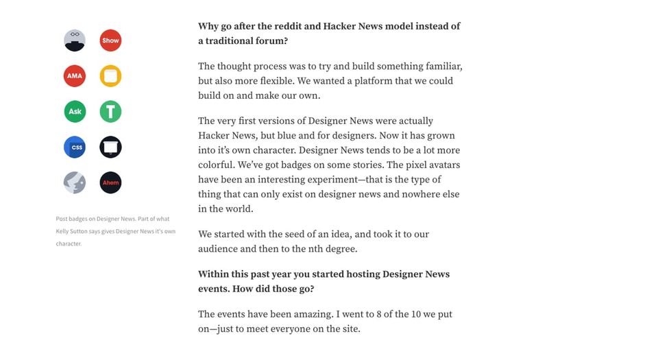
New fonts are up on @SignalTower today—Source Sans and Serif. Sad to see Freight Text go, but @typekit fonts aren't worth 8s load times.
Shipped a banner to a printer, the confirmation email came back in Comic Sans. I hope that it is in spite, not ignorance.
Hey @typekit font requests are taking 3-6 seconds across all my sites. Sent an email to support two days ago.
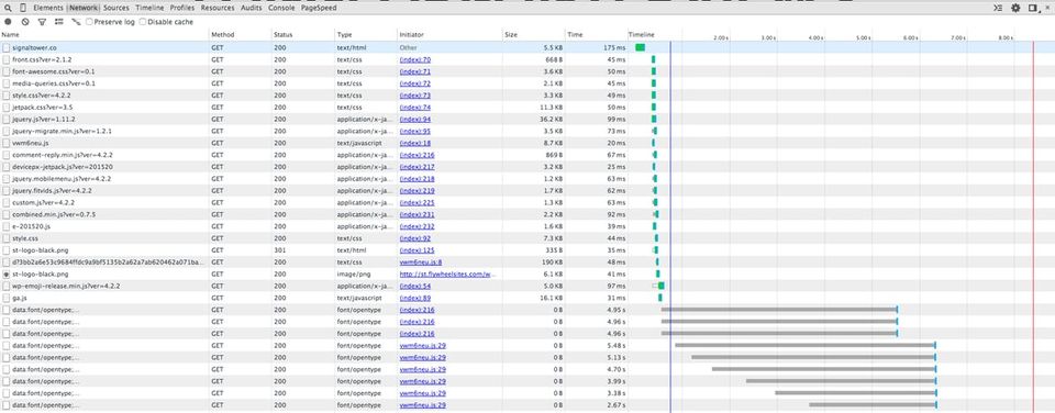
Anyone else hear from Typekit citing that the requests are slow because the CSS is to complex?
Apr 2015
Proxima Nova, ca. 1981 — Medium buff.ly
Typekit just told me the font requests are slow because of the complexity of my CSS. Is that possible?
Mar 2015
Hey @MattWilcox, just discovered your site and wanted to say how much I like the type. Playfair makes for great body copy.
Feb 2015
I love Tiempos—A Typography Teardown of Advertising Age
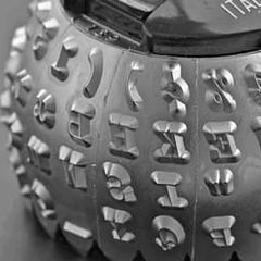
Incredible detail to displaying type at Medium—Death to typewriters: Technical supplement buff.ly
Jan 2015
Can't select fonts from @typekit's dropdown, so I'm going to use Google to find the font I want instead.
Dec 2014
Oct 2014
Source Sans Pro is such a fantastic font. Quickly replacing Open Sans as my favorites sans serif.
Beautiful redesign of U.S. currency, but it doesn't feel very American. It should be green and have serif fonts. buff.ly
Freight Text is such an awesome font family. I have a difficult time getting away from it.
Jul 2014
I didn't know you could request specific characters from Google Fonts. That could significantly cut load times.
Jun 2014
May 2014
Mar 2014
Every paragraph I've written this morning ends with an orphan—and I thought I was on a roll.
I'd call it a healthy obsession—The Royal Tenenbaum’s World of Futura
I applaud this man's appreciation for web typography and dedication to the craft of frontend development, but wow. buff.ly
Oh, and more typography porn. I'll have to try this out—Glyphr, the free HTML5 based font editor

Intel's new font, Clear Sans, looks like a cross between Open Sans and Exo. Great to see more open source fonts

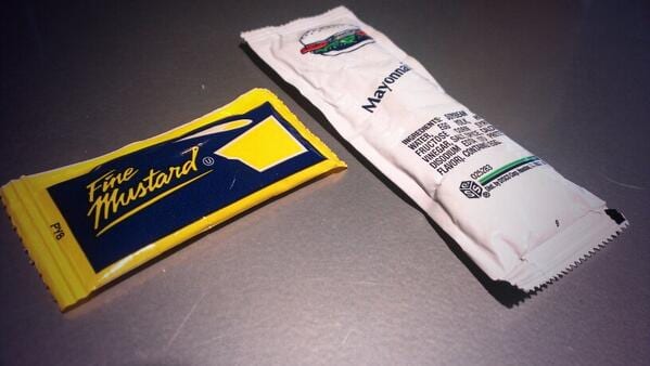
Awesome retro typography on these mustard packets.
Feb 2014
Why movie poster credits are difficult to read. ux.stackexchange.com
One of the better unsolicited Wikipedia redesigns I've seen
In other news I just figured out how to write an em dash on my iPad.
Jan 2014
Frere-Jones is suing Hoefler for half of the world’s preeminent digital type foundry—who's the winner? Typekit buff.ly
Railway + Freight Text Pro. Transportation flavored fonts.
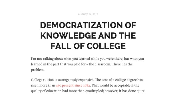
Railway and Freight Text Pro--Transportation font names FTW.
Dec 2013
Change font rendering based on the user's browser. typerendering.com? #aeasf
Oct 2013
Great online book about typography
Aug 2013
It is amazing that google can't get their fonts to look decent in Chrome.
This is cool. A collection of typography in the wild — Type Hunting typehunting.com
May 2013
Mar 2013
Linotype rebrands to Monotype, and is giving away $400 in fonts.