Intercom Moves Secondary Navigation to the Side
Intercom moved their secondary navigation from the top to the side in their redesign. This could allow for more horizontal space—especially when no filters are applied.
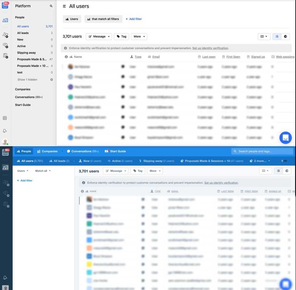
I do prefer how the previous design used color to provide additional contrast. Perhaps, users found that much color distracting?