Claude is doing some testing for a mobile app I'm building. All of a sudden my mac starts talking—bacon and two eggs over easy—it's using the speakers to test voice dictation on this phone.I'm equally impressed and terrified. True awe.
Notes on UX Design
280 notes
Oct 2026
Sep 2026
This UI is trying to be too clever. Feels awkward to use.
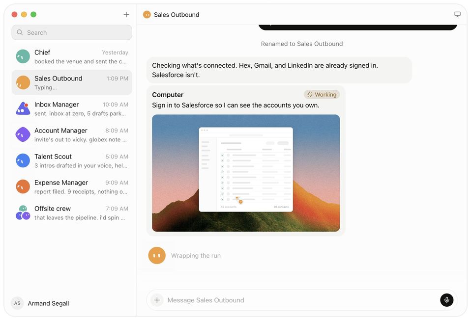
Grok @bot is an interesting product. There's a couple different concepts there that I think are pretty useful.Agents—Consumers don't really know what agents are. I think this is the best attempt at introducing it to them. The cute little characters kind of personify the agents and each character has different talents.Computers—The more powerful thing here is that each agent has it's own computer. Connecting these to agents is really smart and makes agents able to accomplish a on weak machines.This feels directionally right, but I still think this might be too advanced for consumers.
Aug 2026
Super interesting approach here. Seems great for flat areas. I'm unsure how well this would work on a mountain road though.
Keiryosha | まちの計量舎@machi_measure
最近たまに見かける「インセプション風の曲面マップ」、ナビアプリに実装されたら手前と遠くが同時に見渡せて意外と便利そう。orbify.eu

Polish can be a distraction.Historically, I'd only wireframe when I felt like the concept needed more feedback than the details.The same is true with prototypes today.
Emil Kowalski@emilkowalski
While I really like prototypes, because you can convey ideas easier by interacting with the real thing, it’s also important to know when not to do them.Prototypes have this flaw that because everything is already built, and it looks so real, people might assume that all the decisions have already been made.That’s because the building step was the most expensive before AI, but it’s not anymore.So sometimes, it’s better to ask the why first. Why are we making this in the first place?Allow yourself to be slow, write a doc with your reasoning, and only after you are aligned, start prototyping.It all comes down to judgement and taste at the end of the day, whether it’s an animation or an important product decision.You need to develop great taste, it’s more important than ever.
Aug 2022
A little presentation about leveraging design tokens for improved accessibility.

May 2020
I love reading about designing complex tables.
Apr 2020
I am unreasonably excited for the new @Jira navigation. I know it's weird.
Applications that prevent users from passwords from having sequential characters are silly. Discourages uses from using long pass phrases.
I'm a fan of the @SlackHQ UI refresh. Search, Nav and History make sense together on their own. Plus it makes the channel details feel a lot less cluttered.
Mar 2020
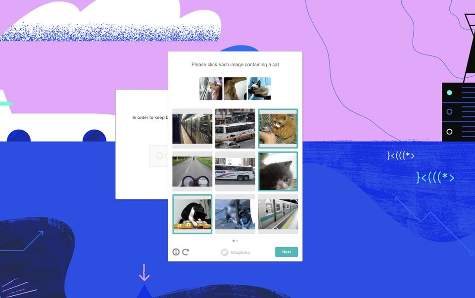
@digitalocean I've spent the last 15 minutes picking out pictures of cats. Can I please access my account now?
@notdetails @maxvoltar No matter what I'm working on, the Zoom UI is always in the way. I'm not entirely sure how to fix it though.
Feb 2020
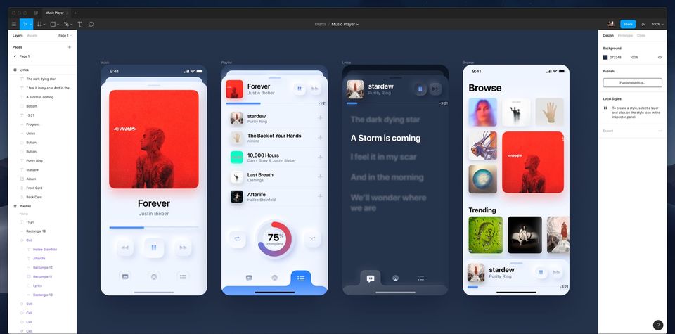
Neomorphism is visually interesting, but seems to have the same flaws of flat design without any of the benefits.Low contrast in most of the designs are certainly a discovery/
accessibility problem. At the same time it would be time-intensive to build complex elements.
Meng To@MengTo
I know some hate it, but here are my observations on Neomorphism.- Diagonal light & shadows
- Gradients (optional)
- No textures
- Buttons look more tactile
- Can adapt to dark modeIf you don’t exaggerate, implementation is adding 2 shadows and 2 inner shadows (optional).
Dec 2019
Nov 2019
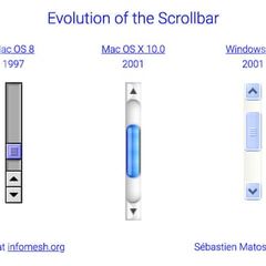
This is cool—30 years of scrollbars. Unfortunately, the site itself doesn't have a horizontal scrollbar.
Sep 2019
Jul 2019
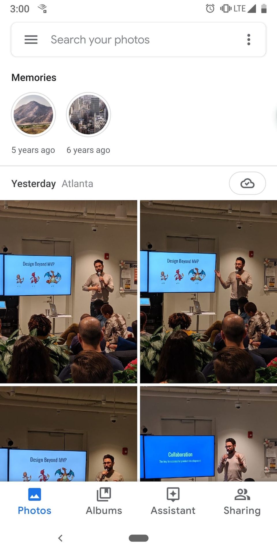
My Atlanta design peeps: A few of my co-workers are putting together an enterprise design meetup. See you there?
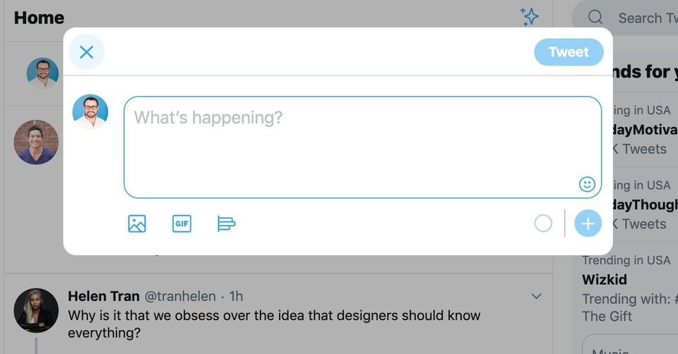
Overall, I'm a pretty big fan of the new @twitter desktop redesign. The only thing that throws me off is the 'X' appearing in the top-left.
Jun 2019
May 2019
@ow To be fair Twitter's current UI regularly receives updates. As a product, Facebook hasn't noticeably changed in years. The only thing that has changed is the addition of new notifications, which have made the product unbearable.
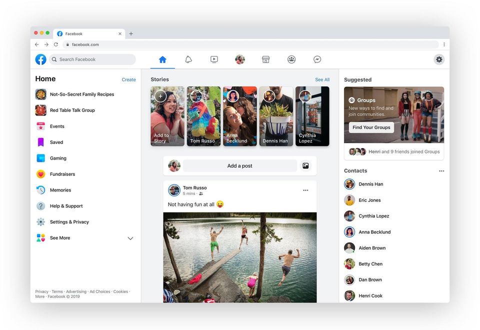
Interesting thoughts on @facebook's supposed new UI.
Brian Lovin@brian_lovin
Seems like people interpreted my last tweet about this as being negative or inferring that I thought the update is bad. What I really meant though, was that I literally have questions about this. Here are my questions so far:
Mar 2019
It's outrageous to be wait 20m only to have a @Postmates order cancelled. I understand merchants get busy. But accepted orders should be fulfilled.
Feb 2019
Don't be too clever with login forms. If you're going to look for a time to follow established patterns, it's probably here. @brad_frost gets a lot right in this piece.
Jan 2019
I can't stand @instagram's quick reactionsb on now stories. Accidentally sent one a dozen times.
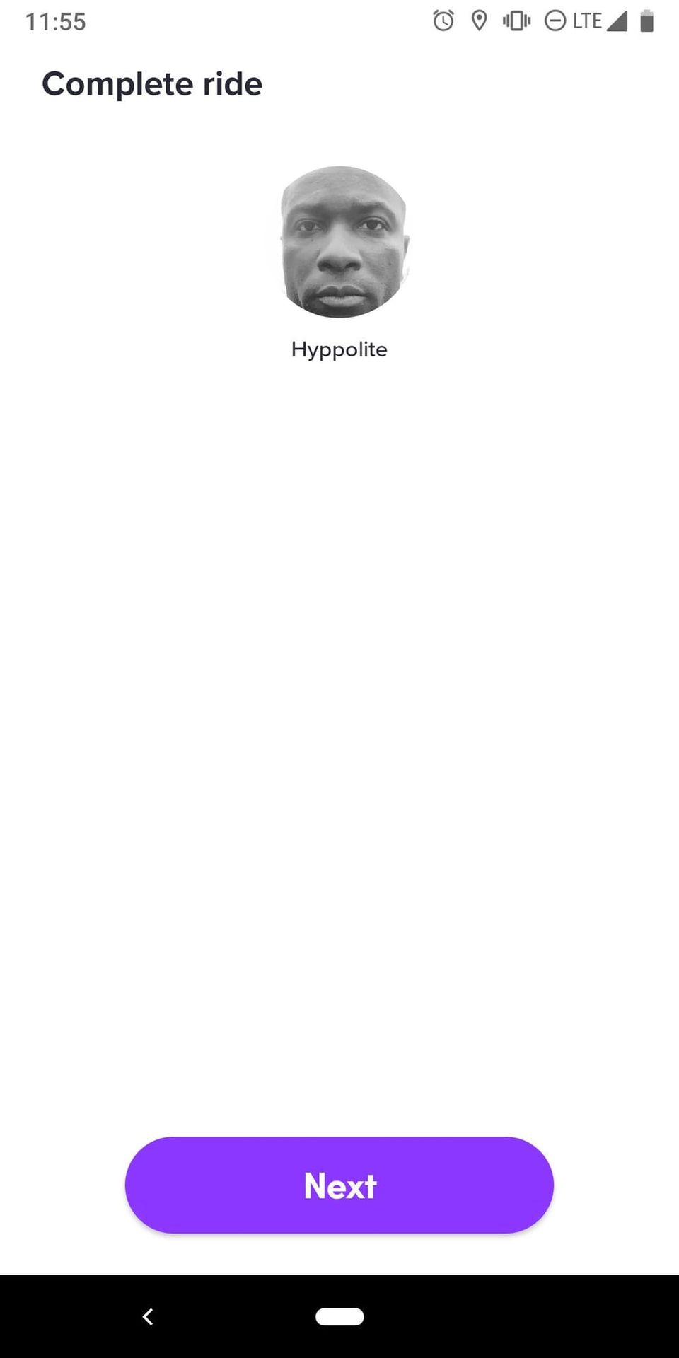
@lyft for the last couple of rides tipping has either been broken or slow on my Pixel 3. After the ride ends I just get a blank screen. Please fix so I can tip these awesome drivers.
Oct 2018
Sep 2018
Unboxing Chrome—an insightful post about the @googlechrome redesign. buff.ly
I do like most of Chrome's new UI. Although, I'm not a fan of this trend towards super-rounded form fields.
Aug 2018
Design friends—does anyone have example of bulk editing a multi-select field?Think the most common scenario would be managing tags in a list.
@pjrvs It's hard to say because apps have varying degrees of complexity. @intercom does and excellent job of smiplifying CRM. As does @zapier for automations.
The current version of @audible_com for Android is horribly frustrating to use. Controls are all over the place.
Jul 2018
@FlyFrontier trying to check-in. When prompted for more information, the continue button doesn't appear to work. Tried in Mac Chrome, Safari and Android Chrome.
Jun 2018
You know what? Other than the comment expand/collapse interaction, I'm a fan of the new @reddit UI.
I don't understand why so many financial tools fail to show cost basis vs market value charts. It seems like that would be a top interest.
May 2018
Gmail's new smart compose feature is fascinating. I'm curious about the interaction design. As is there's only one suggestion that can appear. Maybe it's that good?
Apr 2018
The best thing about the new Gmail UI is how little functionality has changed. New icons and states. Some different looking buttons. Overall it feels like a big visual improvement without removing what makes it great.
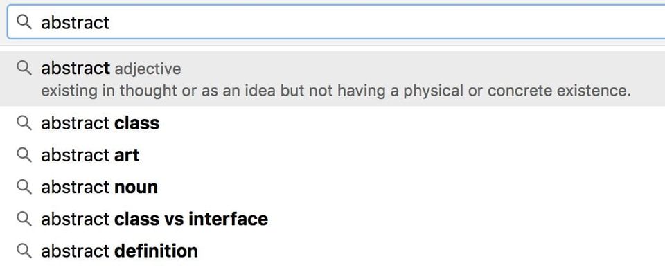
Interesting. Chrome now shows definitions inline with it's typeahead field.
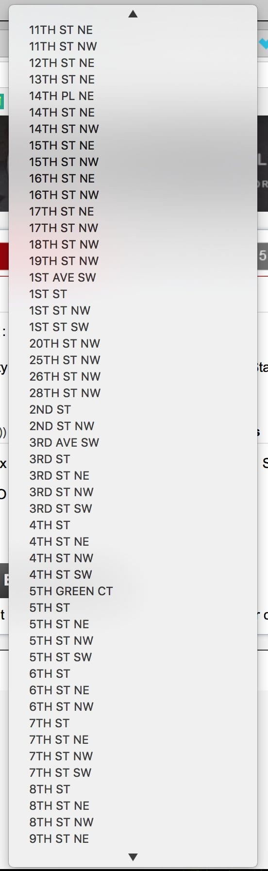
Is this a joke? The select menu has every street in Fulton county.
I wish there were more design reviews like this—Refactoring UI: WP Pusher Checkout Page

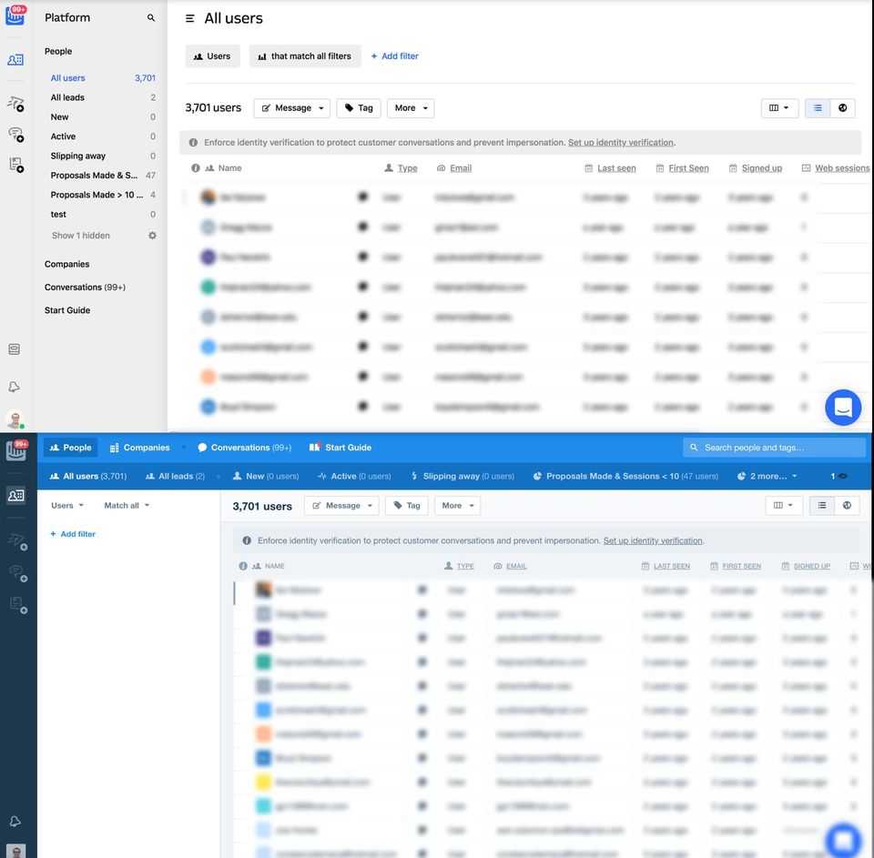
Intercom moved their secondary navigation from the top to the side in their redesign. This could allow for more horizontal space—especially when no filters are applied.
Mar 2018
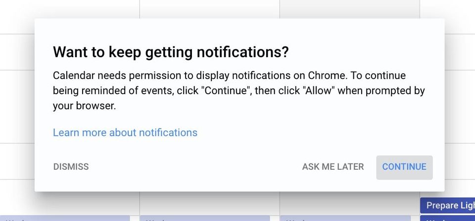
A good example of priming for access requests from @googlecalendar.
Feb 2018
Initial impression of Vero—it looks like a lot of applications on dribbble with no context to how thing work.
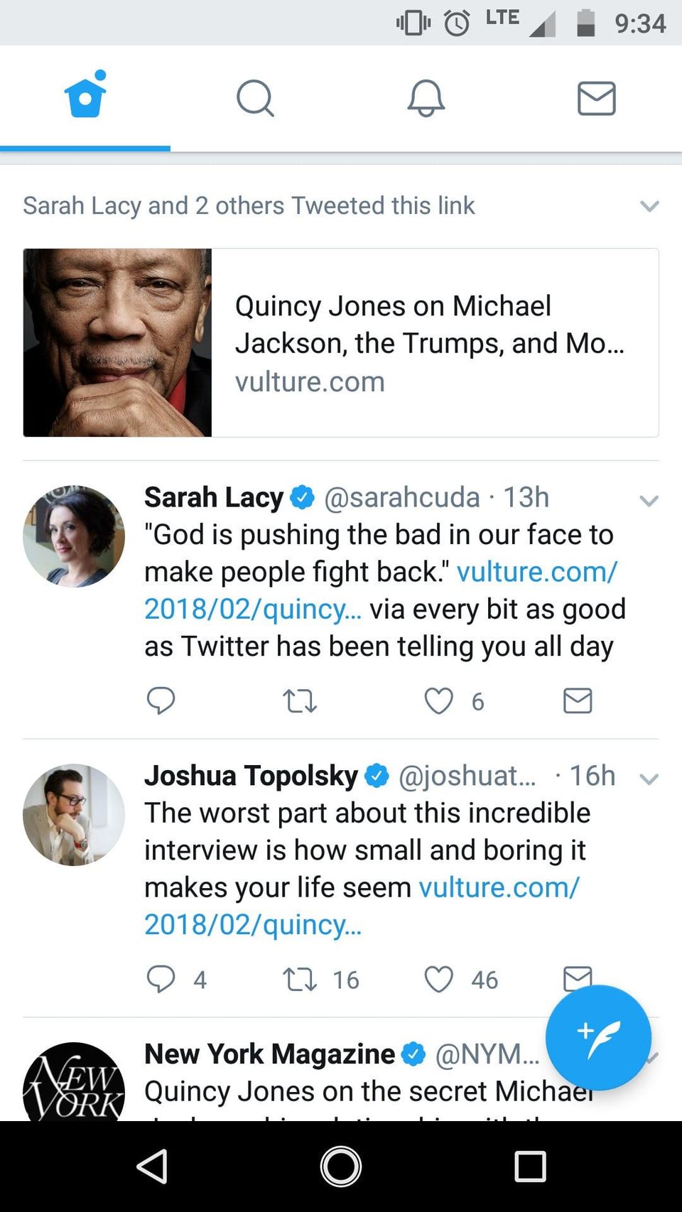
This is an interesting new idea @Twitter is testing. Aggregating tweets about a single link.
Jan 2018
It drives me nuts when @SlackHQ tells me I I have an unread message, and that message is in view.
One one hand I like the live widgets. It's cool that I can use it on the landing page. On the other hand it wasn't entirely obvious.
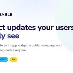
How does a critical alert system like the one in Hawaii take 40 minutes to communicate a false alarm? I understand that mistakes happen. There is some pretty terribly designed software. That is unacceptable.
Some solid low-effort, high-impact wins @notdetails worked on at @github.

Wrote a short post about using toggles or switches in UI.

@RossFloate It does sound friendlier. Elsewhere, I've heard people say priming users. I think they are all similar.
So much of UI design is setting and meeting the expectations of users.
Dec 2017
Oct 2017
Mapping a reply to R isn't a great shortcut @office365. Every time I want to refresh the browser tab (CMD+R), I end up opening a reply.
Trying to think of an application that uses a masonry grid, but doesn't include photos—thoughts?
The incredible thing about the Google Calendar redesign is how little things functionality changed.
Every time I see a ridiculous password requirement, I wonder if it's just going to be saved in plain text.
Sep 2017
I hate when websites use cursors inappropriately and use too many different cursors on a page. This site does both.
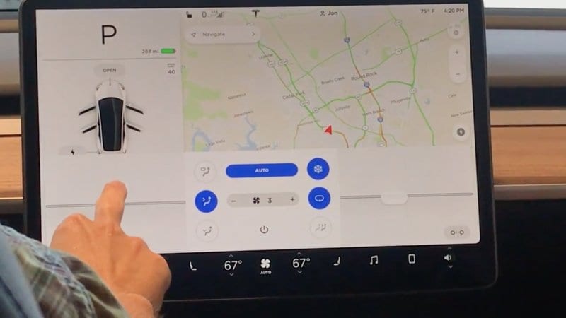
The video of the interface in the Model 3 is terrifying. You have to use the screen to turn on windshield wipers? jalopnik.com
Spotify's browse icon looks like a washing machine.

I'm very impressed with @googlesnapseed's UI. It makes complex editing actions, quick and easy.
I want to like @vsco, but the UI is rather unintuitive.
Aug 2017
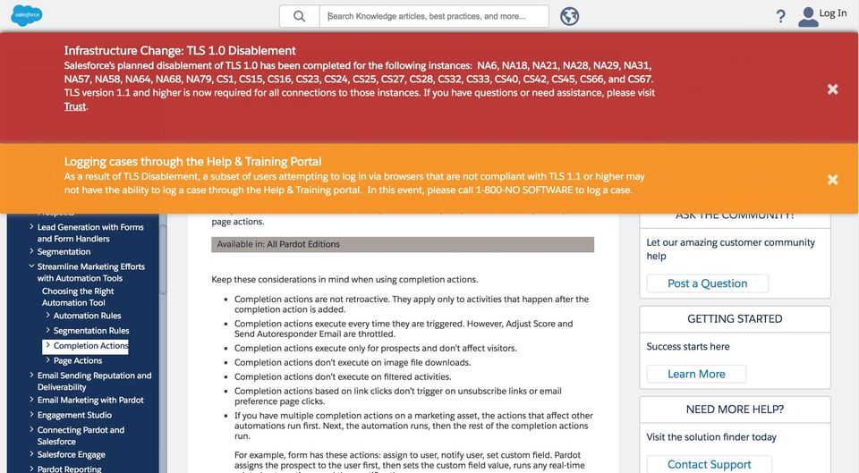
Wow, Salesforce doesn't mess around with their flash notifications.
It seems bizarre that I can't see the size of a folder on @dropbox.com. Some odd technical limitation?
@Twitter, Is it just me or does the cursor not change to pointer when hovering a button or link anymore?
Is is just me or does the new clap feature on @Medium feel an awful lot like the famous Kudos on @Svbtle?
There is exceptional detail in this Uber redesign case study. buff.ly
This is such a fantastic question about improving rule builders that require nested rules. buff.ly
Jul 2017
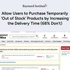
Interesting idea—Allow Users to Purchase Temporarily 'Out of Stock' Products by Increasing the Delivery Time
If you're going to have the inane password requirements, it makes more sense to email login links to users.
I've probably referenced this article a dozen times. It's a fantastic example of advanced filtering. buff.ly
Jun 2017
@NokiaHealth Please bring back the average trend lines that were in the Withings android application! That was one of my favorite features.
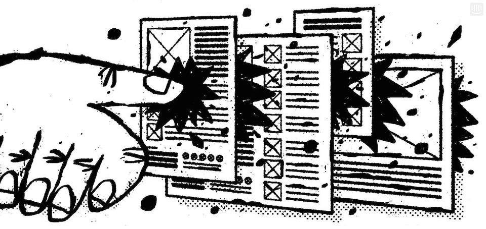
Intercom firing shots—Why 'mobile first' may already be outdated intercom.com
May 2017
The @SlackHQ calling functionality is pretty slick. Love the reactions feature.
I'm certain there is a correlation between product/engineering debt and the amount of settings in an application.
I love spending 20 minutes yelling numbers at an automated phone only to have it tell me the system is down and I have to send them mail.
Forbes has to be the world's worst online publication. In addition to ads rendering the site unusable, they now have autoplay videos...
The @Kodak print kiosks are terrible pieces of software. I just spent 30 minutes trying to print 2 photos.
Apr 2017
Just got a fantastic response on considerations when deciding to use a select list or a dropdown.
ux.stackexchange.com
What are some sites or products with multi-level navigation that you don't hate?
“The more common the problem, the better. Design systems should prioritize the mundane.” bigmedium.com
Today in mundane-but-interesting—Why Japan's Rail Workers Can't Stop Pointing at Things buff.ly
Feb 2017
If google is going to use panels to display search results, they need a different UI for the search bar. buff.ly
For a website largely used by designers, the UX of Typekit is horrendous. I want to use the back button to navigate to the previous page.
In case you were looking for some light product reading—why I refuse to use the term "Dashboard. "solomon.io

@smileysteve It's because they suck. My serious answer is that they add clutter and take away from the "chat" experience.
Jan 2017
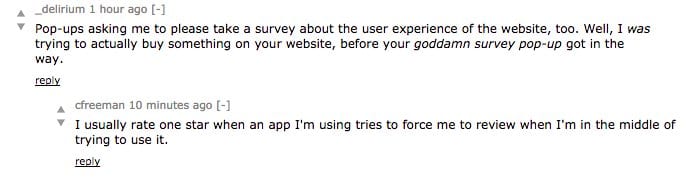
This is generally why we advise against in-app NPS surveys. Just email them to customers.
SnapChat's Story UI is intentionally (supposedly) difficult to use. I wonder if Instagram's stories causes them to rethink that decision?
I hate designing things with charts. They could be completely useless and everyone loves it.
Oh wow, I love the interactions in @Opera's new Neon browser.

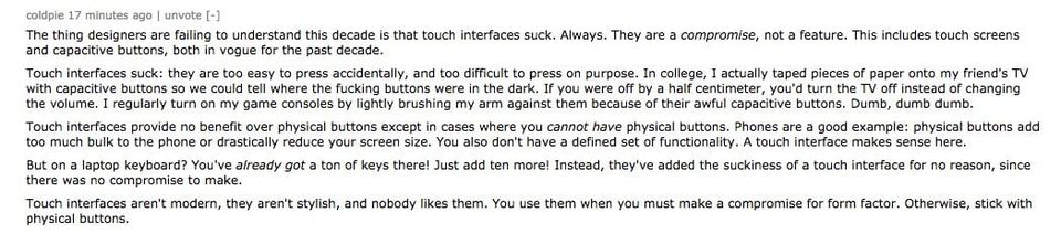
This is one of the best design-centric comments I've come across on HN.
news.ycombinator.com
Dec 2016
Installed FB Messenger to chat with international friends while they are in town for the holidays. Immediate prompts. To replace SMS app.
This is cool. A closer look at the Westworld UI.

Nov 2016
The get a quote section on Insurance by Jack is a great implementation of conversational UI. Perfect with the Brand.

Oct 2016
The autoplay video with sound on @CNN's website is atrocious. Facebook has shown autoplay can be done, but respect the user/visitor.
Still skeptical about this software-based bar replacing function keys. Seems like solving a problem that doesn't exist.
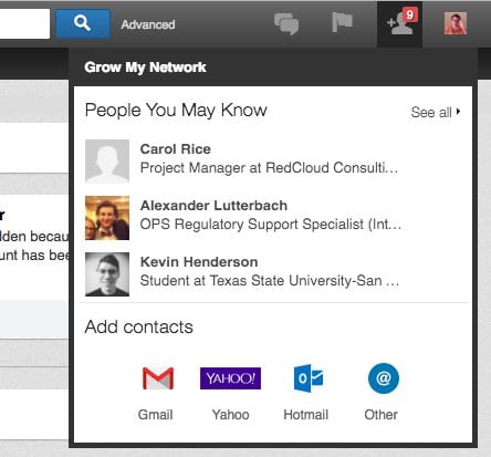
LinkedIn now showing false connection requests.
It's odd how some @Quora links open in a new tab, while others don't
Sep 2016
The whole conversational UI thing is way overhyped.
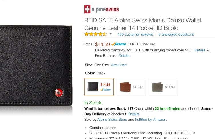
I don't know if Amazon is split testing, but Helvetica Neue Light is not a good choice. Terribly difficult to read.
This talk with Aarron Walter was great—around 48m, he starts drawing the parallels between prototyping and animation buff.ly
User Experience.
This is such a difficult UX problem—Selecting multiple ranges within a single range. buff.ly
Aug 2016
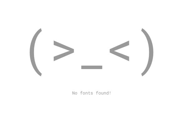
These Google Font blank states are hilarious.
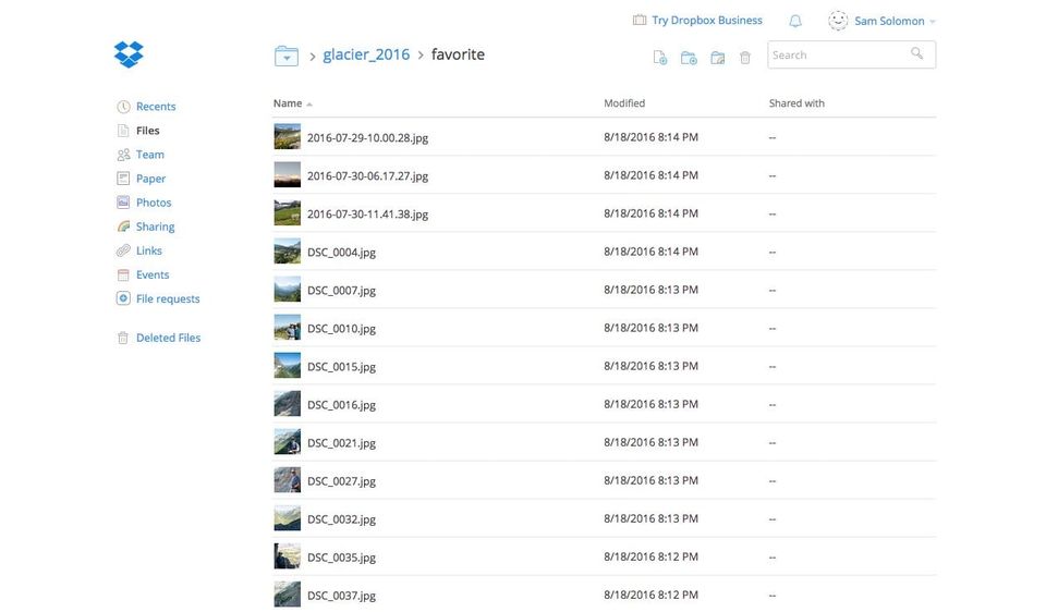
Is there really no select all option in the @Dropbox web application? That seems like a serious oversight.
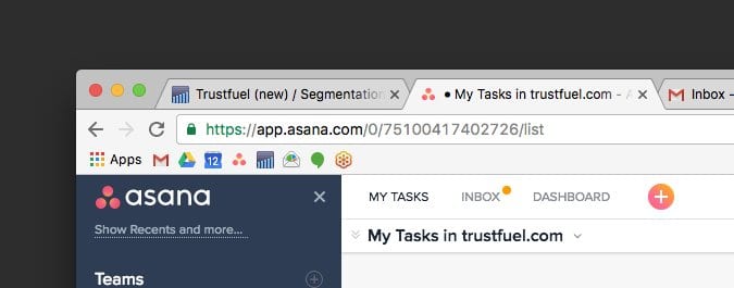
Digging the high-contrast borders in the new Chrome.
Oh man, the interaction design in notion.so is fantastic!
Good thoughts from @ilikescience on designing better data tables buff.ly
Die Dashboards, Die! Why Conversations Will Reinvent Software
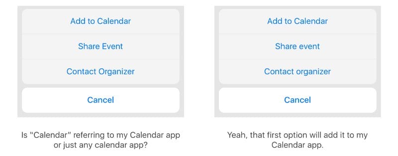
Little details make a big difference. Title case or sentence case? buff.ly
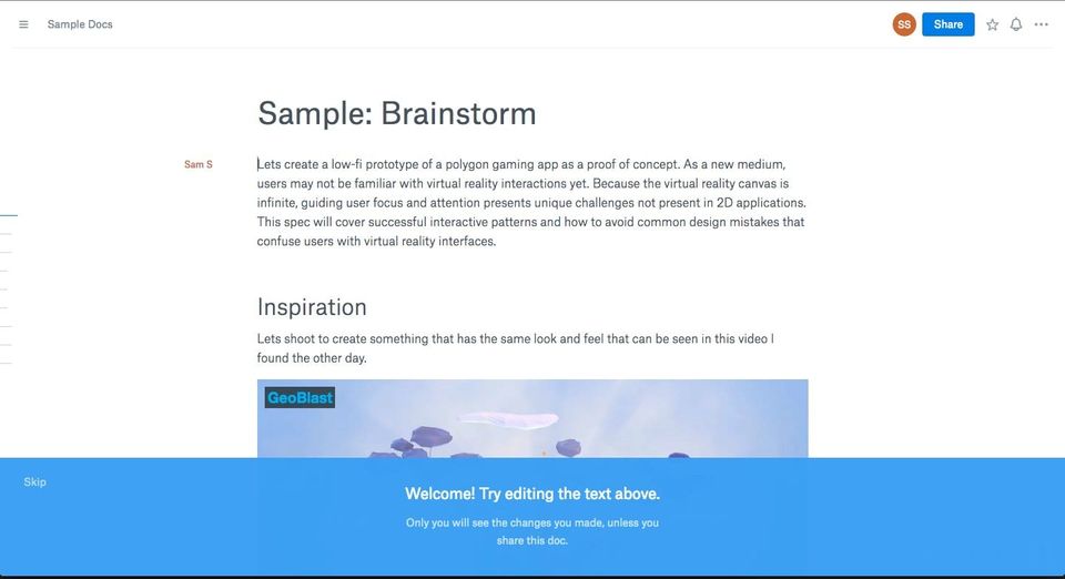
Oh wow, the @Dropbox Paper document editing is gorgeous.
I don't like that I have to tap the Twitter notifications icon twice to mark them as read on Android.
Jul 2016
I hate dropdowns, but this presentation was a little disappointing. What about steppers and segmented controls?
If any of you have built CSV import or column mapping tools, contribute to DN's knowledge. buff.ly
What we learned designing a car user experience buff.ly
It drives me crazy that in markdown a single asterisk creates italics, while in @SlackHQ it becomes bold.
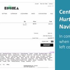
Getting back to the homepage is 6x more difficult when placed in the center as opposed to the top left corner.
Who ever decided that a CNN Live stream should autoplay halfway through an article—it's a terrible idea. Way to distract your readers.
Good baseline practices for designing forms. buff.ly
If you're not careful, dashboards can easily become feature landfills.

Jun 2016
People are experts at understanding their problems, not necessarily in designing the solutions.
@SamuelHulick If you haven't seen the Anchor.fm onboarding process, you should give it a look. Probably one of the best I've seen.
May 2016
Dashboards are a symptom of poor design, not a solution to it.
Are designers and engineers hijacking people’s minds? buff.ly
The UI for Wells Fargo ATMs is pretty great.
Apr 2016
The most difficult part about product design is creating a consistent experience.
I have no idea what the buttons in iTunes are supposed to do.
Make ux.stackexchange.com great again.

The illustrations and animations in this concept are on point. Love how the cups fill. dribbble.com
Mar 2016
“Notifications at the wrong time are worse than useless.” buff.ly
The mobile version of Wikipedia is so much easier to read—even on desktop.
Signing documents in Acrobat is such a pain in the ass. I'm about to Photoshop my signature into this thing.
Good observations—B&H Photo's Mobile Site is Best-in-Class
Interesting thoughts about interaction density

SnapChat and usability as the enemy buff.ly
Cool that @asana tries to prevent users from adding duplicate tasks.
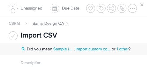
Thoughts on empty states in mobile design buff.ly
Feb 2016
Good thoughts on how to make email confirmation a little easier for users buff.ly
If you're looking for some mobile onboarding inspiration. This gallery of onboarding videos is a nice reference buff.ly
I admit since the Product Hunt redesign, I just don't find myself on the site anymore. It's much more difficult to scan horizontally.
Is this the perfect save icon? buff.ly
Good designers always look for ways to delete redundant steps. buff.ly
Jan 2016
“ Using real examples from the start of the design process is important as it forces you to design for reality.”
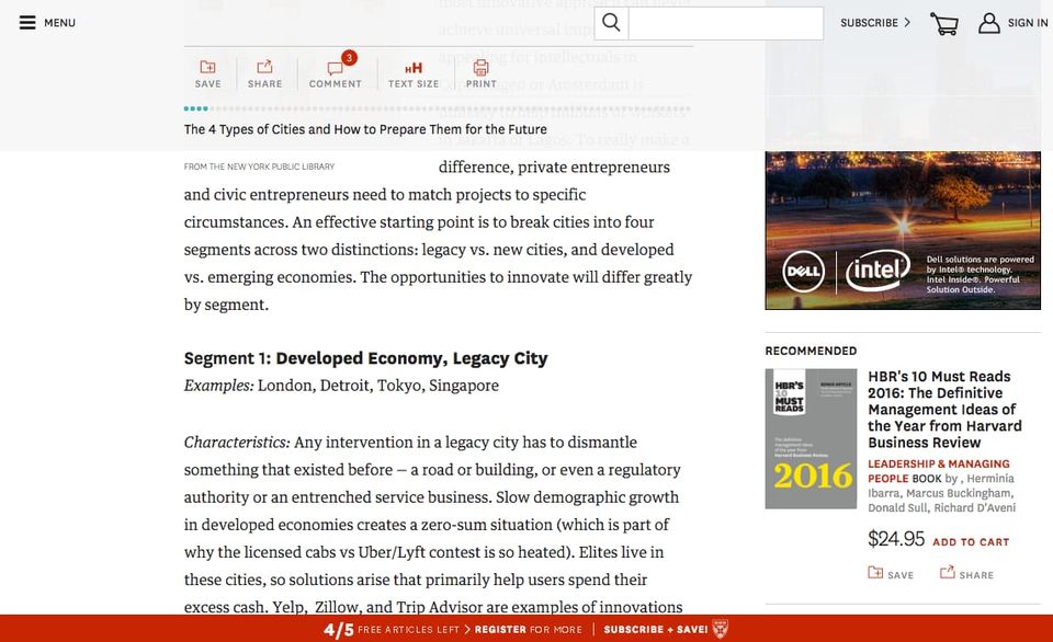
The fixed header and footer on hbr.org are brutal. There's barely enough room to see the article.
To use or not to use "Zebra Stripes", or Alternating Row Colors for Tables buff.ly
Snapchat definately follows the usibility as an anti-pattern argument—Usability as the enemy buff.ly
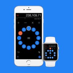
Thoughts questioning calculator layouts. I want to scough at the radial layout, but there might be something to it.
Amen. medium.com
I'm all for mailto links, but they shouldn't be used in buttons. They should only be used with linked text email addresses
Dec 2015
Designers, don't make your checkboxes round. You're not doing users any favors.
Just discovered NPR One. Absolutely love the concept and design—home run of a product.
Nov 2015
Oh this is cool, suggest a correct email to users.
Great thoughts on sign up interfaces from @notdetails
I'm a fan of @lyft's fancy new car icons.
Designers and product people—how would you feel about changing your site to use social logins?
Love the subtle animation when you like a tweet. Hint: Like this to see it.
Anybody out there have experience preventing duplicate accounts from being created, when implementing social login?
Oct 2015
Sep 2015
Oh man, there are so many gems in here—
Macintosh Human Interface Guidelines circa1995 interface.free.fr
Cable interfaces suck so much.
Love subtle, but useful details in design. This internal vs. external link indicator is a great idea.

Checkboxes should never be round—even when they look better
Just discovered @fullstory. Love the product. Absolutely an interface designer's best friend.
Aug 2015
Google's @adwords signup is a serious dark pattern. Automatically starts spending money on your ads during onboarding without notificaiton.
This is a good idea. Same UX as Uber/Lyft but for restaurants. buff.ly
Health insurance interfaces are an absolute nightmare.
What web application has the best onboarding process. Suggestions?
DN Answers: How to display errors in red when your brand color is ALSO red? buff.ly
Jul 2015
Well-designed interfaces look boring buff.ly
The anatomy of a credit card form buff.ly
I'm pretty sure Yahoo is just making up design patterns for logins. Pretty sure I have 4 or 5 separate accounts now.
The best icon is a text label
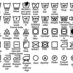
Tumblr's UI is just a bit too clever. I have several Tumblr blogs, and still get lost whenever I'm at the dashboard.
Jun 2015
As a user, it's maddening. Chances are I won't remember what I used when I'm trying to access my account next week.
These user ID rules are ridiculous. This isn't a password. More poor design spotted in the healthcare world.
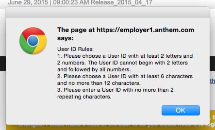
My Morning:
-This is going to be a usability disaster
-Hey, this might work
-This is going to be a usability disaster
-Hey, this might work
May 2015
I'm kind of sick of the whole UX vs UI thing now. A good product is a good product. buff.ly
Can't tell if this is real, or the work of a troll—The Online User eXperience Institute
The Manchester City website has an accessibility page, which lets users change background colors, font sizes. buff.ly
"You know how you get people younger to gamble? Hand them a fucking telephone."

Slot machines perfected addictive gaming. Now, tech wants their tricks—Engineering Addiction

"Like a well-built home, great software focuses on giving its users hundreds of small, satisfying interactions." buff.ly
Apr 2015
I'm frustrated with these tabs that contain a bunch of forms. Markup is getting sloppy.
I have no idea what all these buttons do in my Comcast account page. Also, every click brings up a loading wheel...
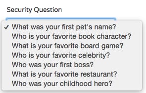
These are some BS security questions...
I couldn't find out how to get to the settings/account menu using the LinkedIn UI. Adding /settings to the url seemed to work.
Don't ask for a username when you want the user's email.
Do-it-yourself usability tests for creators

Mar 2015
Ah yes, drunk history, but for QA and User Research. theuserisdrunk.com
Hey, @HealthCareGov it isn't clear for users that the user's email is also their username. You should get rid of username.
Whoa, that's pretty cool. If you login to your @DollarShaveClub account after clicking on an email. You only have to enter your password.
I like a lot of the design concepts in Hiri.
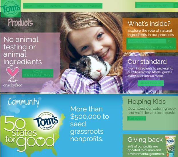
The number one rule of web design has to be that a link should look like a link. nngroup.com
Feb 2015
Anybody know of a pttrns.com for web apps?
Thank you for downloading our app, we now have your address book and will start sending you spammy push notifications.
Jan 2015
This is a very, very good look at how @duolingo onboards new users by my friend @SamuelHulick

Can't select fonts from @typekit's dropdown, so I'm going to use Google to find the font I want instead.
Whoops, that's a serious design mistake—Ford recalls SUVs because drivers are accidentally turning them off buff.ly
Dec 2014
Really clever and thoughtful way to prompt the user to rate your app. buff.ly
Nov 2014
It’s time to treat push notifications as sacred buff.ly
Warning UX porn ahead—The Evolution of the Title Bar Buttons
Good examples here—How Ghost Increased Conversions by Over 1,000%
Oct 2014
Also, not giving Taco Bell permissions for contacts, calendar, location, phone, photos, Wi-Fi connection info, device ID or call info.
So I spent this weekend working on an unofficial redesign of The Pandora One desktop player. What do you think?
dribbble.com
Deceptive design as a business model—Congratulations! We successfully did not give you any discount! buff.ly
Interface design has three facets: Visual, UX and Conversion. Too much of one, and you neglect the others. It's a careful balancing act.
Apple isn't interested in building a touchscreen laptop, nor should they be. It's a terrible idea. Remember Con10uum?

Sep 2014
What does login look like without the password?—Urgent security warning that may affect all internet users Sehttp:/ buff.ly
Aug 2014
Why is the wired.co.uk new site use a side scroll? Which of your users said that was a good design decision?

The homepage is dead, long live the homepage. buff.ly
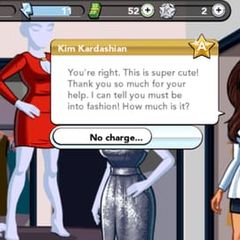
How intentionally deceptive UX lead to the rise of the Kardashian Game.
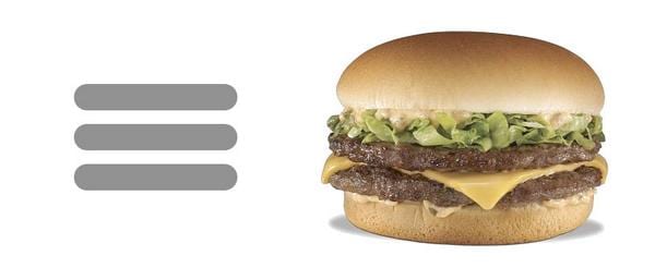
I present figure 1, the hamburger.
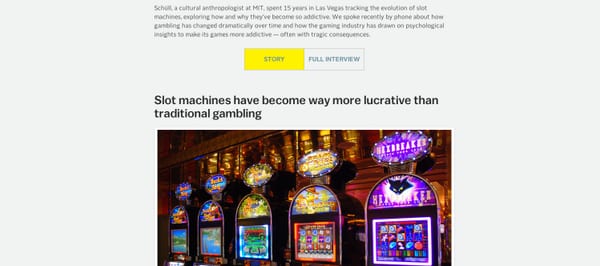
This is interesting—@voxdotcom is running the full interview transcripts within their storiesvox.com
A collection of educational UX videos with user champion @lukew youtube.com
This is gold. Formfield best practices. static.lukew.com
Killer User Onboarding Starts With A Story by my friend @SamuelHulick

Interesting, coke freestyle interface changes and back / forward arrows illuminate on the bottom when the handicapped button is pressed.
Jul 2014
Here's a classic. If the sign doesn't work, using another sign to point to it doesn't help—Signs on Signs

Oh, so you like sidebars? azumbrunnen.me
Adobe CC has such a horrific user experience click a button that should work in-app, sends me to a webpage.
...When bad UX is part of the brand standards.
What good is the autosave feature in Outlook for Mac, if it interrupts the email I'm typing for 10 seconds to save?
Jun 2014
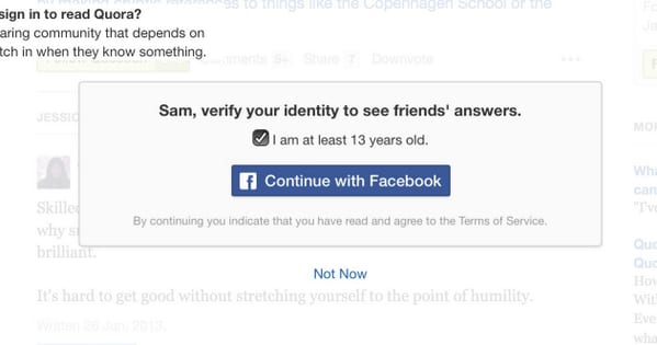
Hey @Quora, I've already logged in via email. I don't want to connect my Facebook account.
May 2014
How Slack onboards new users.
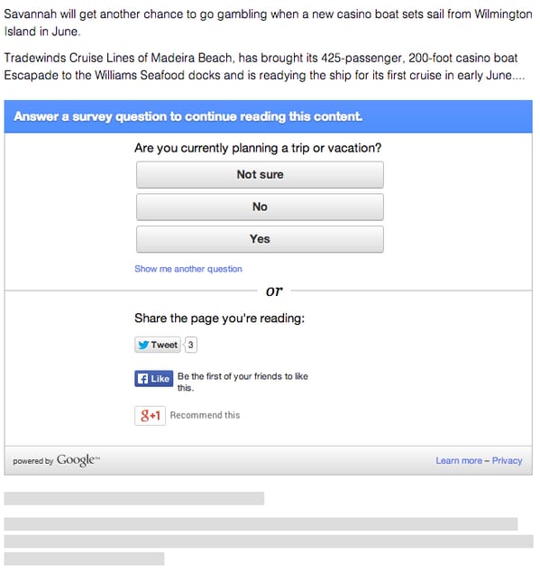
Never seen this pattern before. Share or take a survey to continue reading.
Apr 2014
The three types of interface design: Visual, Experience and Conversion. Now I need a venn diagram.
Building ugly software is no sin, but building unusable software is.
Design fails when simple things need labels or instructions.
How Stripe uses subtle animations to improve the online checkout experience. buff.ly
Fantastic case study in conversion design—Is booking.com the most persuasive site in the world?
Mar 2014
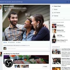
Facebook's new News Feed was too good. It got canned in favor of ad impressions—Facebook's Predicament
I love stuff like this. Watch a stranger review my new blog. "You have all this empty space."

So how about that new uppercase button on the iPad?
Interesting thought, but I don't think this is true in most cases—Notifications are a UX Anti-Pattern buff.ly
Good UX, Wells Fargo ATMs wish you a happy birthday when using them within a week of your birthday.
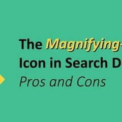
Little things in the UI make the biggest differences in UX—A Look at The Magnifying-Glass Icon in Search Design
Interesting numbers from @lukew on the percentage click on social sharing buttons.

Interesting, infinate scroll mixed with pagination. This seems to answer most of the UX arguments against it.
Feb 2014
Good design - a parking deck that shows how many spaces are left on each floor.
This is brilliant. Make sure you watch the video—A New Car UI

Very cool to see the discussion my post about UX and social media buttons has caused over the last week. x.com
Cruising U.S.A., contact form style. Design A, Execution A, Usability F
Interesting commentary about my article, Why I'm Done with Social Media Buttons on Designer News.
Jan 2014
Initial reactions to Facebook's new product Paper—Solid interaction design, looks like a FB only Flipboard, interesting for about two days.
Ah yes, appliance design—The Hot Dog Button, a true innovation. aaronshekey.com
While we're talking about news publications, I'm fascinated by the fact that readwrite.com doesn't have a nav, just a topics page.
theindustry.cc relaunched recently. Does it seem odd to anyone else how most of the content is below the fold?
Bullshit Overlays. @brad_frost weighs in on popup modals. cc @SamuelHulick
A brilliant concept for one-handed mobile UI--Vice Versa behance.net
Dec 2013
Blog post title, IA or the Highway. Boom.
Not sure I want to support users on touch-screen laptops. I don't want to support devices with poor ergonomic design. #aeasf
Mobile-first design is taking a small screen and making it better, as opposed to taking a big screen and making it worse. -@lukew #aeasf
The guy that increases conversions 34 percent gets a dish at the cafeteria named after him. - @lukew #aeasf
Keep the keyboard use to a minimum on mobile. #AEASF
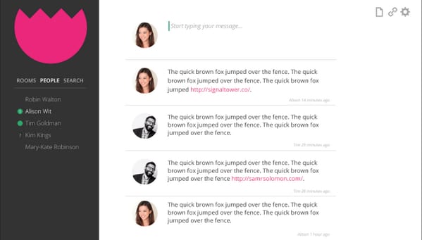
Sneak peak at a chat app I've been working on. Think I need to revisit some of the features. Already too complicated.
Nov 2013
Sep 2013
Kentico CMS goes down as one of the worst pieces of software I've ever used. No regard for the user. Simple tasks are extremely laborious.
Brilliant, sublte peice of UI — Focus transition
I mentioned LinkedIn's dark pattern UI before. This is the result of one of those dark patterns.

I see this hipster x marks all over websites, and always think clicking them will close something.
I've been seeing the image zoom on hover effect a lot lately. Generally, I'm hesitant about new UI ideas—this time may be different.
LinkedIn's endorsement feature is a borderline dark pattern UI. I shouldn't be receiving endorsements for press releases.
The primary function of the carousel in a user interface is to convince clients they don't need a "media center" or a "gallery" page.
Aug 2013
Jul 2013
The enterprise software conundrum is a likely culprit. End users aren't usually the buyers.
Omnigraffle rule of thumb - Sites with great IA are easy to lay out, sites with proor IA will make you want to throw things.
Love irony? Hate sliders/carousels? This page is for you. shouldiuseacarousel.com
Brilliant UX for heavy content sites — Time to Read
Jun 2013
Building good landing page UI. goodui.org
Interesting button styles. Especially the green section (click the order truck). But some of them feel over-the-top.
May 2013
Not a big fan of the esquire.co.uk redesign. It is difficult to tell what stories the pictures go with.
"ok, glass" a Google Glass concept by @jckmgn
Apr 2013
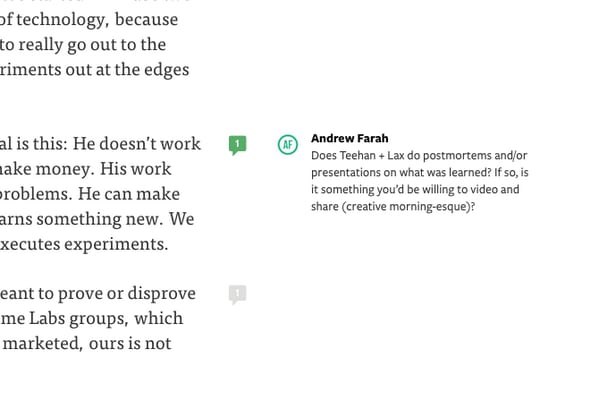
Whoa, inline comments on @Medium . Is this new?

Oct 2011
Video: How will we use screens to interact with our environment in the future? A few interesting ideas... tumblr.com
Aug 2011
Jun 2011
A first look at #Microsoft #Windows8 UI. Windows Phone anybody? bit.ly
Nov 2010
An Idea for Navigation Companies - I have an idea for the GPS companies of the world, companies like Google,... tumblr.com