Medium Returns to a Serif Wordmark
Interesting. It appears that medium has updated their logo to look like the original one. I never really was a fan of the green M.
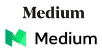
It didn't really feel like a logo for a publication.
Interesting. It appears that medium has updated their logo to look like the original one. I never really was a fan of the green M.
It didn't really feel like a logo for a publication.