I've learned so much about video creation in the last 24 hours.If you spend the reps working at it—you can really do just about anything.Every day it becomes more clear that more and more of our limits are self-imposed.
Notes on Design
444 notes
Oct 2026
Man, I miss Little Trouble. That bar was a real gem.
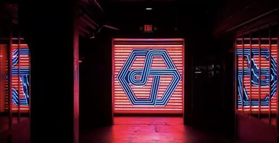
Giant wordmarks in the footer, really are in vogue aren't they?
Sep 2026
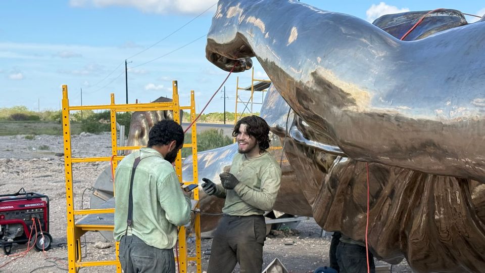
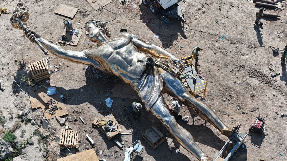
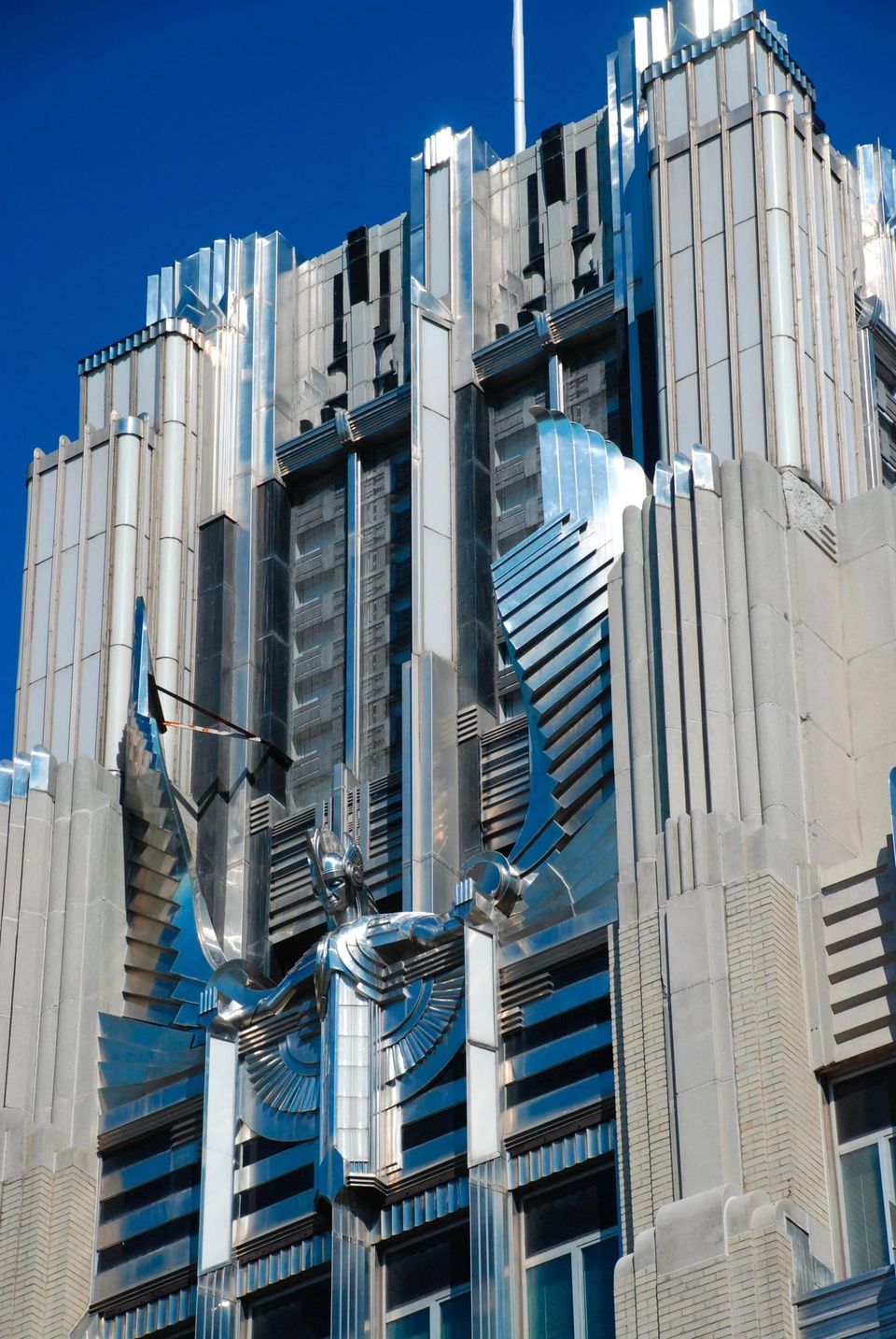
This giant Prometheus going up near Starbase is rad! Exhibit A for our new age of Art Deco optimism.
Joe Tegtmeyer 🚀 🤠🛸😎@JoeTegtmeyer
Just outside Starbase, a 50-foot bronze Prometheus is going up!Not a SpaceX commission. Not paid for by Elon Musk.French foundry Atelier Missor cast it in sections near Paris, shipped it across the Atlantic, and is assembling it on private land near the entrance for about a million dollars of their own money.In the myth, Prometheus stole fire from the gods and gave it to humanity. Here he holds that torch toward the same sky Starship is built to punch through.The legs are engineered for a Gulf hurricane: stainless tubes, 14 inches across, half-inch walls.Ancient titan. Modern launch site. Same idea … don’t accept the ceiling.


Beautiful. Bring back Art Deco!
Dume@gietzschean
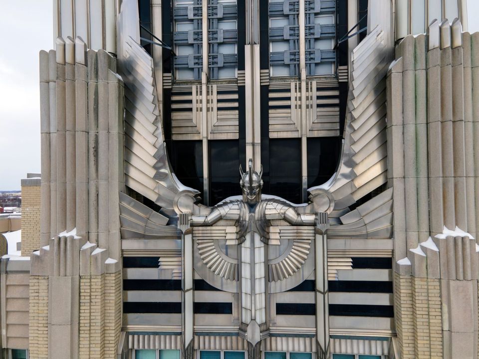
Art Deco actually made a power company building look exactly like a power company.The Niagara Mohawk Building in Syracuse was completed in 1932 as the headquarters of Niagara Hudson Power Corporation.At night, concealed lights within the façade, illuminated glass panels, floodlighting on the central 'Spirit of Light' sculpture, reflective aluminum, polished glass and stainless steel turned the building into a glowing advertisement for the power of electricity in the age of machine.This also represented the optimism and beauty that could be incorporated into modernist structures.

You know, I was always a pretty poor engineer. On the other hand I always had a pretty strong product sense and eye for details. So I leaned into that.Agents are already much better at engineering than I am. I expect we're not too far from them being a better designer than I am soonThe work I do today feels nothing like what I used to do. Whatever this is, it’s something new. And I couldn’t be more excited about the future.
There is beauty and benefit in simplicity.
David Senra@davidsenra
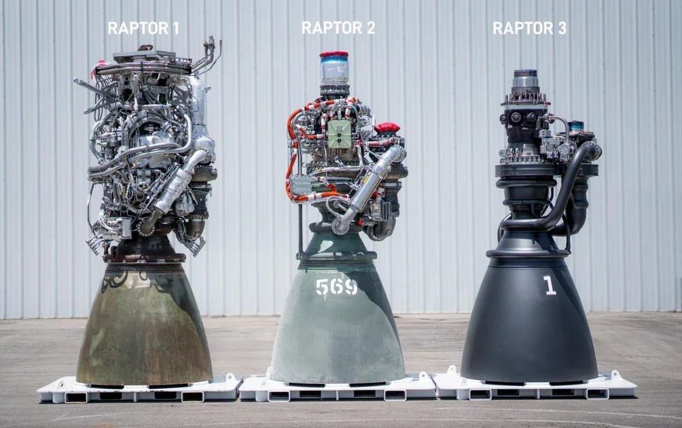
I've been talking about this trend for a while. It's becoming more and more clear this is the way foward.
Tobias van Schneider@vanschneider
Depending on how you look at it, it's both a blessing or a curse.The consolidation of roles (due to AI) means that Designers are Developers now. And Developers are Designers. In particular on front-end.In fact, I'd argue the top 20% of designers are now better front-end devs than 80% of all devs before.And in the opposite direction, 20% of the top developers are now BETTER Designers than 80% of the Designers before, with their new combined skillset.For some people this is a godsend gift, for others its their nightmare come true.For me personally, I am split here. It's both for me, because I've never wanted the role of a engineer, but at the same time I enjoy it, because I'm quite effective.But I need to remember myself: I get my satisfaction from being a Designer first and foremost, not engineering, regardless of how easy or difficult it is.When I dream, I dream of designing, not implementing my designs. I don't dream about fixing bugs, chasing edge cases. I dream of problems that are solved on the emotional spectrum. All of which still would need someone competent and skillful to implement it.Even with the consolidation of roles, I still believe that towards the top (both in reality and aspirationally), the specialization will hold true and keep existing.I don't know where I'm going, but we will find out. A have a hunch (:
Aug 2026
Polish can be a distraction.Historically, I'd only wireframe when I felt like the concept needed more feedback than the details.The same is true with prototypes today.
Emil Kowalski@emilkowalski
While I really like prototypes, because you can convey ideas easier by interacting with the real thing, it’s also important to know when not to do them.Prototypes have this flaw that because everything is already built, and it looks so real, people might assume that all the decisions have already been made.That’s because the building step was the most expensive before AI, but it’s not anymore.So sometimes, it’s better to ask the why first. Why are we making this in the first place?Allow yourself to be slow, write a doc with your reasoning, and only after you are aligned, start prototyping.It all comes down to judgement and taste at the end of the day, whether it’s an animation or an important product decision.You need to develop great taste, it’s more important than ever.
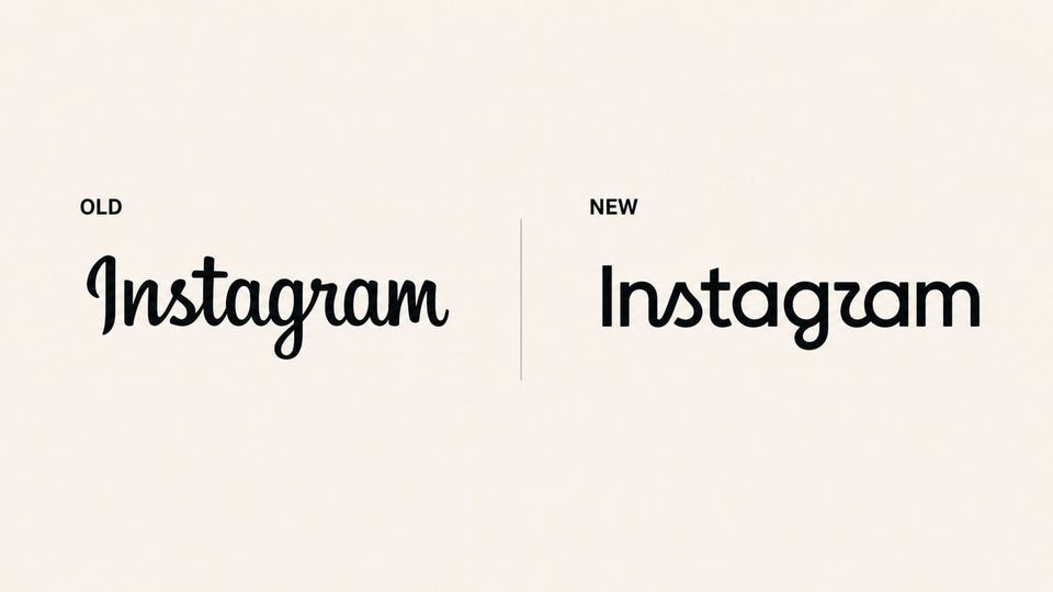
The new Instagram logo is getting a lot of hate. Honestly, I think it's a pretty sharp upgrade, while keeping the character of the original.Also nobody, under 30 knows how to read cursive anyways lol.
Sam Solomon@SamuelRSolomon
The two things people hate most are the way things are and change.
Jul 2026
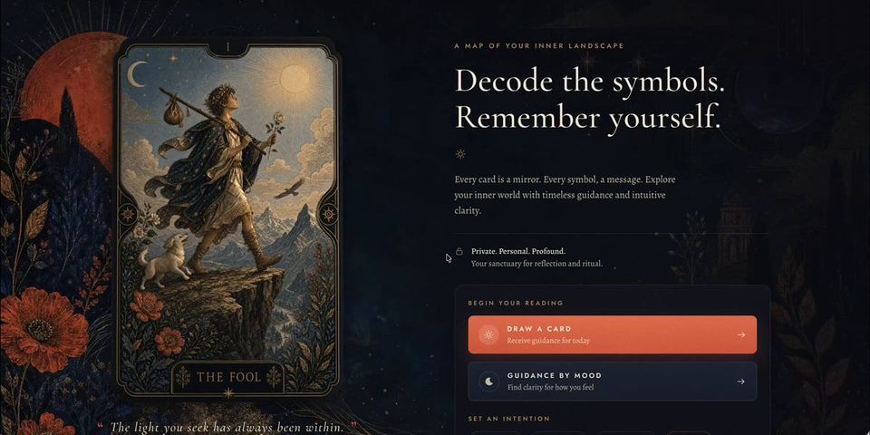
Wow, this is a pretty rad card effect.
Exceptional mark and name for a nuclear energy company.

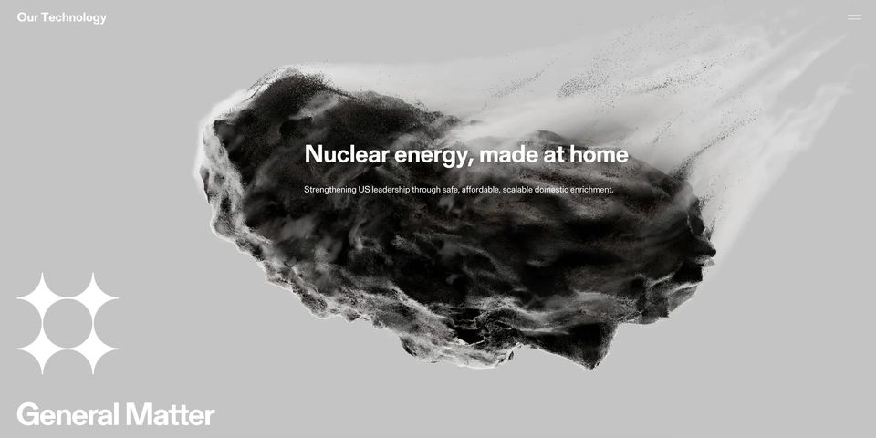
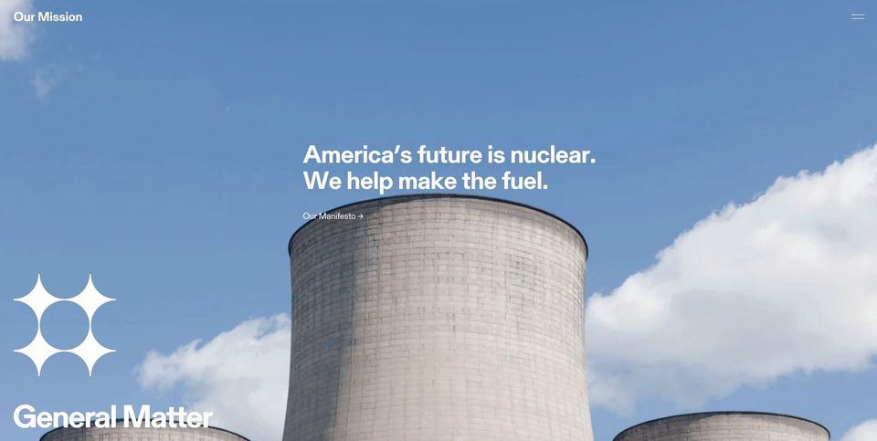
May 2026
I cannot get over how rad the @AmcaInc branding is. Exceptional design.
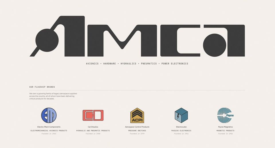
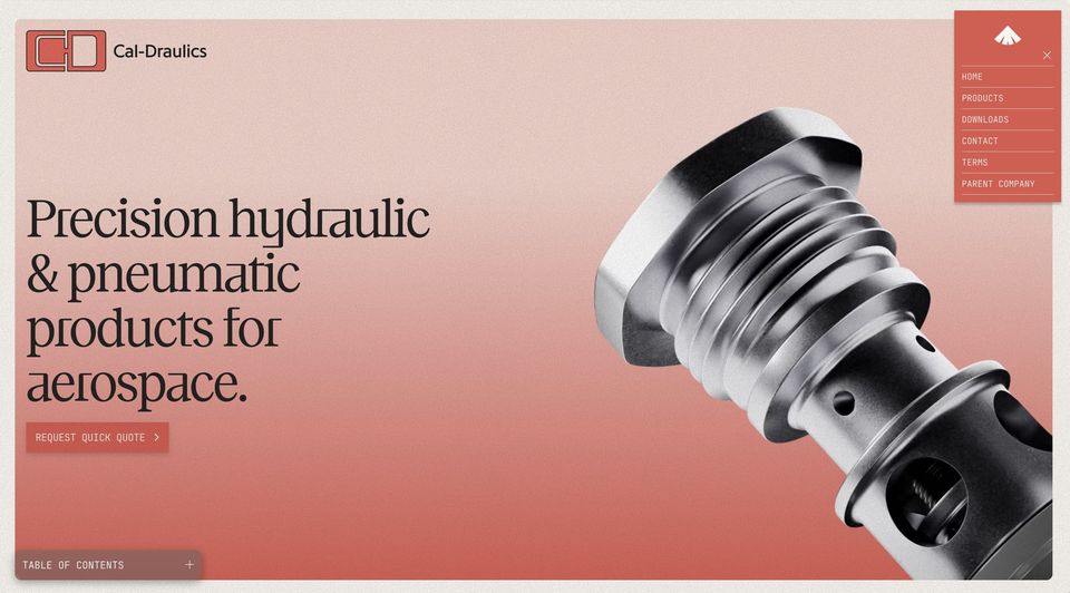
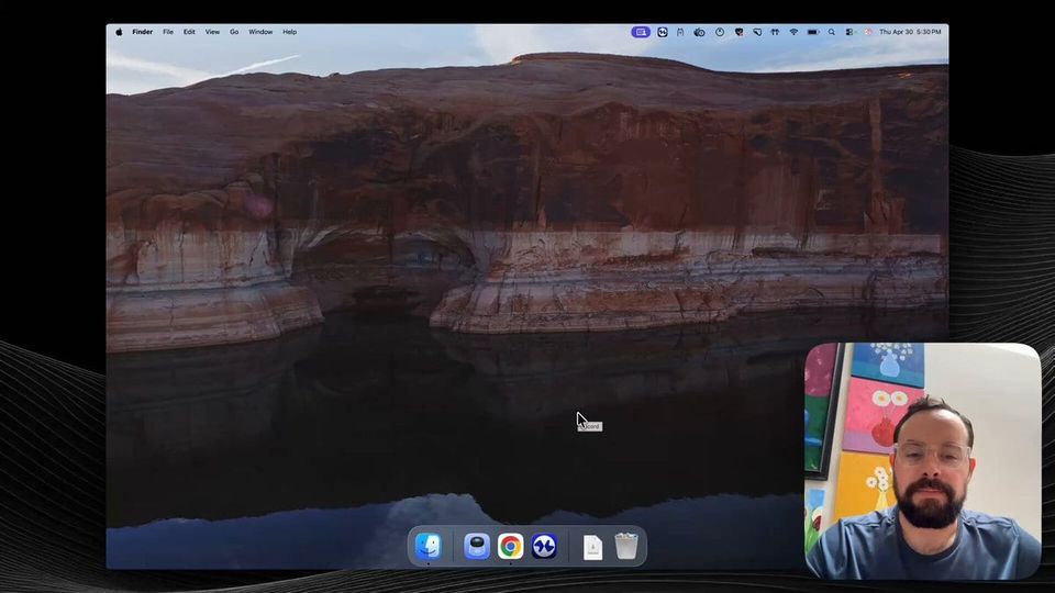
I created several tutorials to get Salesloft's product design team comfortable using agents. I got several requests for those videos, so I'm going to record a few videos showing my workflow.Here's the first episode:
Apr 2026
Details.

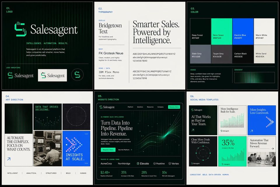
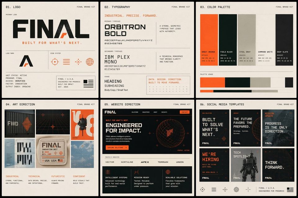
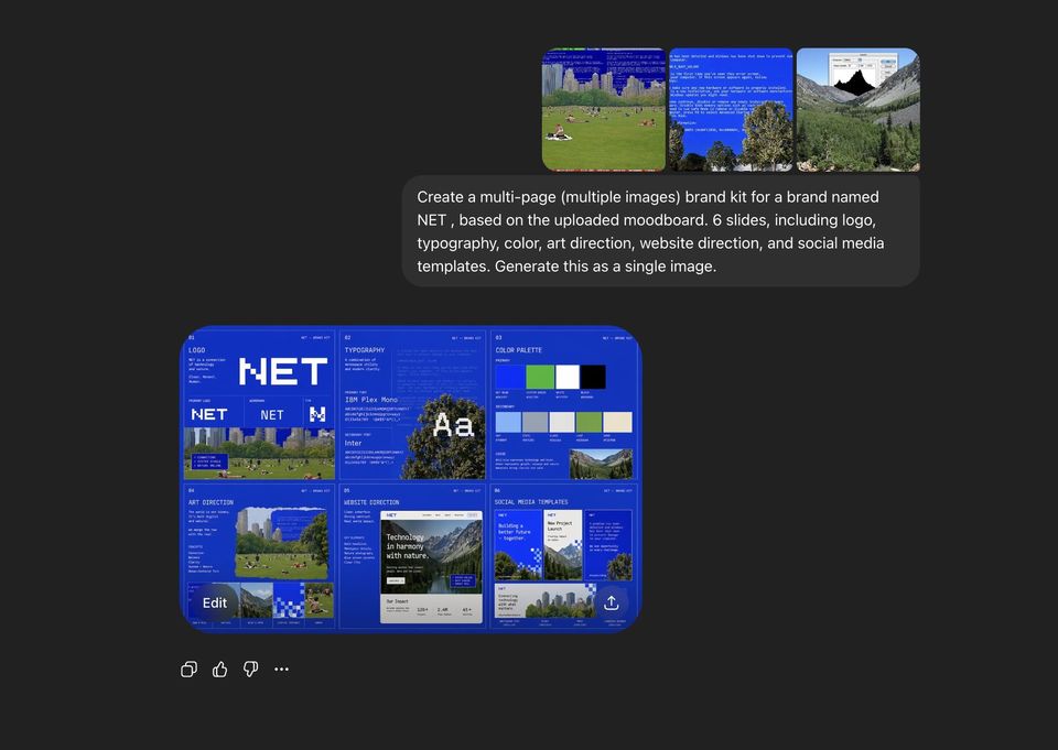
ChatGPT 2.0 is wildly good at distilling visual concepts.
Hewar@hewarsaber
GPT Image 2 is insane for brandingDesigners, we're cooked
Three questions of criticism applied to product design:1. What is the designer trying to do?
2. How well did they do it?
3. How might I apply this to my work?
I think it's telling that Figma is listed last here.Once a prototype that has been validated, the next step is incorporating that design into the code base, not creating design specs.It's process for the sake of process at that point.
Shane Levine@theShaneLevine
People ask me how has AI changed the design process?Just look at @tryramp Product Designer job description
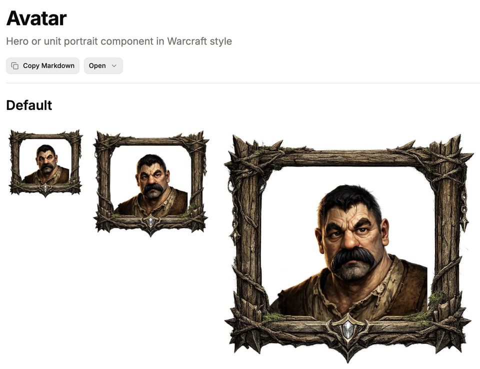
@xeno_mouse @ragojose @shadcn There's also Windows95cn, but hard to match the craft and execution of Warcraftcn.
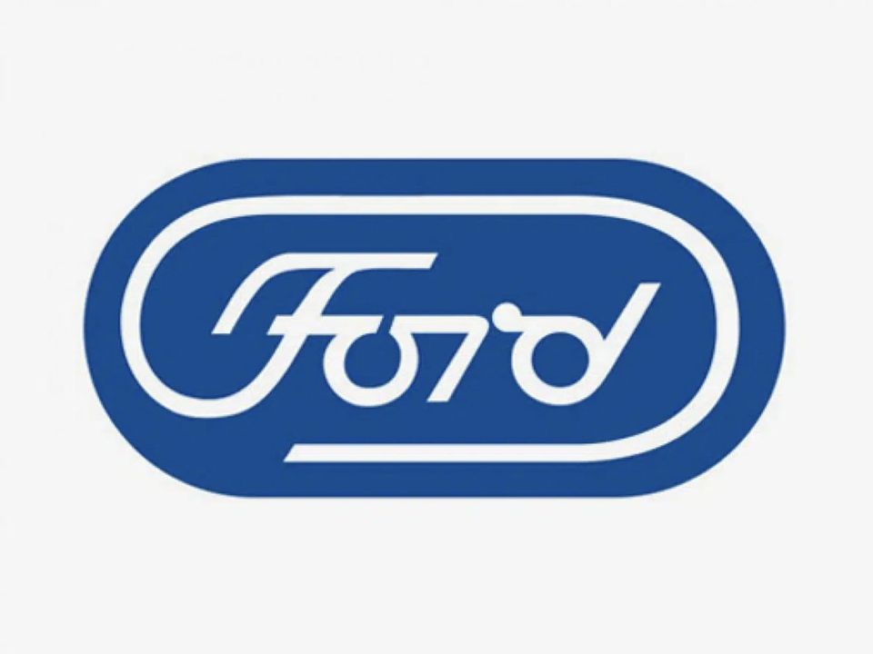
Wow, stumbled upon this unused Paul Rand logo concept for @Ford in the 70s.en.creativosonline.org
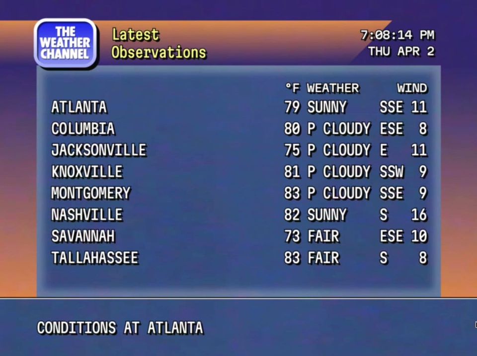
Oh my god. @weatherchannel's retro mode is a work of art. I just want this running in the background all the time.
Mar 2026
Warcraftcn is such a work of Art. I love it!
warcraftcn.com
"The future of product design probably looks less like drawing rectangles—and more like tiny pieces of code."

Jun 2023
I was recently looking for an excuse to build something with Apple's new iOS library for Figma. Decided to spend the weekend redesigning the @MARTAservice iOS app.

Aug 2022
A little presentation about leveraging design tokens for improved accessibility.

Apr 2022
Through the years I've hosted a fair amount of interviews with designers, entrepreneurs, artists and authors. All of those interviews now have a home on my personal website.I wrote a bit about my experience and listed a few of my all-time favorites.

Jan 2022
The last two weekends I've been experimenting with generative art and NFTs. I just published my first collection on @opensea—Geometric Spotlights. opensea.io




Apr 2020
Mar 2020
If all the @hgtv shows, Hometown is probably the best. @ErinRNapier and @scotsmanco are incredibly talented. Most of the renovations aren't my taste and I still think they're great.
The Xbox 360 iteration was just about perfect. That design has mostly carried over to the X. It's significantly more comfortable than the Sony controllers.
Question for other product design teams—how strict are you about layer/group names? Why?
Feb 2020
I work with PMs and research to draw squares. Then make sure engineering is building those squares properly.
Maxim Leyzerovich@round
If you can’t articulate what you do (what you work on – not what your title means) to a person outside your field in a few sentences: then you don’t actually grasp the importance, let alone impact, of your work.
Neomorphism is visually interesting, but seems to have the same flaws of flat design without any of the benefits.Low contrast in most of the designs are certainly a discovery/
accessibility problem. At the same time it would be time-intensive to build complex elements.
Meng To@MengTo
I know some hate it, but here are my observations on Neomorphism.- Diagonal light & shadows
- Gradients (optional)
- No textures
- Buttons look more tactile
- Can adapt to dark modeIf you don’t exaggerate, implementation is adding 2 shadows and 2 inner shadows (optional).
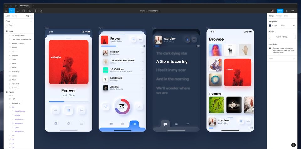
I'm a sucker for a good card deck—and this Starcraft-ish deck is rad.

What is this, The Fountainhead? nytimes.com
Looking for some tutorials on creating hand-drawn isometric illustrations. Can anyone point me in the right direction?
Nov 2019
Tesla's new truck is perhaps the first time a production vehicle has looked like the concept.

Sep 2019
This is a really cool tool for designing color schemes—ColorBox by @lyftdesignteam
Aug 2019
Circles are just rounded squares.
Maxim Leyzerovich@round
Design is the rendering of rectangles.
I've got a few @dribbble invites that are apparently expiring. Any designers out there who want an invite?
Jul 2019
The new poolside.fm design is so rad. Love it @marty
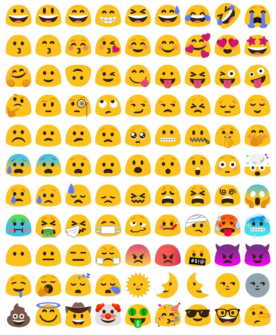
Man, I miss the old Android blob emojis.
jennifer daniel@jenniferdaniel
Though they were retired before my time, I still take the time to update the blob character set for my own amusement. I miss these little dudes, the world is better with them in it. 💋
May 2019
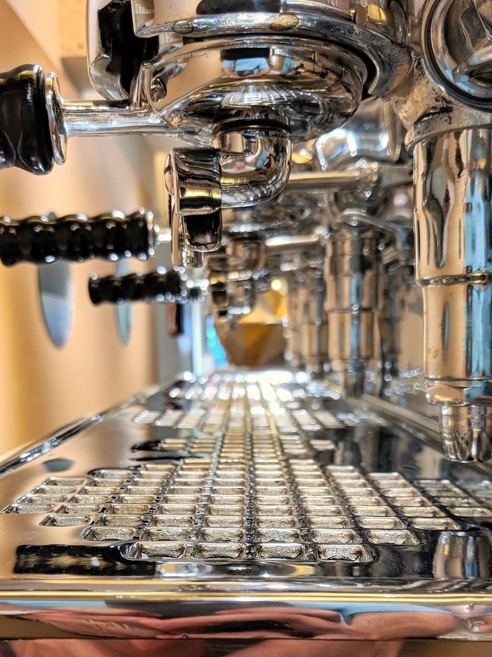
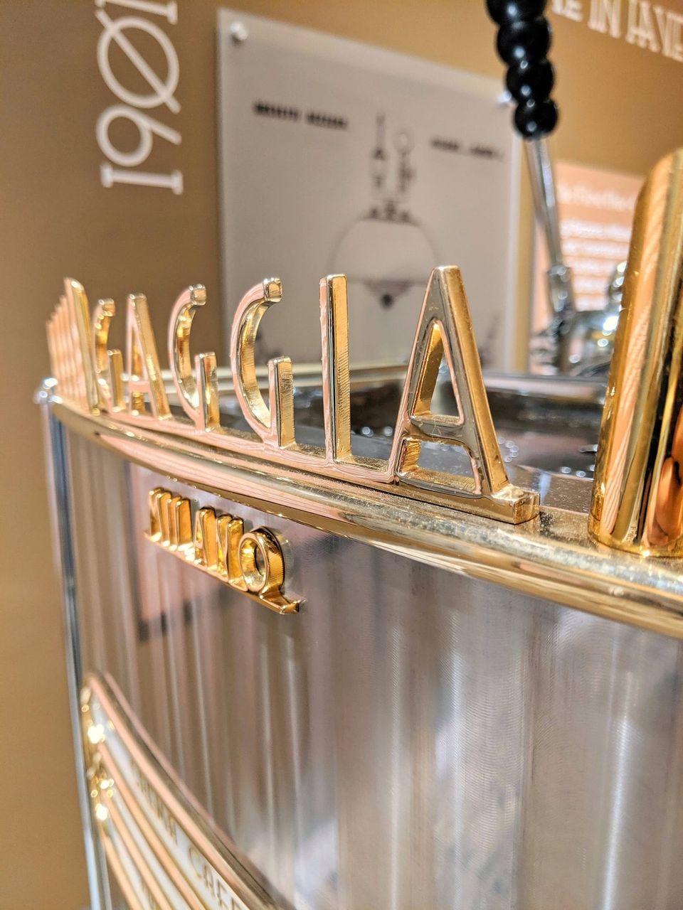
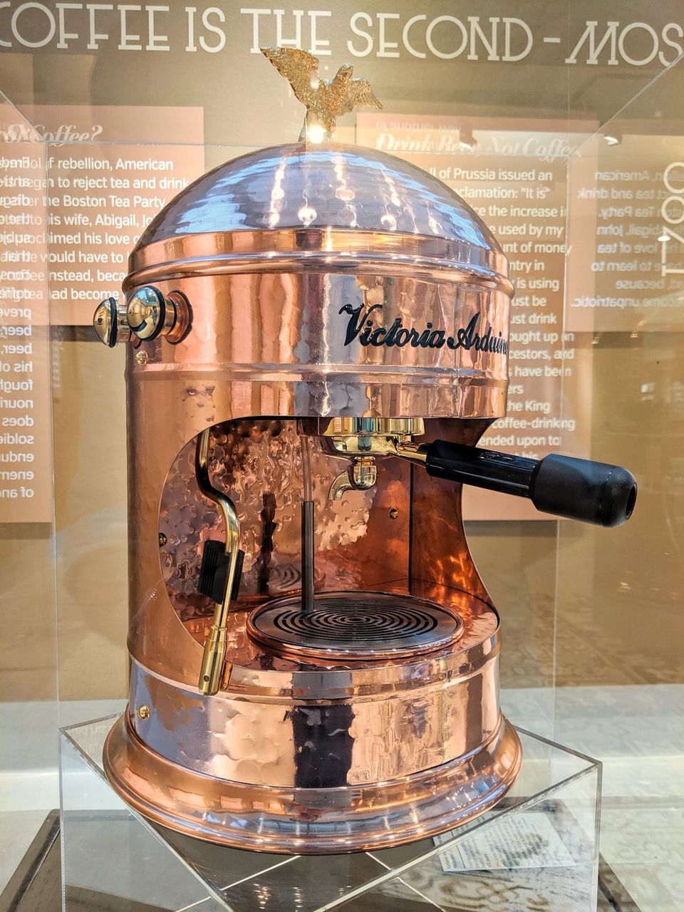
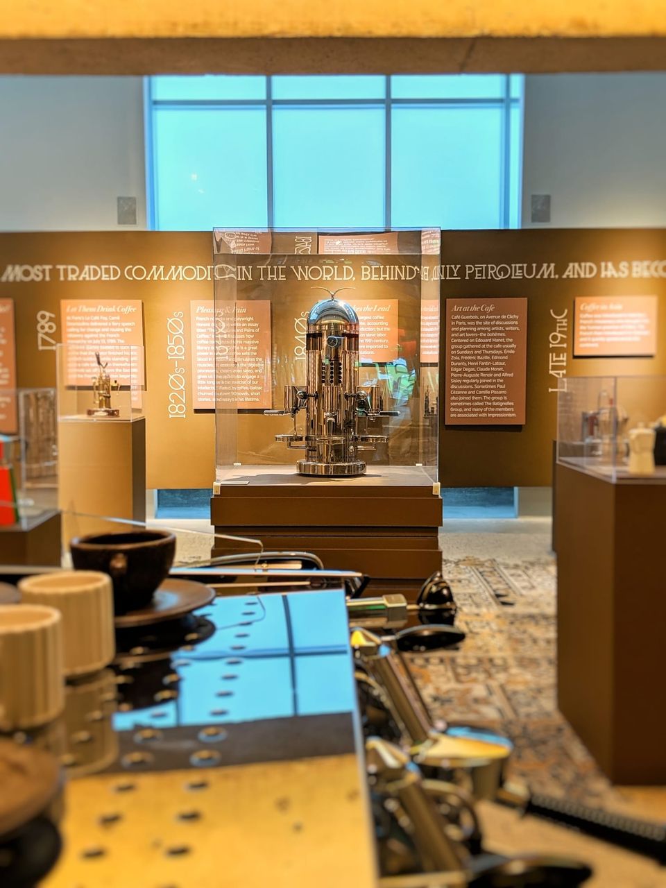
Some cool pictures from the @modatl espresso exhibit.
Apr 2019
Some rad artwork from #CS19's Ink Wars.
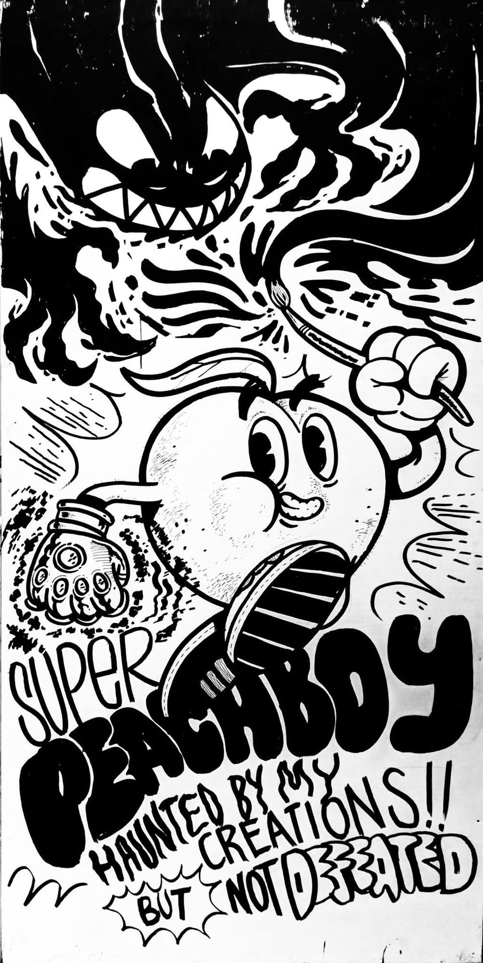
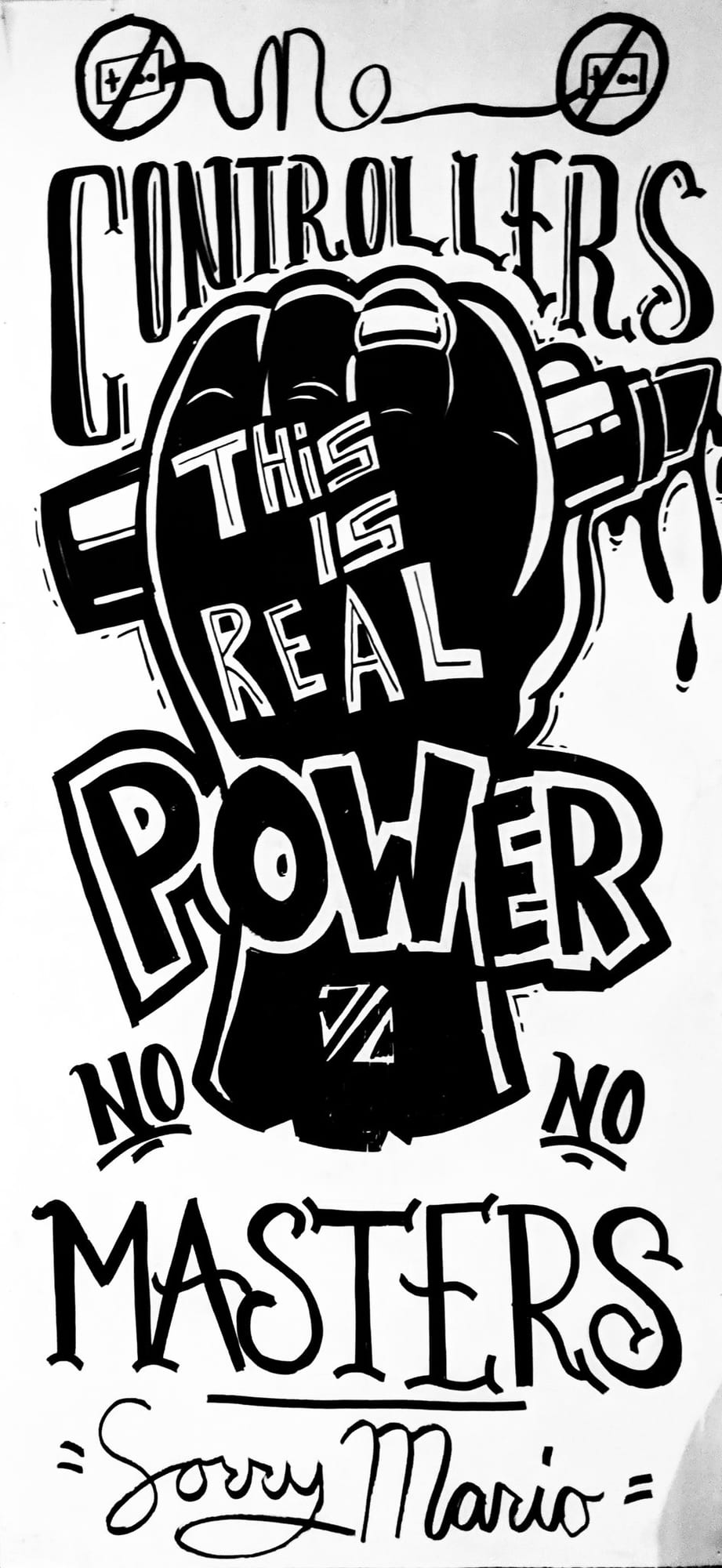
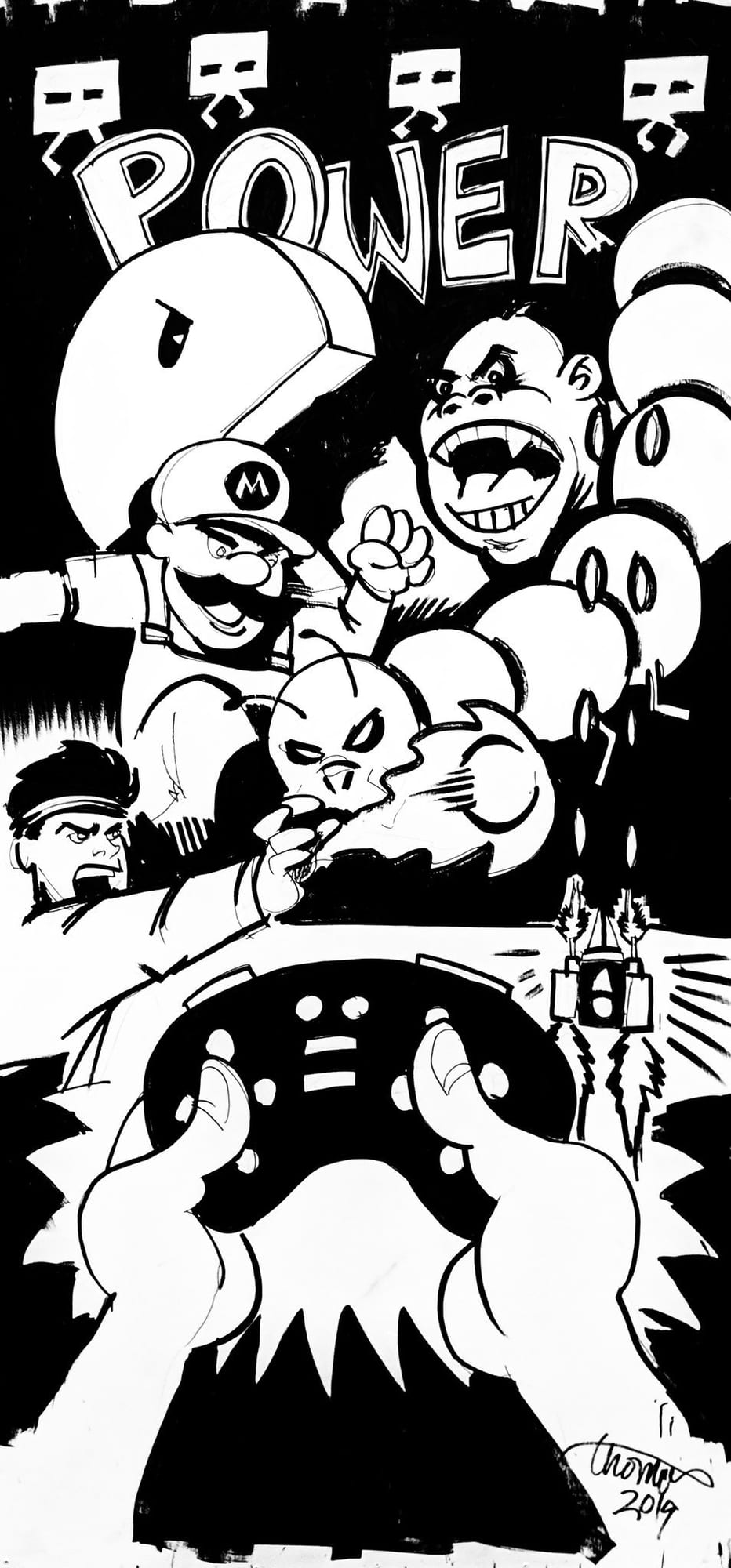
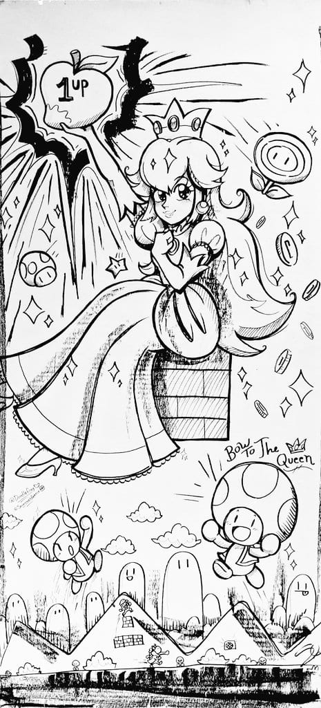
Twitter design peeps—anyone headed to @CreativeSouthGA this week?
Mar 2019
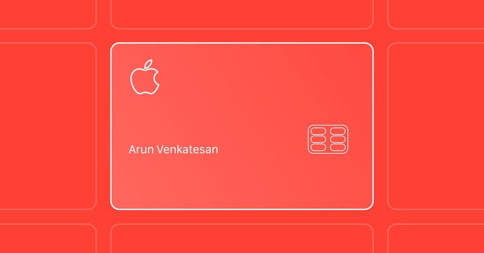
I appreciate this type of detailed commentary on the design of @apple's new credit card. arun.is
Love this commentary on misleading charts from @TheEconomist. buff.ly
Love this thread on product design.
So @business got rid of their beautiful sparkline charts and that makes me sad. bloomberg.com
Probably the best read I've come across on the 737 MAX issues.
ramón cacho - pr/acc@ramoncacho
Super interesting read on the failed systems design of the Boeing 737 MAX:mailchimp.comcc @levelsio you’ll enjoy this one
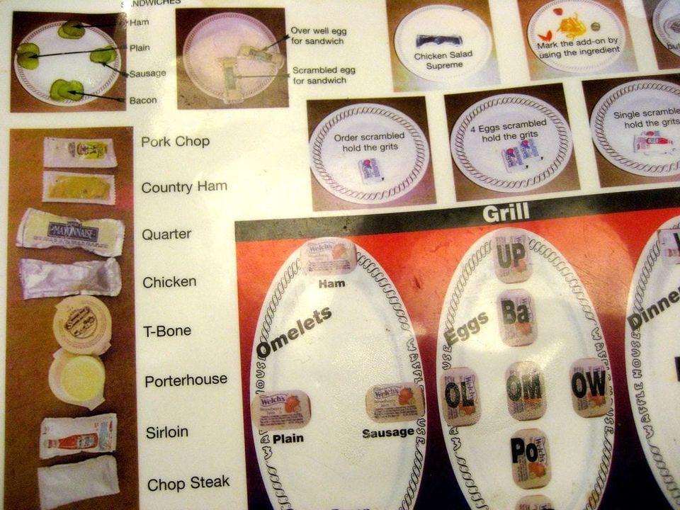
I knew Waffle House cooks used pickles as a way to keep track of some orders. I did not know that system was so elaborate or clever. flickr.com
I love the comments presented here in this post about @Medium's design critiques. It shows both the level of detail detail and the type of discourse that takes place when designing such a feature. buff.ly
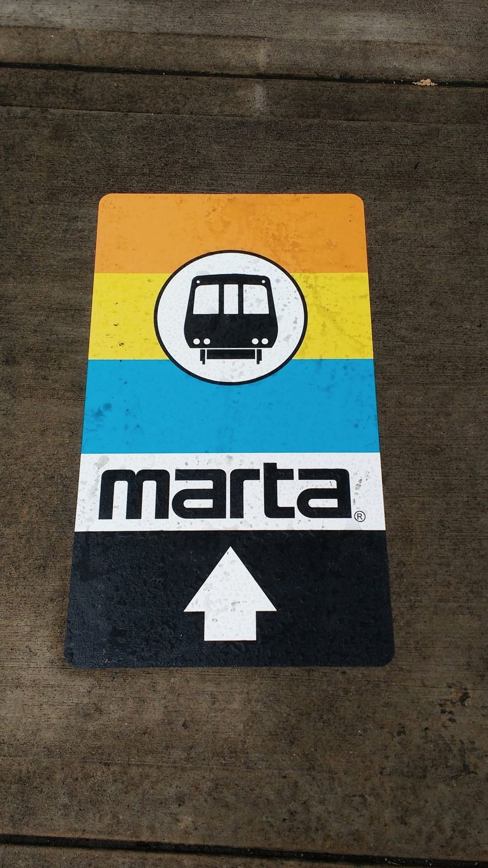
That retro vibe is the best part about the MARTA brand!
It's interesting to see signalvnoise.com move away from @medium. I was a fan of the pre-medium design, but also like the outrun vibes of the new look.

FWIW, this is one of my favorite coffee table books.
Product Dork@productdork
1975 NASA Graphics Standards Manual
Nov 2018
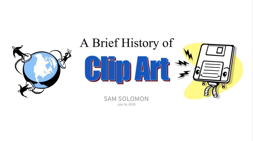
Just incase you missed it—I recently published a talk I gave on the history of clip art. solomon.io
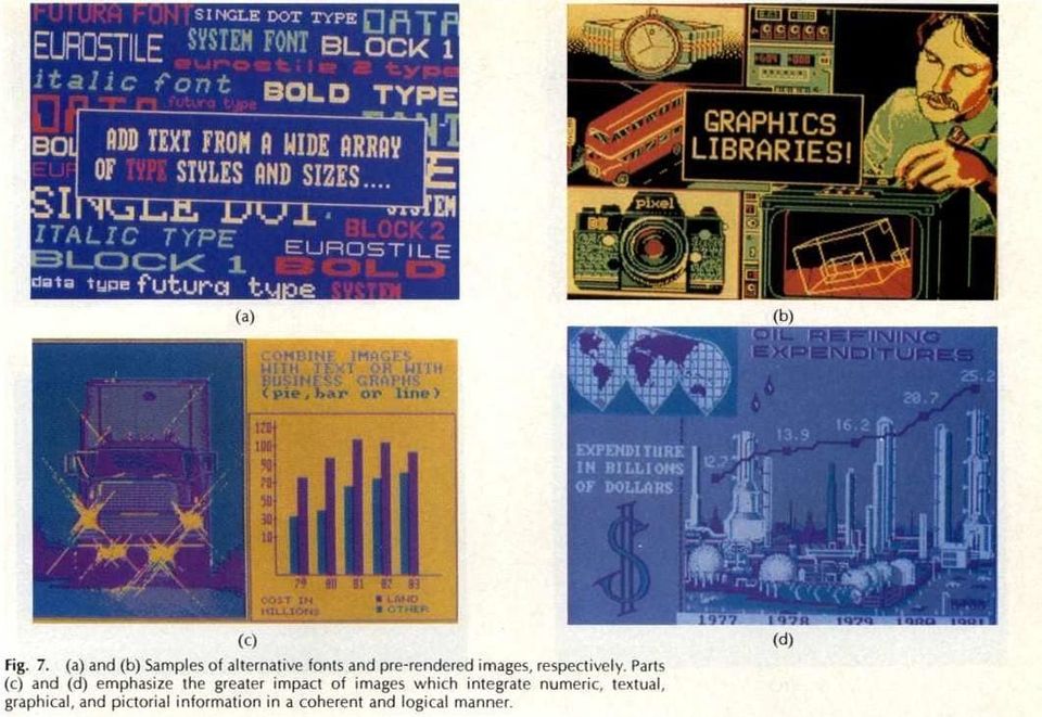
I turned a little presentation I gave at @SalesLoft into a short blog post—A Brief History of Clip Art solomon.io
Oct 2018
Thermostat design is so poor. I'm an interface designer and I can't figure out how this thing works. No wonder @nest has made a killing.
Sep 2018
I'm digging this @Mailchimp rebrand. Big project—both the marketing website and the app components.

Interesting another @Uber rebrand? App icon has a wordmark. The square in the top left is also the new drawer icon.

It is hard to believe that this came from @apple, a company widely known for exceptional design and branding.
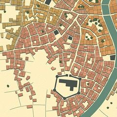
This is a peculiar, but awesome project—Medieval Fantasy City Generator
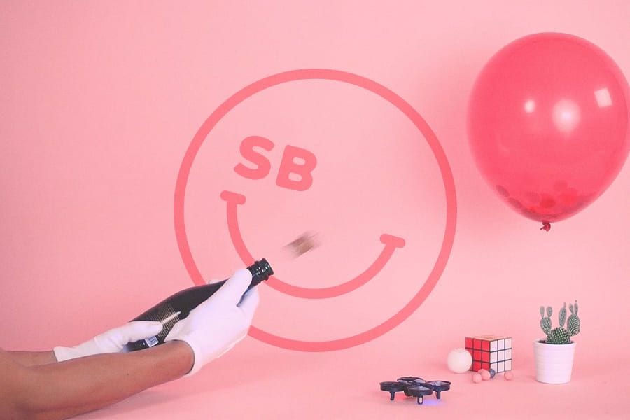
Not my taste, but I appreciate a lot of the interactions in the Serious Business site. serious.business
Jul 2018
Pretty excited about this presentation I'm giving to the design team today.
If you're a fan corporate identity design, take a look at this British Rail Corporate Identity Manual.
Jun 2018
This camera design is incredibly clever. I am skeptical about how well it wears though.
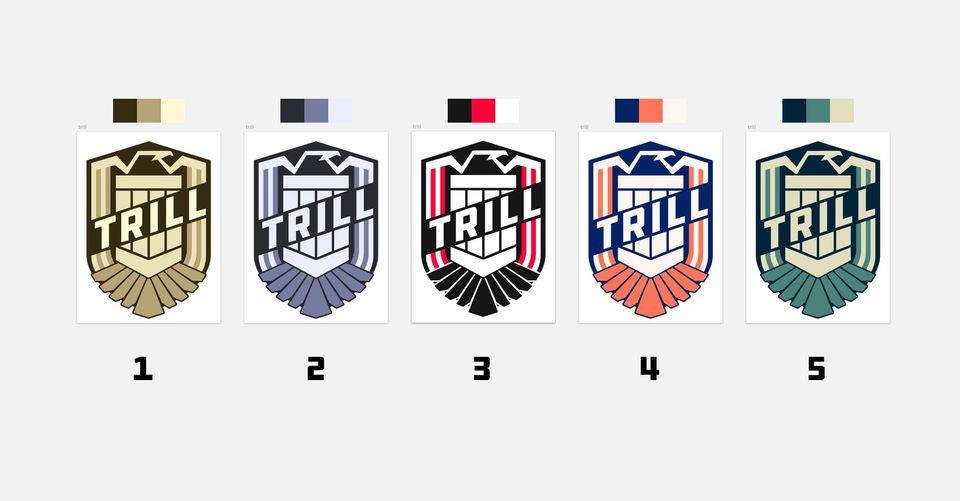
Wrote a bit about the team badge I was working on. Also, some alternative color palettes that we decided not to use. solomon.io
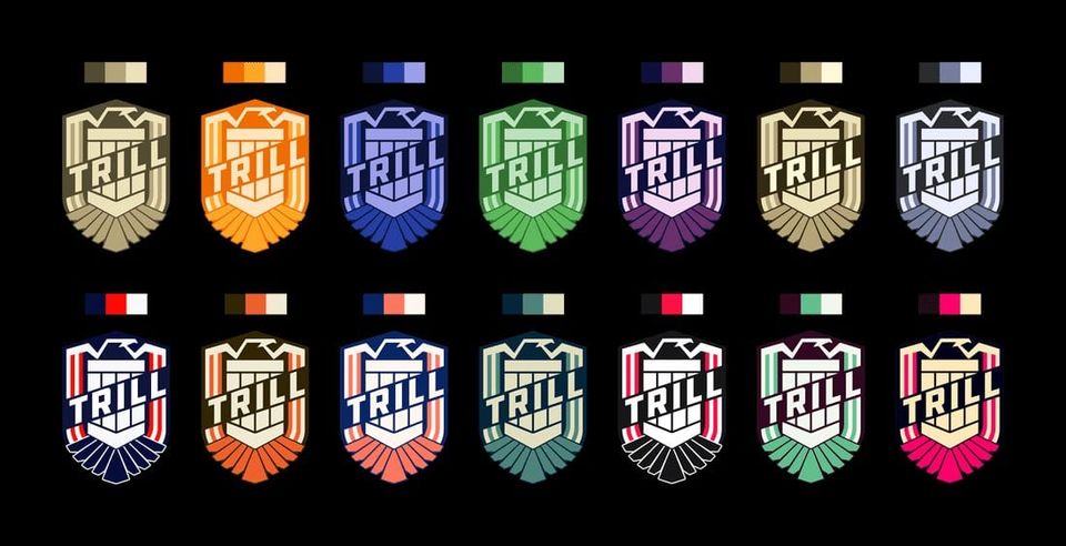
First dribbble post in a while. This sticker was designed for one of my product delivery teams, License to Trill. It's pretty rad! dribbble.com
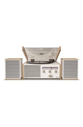
Not a record guy, but I love the look of this player. nordstrom.com
May 2018
Very excited about this #designishuman panel on how growth and culture shape cities.
Working on another team badge for engineering day. There might be something here. 🤔

I draw a lot of squares...
Apr 2018
The opinions in this @99piorg story fascinating. Moving away from modernist American architecture back to ornate styles was unpopular opinion at the time. It's the same reaction Howard Roark faced in The Fountainhead for moving from ornate to modernist. buff.ly
@aronsolomon Yeah, since it is supposed to be a badge, 1 and 2 are my favorites as well.
Pretty happy with these. Final options for our product delivery team badge—License to Trill.
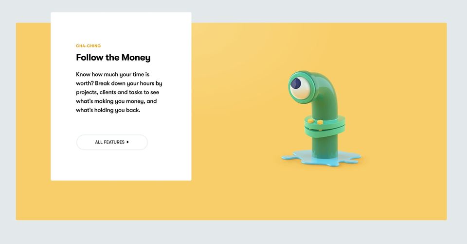
I love all the quirky renders on @toggl's homepage. Especially the eye that follows your mouse in the "Follow the Money" section. toggl.com
Mar 2018
We should be moving away from protectionism towards competition—that's how the most useful products are developed. I like @monteiro, but requiring product designers to have a license is flat out ridiculous.
This rebrand of the USPS is still one of my favorites to-date. buff.ly
Lol, listening to @LukesBeard go on and on about @MARTASERVICE's brand. "Never change that logo!"
Feb 2018
Talk about attention to detail...
Benjamin De Cock@bdc
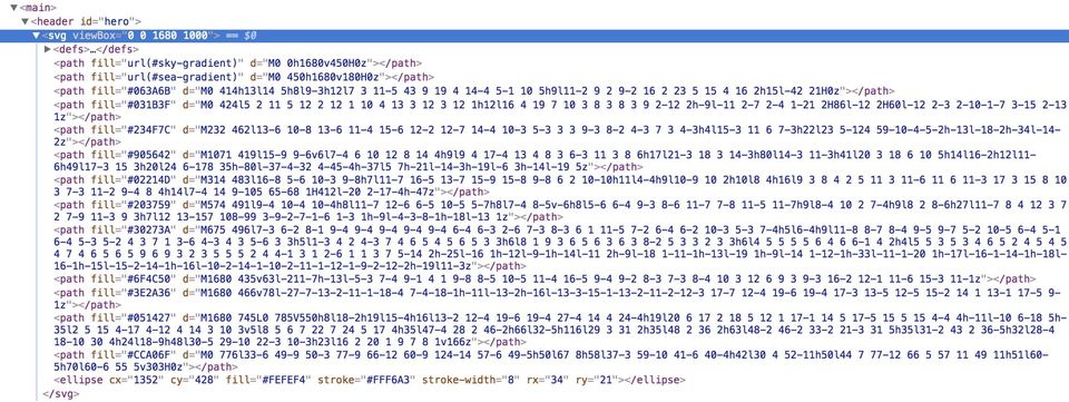
Fun fact about stripe.com : while the hero image is loading, the header displays an inline SVG illustration blurred with a CSS filter ᕕ( ᐛ )ᕗ

Everything the design team @stripe does is spectacular. Also, I'm a huge sucker for Tiempos.
Jan 2018
Dec 2017
Love the subtle motion on these @stripe guides. The team is seriously talented.

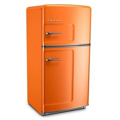
How Big Chill's retro fridge came to be
I'm a big fan of this new @F1 branding. wklondon.com

Nov 2017
Really digging some of the ideas in the Design Systems Handbook. designbetterpodcast.com
Oct 2017
@MichaelRIsaacs This is exceptionally well executed. I like the slight opacity in the text blocks so you can see the map below.
Love the animation on this homepage. It perfectly explains what the product does. pageclip.co
On another note, the @Stripe design team continues to knock it out of the park.
Just wanted to point out that there have been some pretty solid gifs from the dropbox redesign.

I feel like the beauty of Dropbox is it's simplicity. It feels like this rebrand throws that value out the window.
Sep 2017
Spotify's browse icon looks like a washing machine.

Wow, this is a cool piece of history—The Early Master Plans for National Parks buff.ly
Aug 2017
The interior seems out of place, but the concept for this thing is spectacular.

Interesting. It appears that medium has updated their logo to look like the original one. I never really was a fan of the green M.
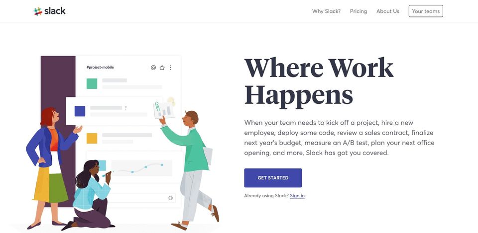
I love the typography and illustration style of @Slack's new homepage, but it feels a little off brand. It's not as colorful as the product.
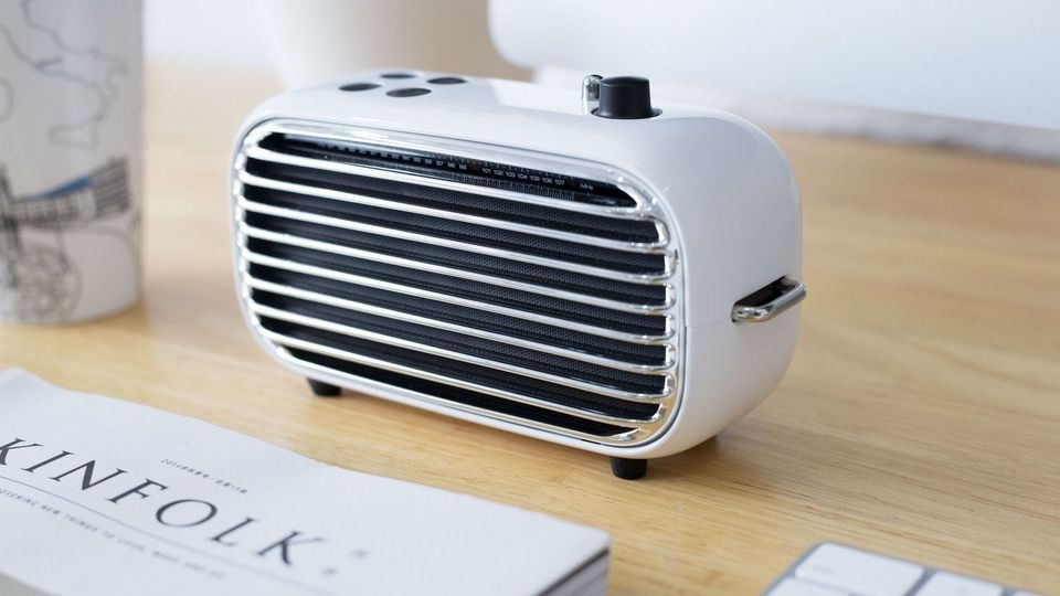
Whoa, I love this retro-looking wireless speaker. buff.ly
The gradients on the @OpenAI website are out of control. buff.ly
Frank Lloyd Wright designed the Johnson Wax offices like a forest open to the sky dezeen.com
Jul 2017
I am very impressed by these vector icon speed runs
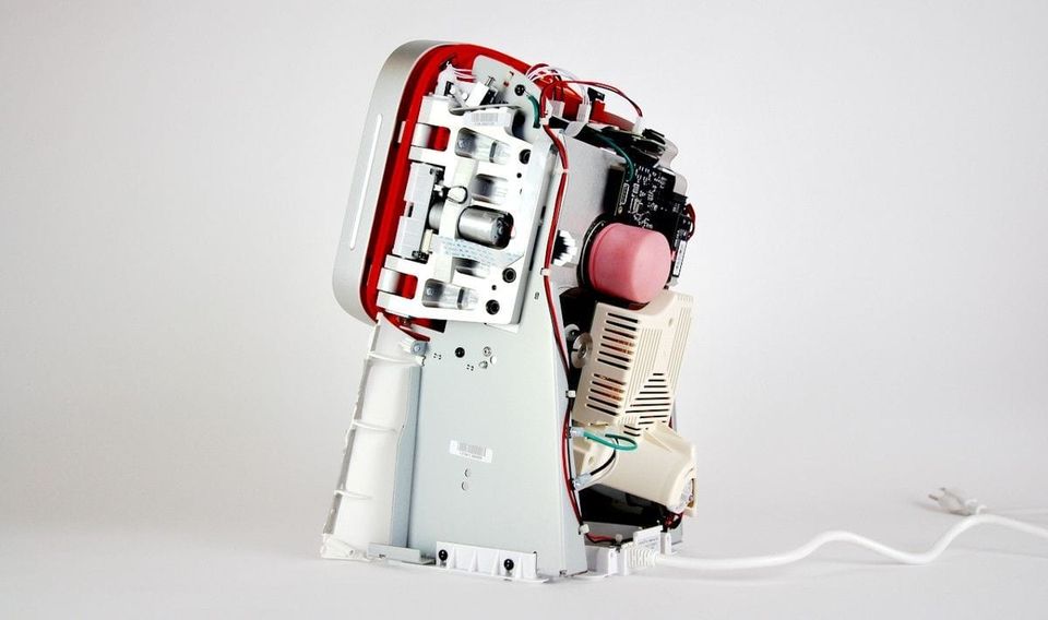
This is an incredible breakdown of the engineering behind Juicero. blog.bolt.io
The concepts for these earthship houses are incredible!

Design without function has a name. It's called art—Fuck function. Lets make design pretty again. buff.ly
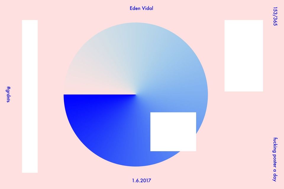
Whoa, this site has some rad poster inspiration. flowsupply.co
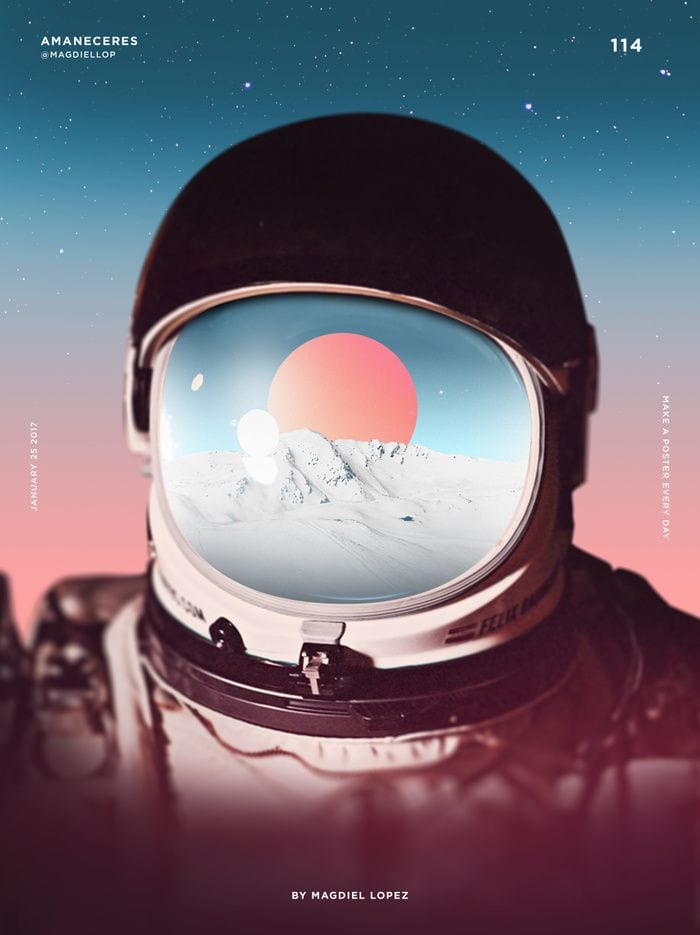
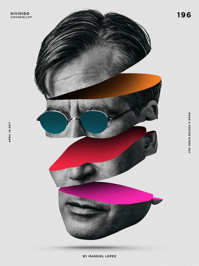
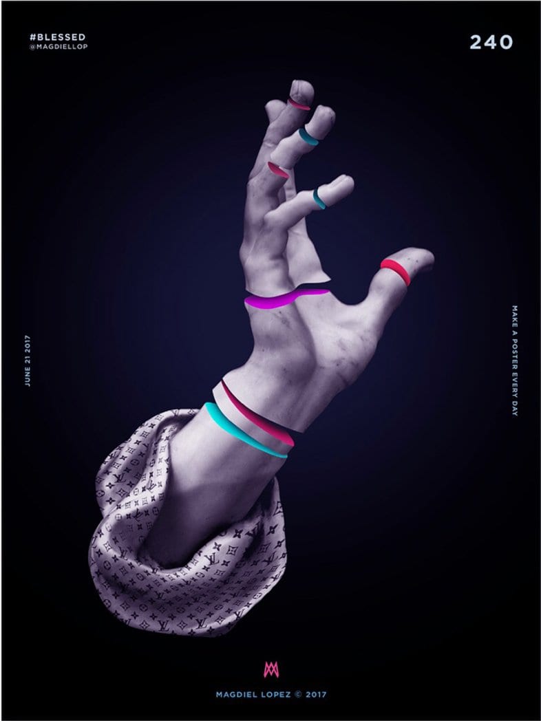
The moving elements are a little distracting, but I love the use of layers for section breaks on this site!
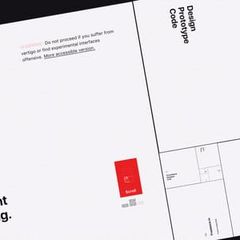
This new trend of brutalism in web design is not my taste, but this site executes it pretty well.

Jun 2017
May 2017
Love these illustrations over all The Palazzo's collateral. @ The Palazzo Las Vegas instagram.com
Not terribly usable, but an incredibly original portfolio. Bravo. Now I may have motion sickness.
I just discovered clothing grids. Now all I want is more grids.
Apr 2017
Every-freaking-thing the @stripe design team builds is incredible. stripe.com

“The more common the problem, the better. Design systems should prioritize the mundane.” bigmedium.com
Where did the power symbol come from?

Mar 2017
Still a work in progress, but the site has a new coat of paint. solomon.io
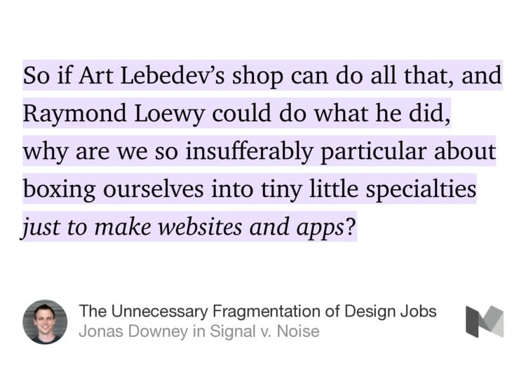
The Unnecessary Fragmentation of Design Jobs m.signalvnoise.com
Maybe they're trying to be different, but the new Smashing Magazine design is neither intereresting nor legible.

What will the designer of 2025 look like?

Just finished Abstract on Netflix. I thought the most interesting episodes were on stage and interior design.
The grid index for blog posts is everywhere now. Are there examples without thumbnails that look good?
Feb 2017
New website concept is coming together. Copy still needs some work.
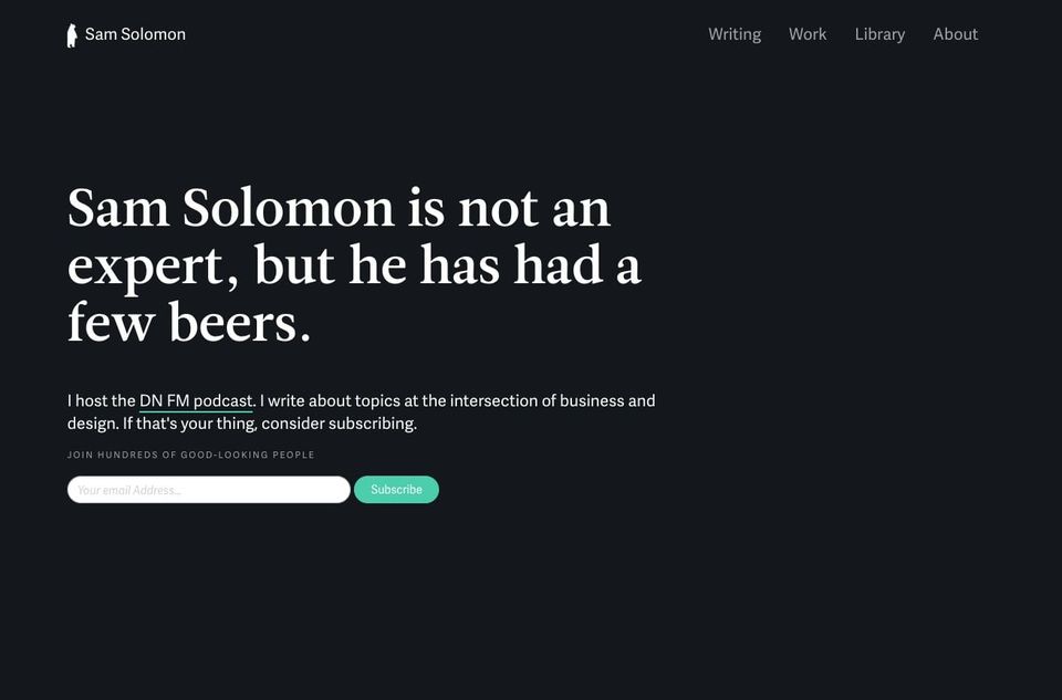
Oh man, this Hacker News thread is fantastic—Ask HN: What're the best-designed things you've ever used?
The questions are often more important than the answers—Generative design software will give designers superpowers dezeen.com
Trying to help a friend come up with a name for his agency. Possible options:
- Good Looks
- Maybe Giant
- The Replacements
Why are most of the famous design agency logos simply typeset? buff.ly
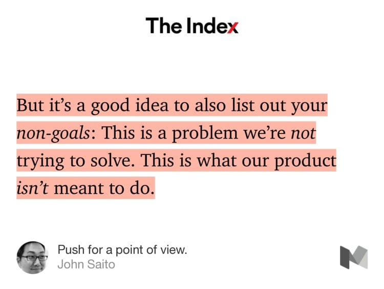
Interesting idea—defining goals and non-goals in product design. theindex.generalassemb.ly
This is a fascinating method of story telling for a personal site.
I generally don't think of bright greens and blues going together, but these illustrations are fantastic.
Man, this is one beautiful drone.
Politics aside, these are some fantastic magazine covers.

Dec 2016
Just posted a few slides from our 2016 Customer Success Report to dribbble. dribbble.com
The art direction for this site is nuts—Falter Inferno buff.ly
Nov 2016
Tailor Brands raises $4M to have robots design logos for you
I just made some cool lookin things.
Wow, the National Geographic website is impressive. I don't hate the subtle parallax. nationalgeographic.com
No matter what you think of Fisker, the guy designs some incredible looking vehicles.

This is right up my ally—Beautiful Maps

Oct 2016
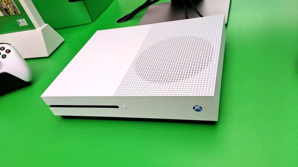
The Xbox One S is such a beautiful piece of hardware.
After watching this video the Zendesk rebrand makes more sense.

If you haven't listened to my conversation with @randyjhunt, you're missing out. Something for your morning commute. buff.ly
Love these illustrations!
Fantastic conversation with @Etsy's VP of Design @randyjhunt. If you're looking for a morning podcast, check it out! buff.ly
Sep 2016
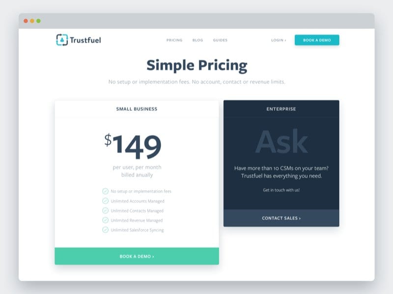
Had a couple free days to update the trustfuel.com website. It's still a child theme, but a little work goes a long way.
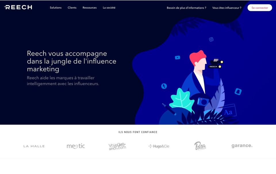
Love the color palette on this site—deep blue with contrasting bright colors. reech.com
Man @Stripe's design team is so fire.

No design beats concise copy.
Fantastic conversation with @maxvoltar about moving to the US, his career at Instagram and Dropbox, and what's next buff.ly
This talk with Aarron Walter was great—around 48m, he starts drawing the parallels between prototyping and animation buff.ly
Aug 2016
“It’s a designer’s job to ask good questions”

Incase you missed it—My conversation with Behance founder Scott Belsky on the implications of the interface layer. buff.ly
Designer friends, please take this important industry survey.I design best when...
Also, this rad gif. blackbox.cool
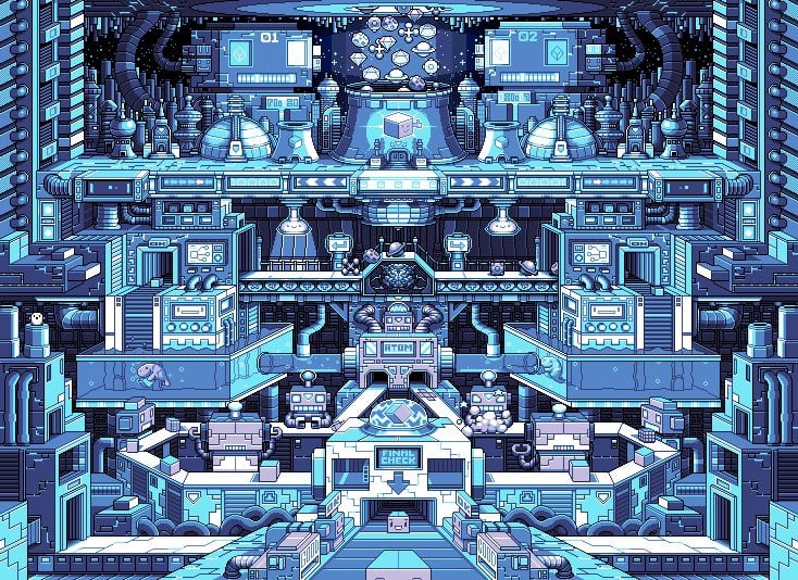
Effective is much better than clever.
My conversation with behance founder @scottbelsky on empowering the creative world. buff.ly
“Catering to bad taste, which we so readily attribute to the average reader, merely perpetuates that mediocrity.”
What Makes a McMansion Bad Architecture?
Great conversation with @aarron on how he moved from painting to software. buff.ly
I look at this new Subway logo and can't help but think of Waste Management. I think it's the colors.
Oh wow, the @Dropbox Paper document editing is gorgeous.
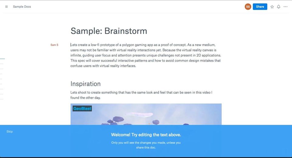
Jul 2016
I just discovered reddit.com and now I can't leave.
I just spent 8 minutes watching animations of different bridge solutions.
“Recreate the work of masters to become a master yourself.” buff.ly
@aronsolomon This is happening in so many areas. See all the design agencies that were purchased by larger companies in the last two years.
Jun 2016
I'm a fan of the new UnderConsideration site. My only concern is the headline font is difficult to read.
Interesting to see how the NY Times homepage evolves during a breaking story. buff.ly
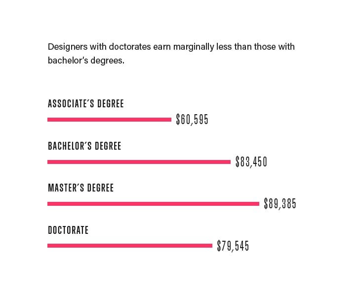
Interesting. A designer with a master's degree is more likely to earn more than one with a bachelors or a doctorate.
May 2016
Stuff like this is awesome. Transportation!

"if a picture is worth a thousand words, then a prototype is worth a thousand meetings"

Are designers and engineers hijacking people’s minds? buff.ly
Love the textures in these works. Also, I think the fuzzball sheep are pretty funny.
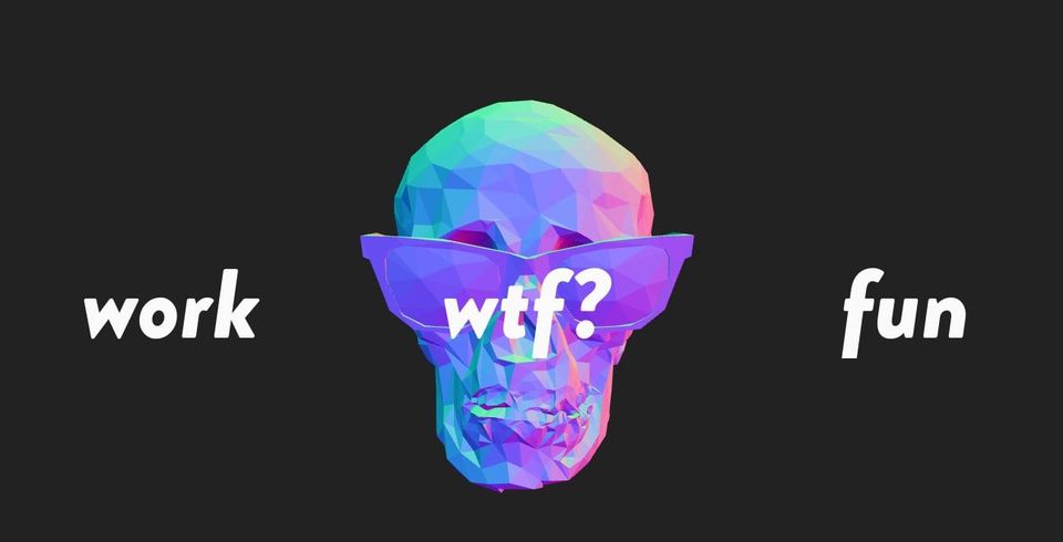
Not generally a fan of the overly animated portfolios, but this skull-thing is rad. eli.wtf
Apr 2016
"Product management as we know it is shifting into the realm of the designer"
The Streamline icon set continues to be one of the best creative assets I've purchased. buff.ly
This deck of cards looks badass.
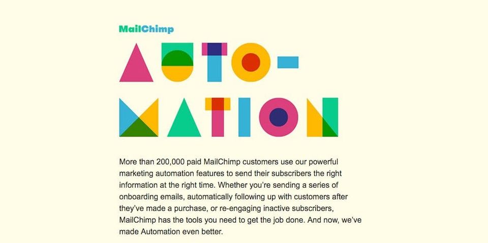
No surprise @MailChimp is sending some sweet looking emails.
The most difficult part about product design is creating a consistent experience.
I know cars rarely come out like the concept, but this Buick is awesome.

Designing complex products buff.ly
I'm a fan of this redesign for Charlie Rose's show. Feel like it could use an accent color though. buff.ly
While I'm all for trees and greenspace, stuffing a bunch of trees into high rise patios seems like an odd solution?

While I love that Bloomberg pushes design, some concepts miss the mark. This one is just odd. bloomberg.com
Are designers losing a their seat at the table? buff.ly
How long until AI replaces logo designers? By these results a while. Impressive nonetheless.
The new @medium design feels much more like a social network and much less like a publishing platform.
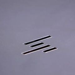
Big fan of the new HP slash logo. It's aggressive.
The illustrations and animations in this concept are on point. Love how the cups fill. dribbble.com
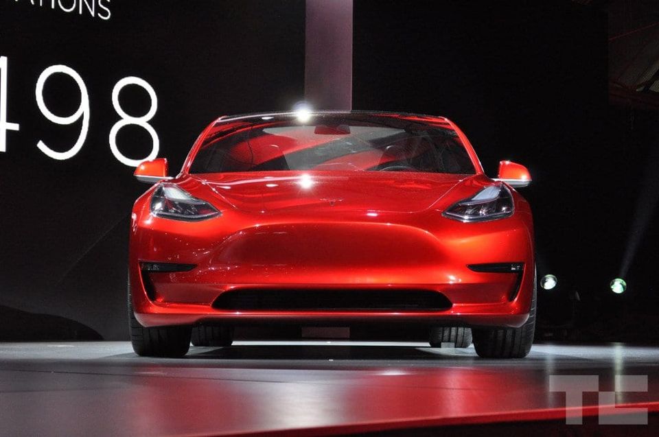
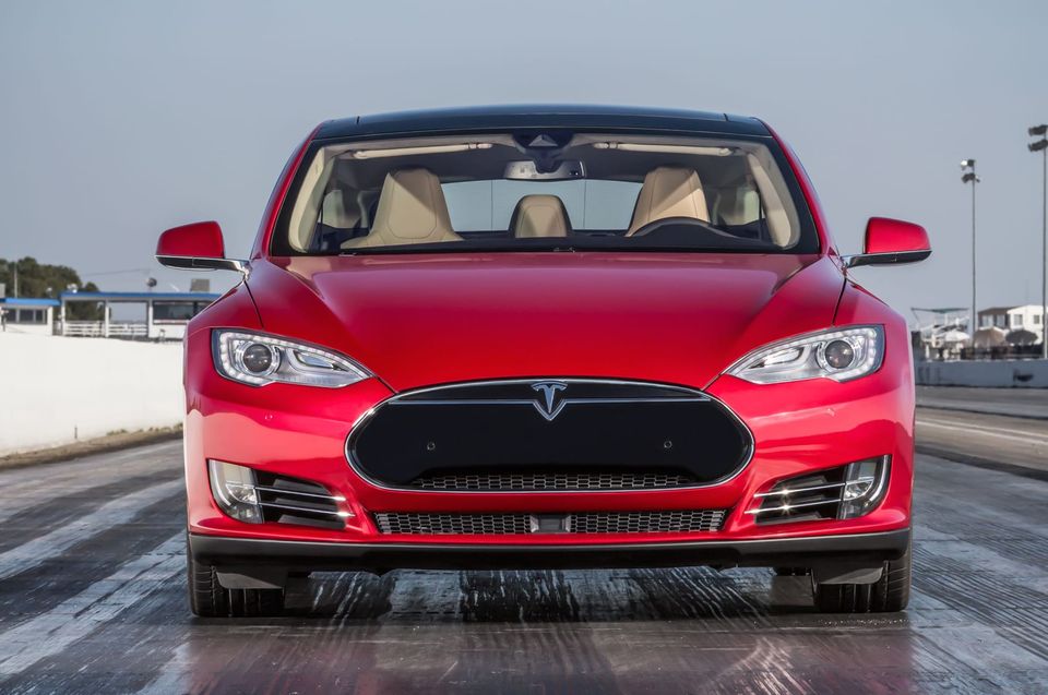
The flat nose of the Model 3 seems odd. Why not use the same logo and crescent that is on the S and X?
Mar 2016
Wow, these LucasArts Posters take me back. Full Throttle, Sam & Max and The Dig were some of my first computer games
I'm pretty excited for this NASA graphics standards manual. It's like a conglomeration of my favorite things.
Finding your own style as a designer. buff.ly
I'm amazed it took this long to get vector logo files in one place. buff.ly
It's interesting that technology companies and large consultancies (Deloitte E&Y) are the ones acquiring design firms.
Not sure I've ever said this about a website, but the sound design on this KLM site is incredible. ifly50.com
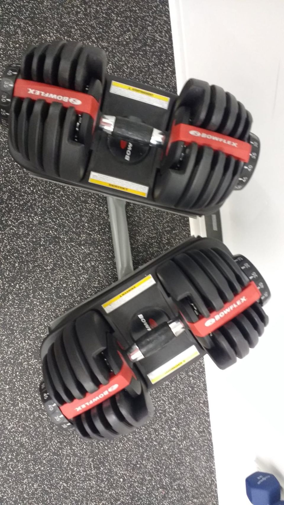
Clever, these dumbbells pick up different amounts of weights depending on how the dial is set.
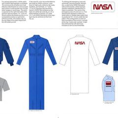
So, how awesome is the NASA Graphics Standards Manual?
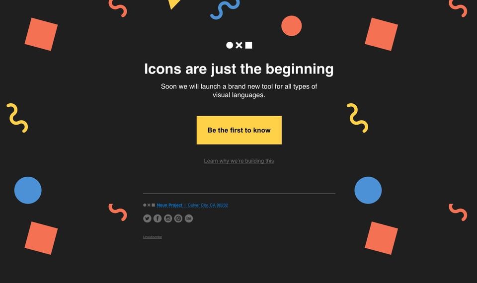
The @nounproject has some boss email designs. That is all.
What is Product Design? buff.ly
Feb 2016
Why Bother Making Beautiful Team Pages? It shows companies care about their employees. buff.ly
This daily icon diary is a really cool project buff.ly
Great idea for a project! Collect all the Daily UI dribble shots in one place.

More @dribbble email shots dribbble.com
So, it's been a while since I've posted anything on @dribbble. Here's an email I recently designed. dribbble.com
"Uber's redesign contained an unprecedented level of micromanagement by Kalanick, for whom it was a passion project"
A history of the Windows Start menu

More cool stuff from @HeyFlywheel's #29DaysofDesign!
Is this the perfect save icon? buff.ly
Good designers always look for ways to delete redundant steps. buff.ly
Uber rebrands, tries to look more like Lyft.
I wish @dribbble had better filters. I want to search for the best shots in the last year.
The folks at @HeyFlywheel giving away some cool design stuff.
This is new.
Jan 2016
How I designed ‘Read’ buff.ly
What are your favorite blog designs?
Want to stop the dribbble Great job epidemic? Provide one piece of constructive criticism to a popular shot each day dribbble.com
Designing the ESPN for eSports buff.ly
Amen. medium.com
What's with these UI designs having crazy drop-shadows? In the last month or so it seems like almost every design on dribbble has one.
It's fascinating to read through thoughts and iterations of designing and building a physical product.
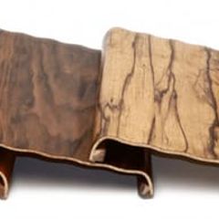
Whoa, original concept artwork for Blade Runner buff.ly
Unsolicited Dating Advice by @notdetails — You start reading for the pun, keep reading for the concept.
Dec 2015
Checkout my interview with @digitalocean's @notdetails on living with your design work and building design teams.
It's been a while, but have a new interview with @notdetails on @SignalTower this morning! signaltower.co

Love the new Bud Light cans, but it looks a bit like PBR—Bud Light Gets a Bold New Look anheuser-busch.com

Design machines louderthanten.com
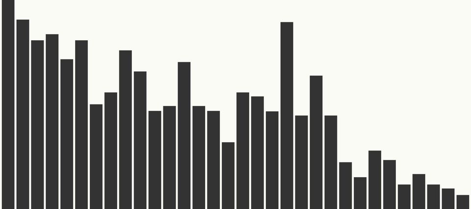
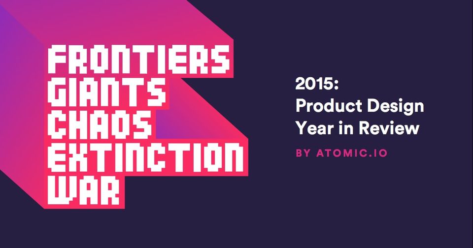
Wow, a lot of effort went into this—Product Design Year in Review buff.ly
Just like technical debt, products incur design debt.
Whoa, big fan of the new Google Ventures logo and site.

Nov 2015
An important read for every designer—The Dribbblisation of Design buff.ly
Designer friends, how do you feel about designing in the browser?
I'm a fan of @lyft's fancy new car icons.
The reasoning behind the @SidePrize pink. solomon.io

Oct 2015
Balancing design simplicity, product complexity, and business growth
Really like this new Netflix brand identity.
Great post by my friend @notdetails on setting goals for the week.

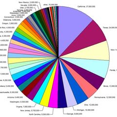
Should You Ever Use a Pie Chart?
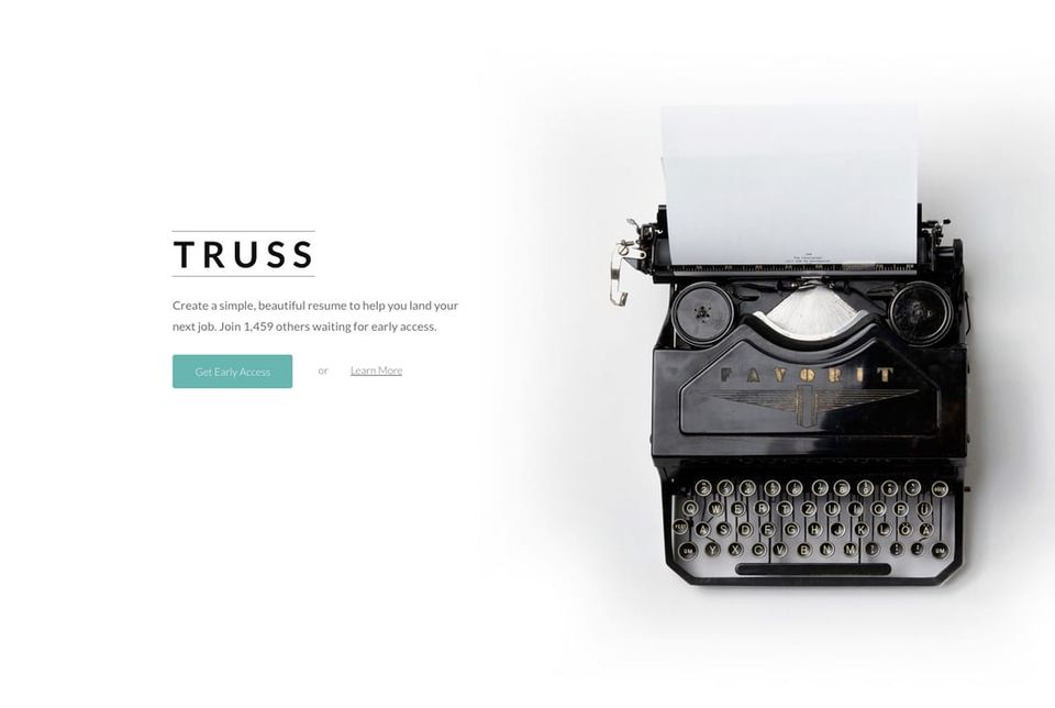
Well, I'm glad somebody is inspired by my work. My resume builder to the left, copy to the right.
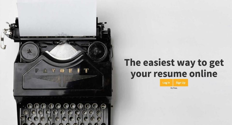
I really loved the old @Medium logo. It felt sophisticated.


OXO nailed the redesign. buff.ly
Sep 2015
Looking at print design, I still find subtle details that transfer to the web.
Fan of the new logo—Meet Opera's new brand identity

Product design debt versus Technical debt
One of the biggest mistakes I’ve made in my career as a designer buff.ly
The designer's price list
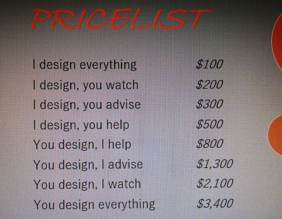
Aug 2015
If architecture or interior design interests you I highly recommend The Spaces and their newsletter. thespaces.com
This is a cool concept for an app—Architecture of Radio architectureofradio.com
Wow, this might be the best thing I've read on Quora. Great read for product designers—Code is Law buff.ly
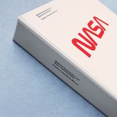
This is so awesome—The NASA Graphics Standards Manual
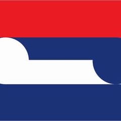
There are some really cool finalists for New Zealand's new flag design.
I don't know if they can compete with Amazon, but I love jet.com branding work.

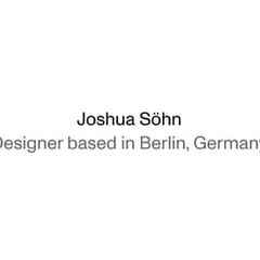
Love minimal sites like this. You go, Joshua Söhn, whoever you are.
Awesome. Color palettes made from Pokemon
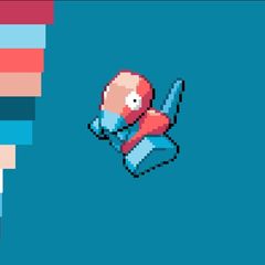
Jul 2015
I just downloaded a bible app just to take a closer look at the design. Don't know if that's a good thing or a bad thing.
A bunch of designers say what they're currently reading. buff.ly
How to become an awesome designer in 365 days

"It was clear that the epicenter, the energetic core, to web and app design was there — not in schools or in AIGA." buff.ly
Designers, what are some homepages you like for a consumer-focused tech company?
looking for homepage inspiration from other consumer tech companies @snapchat interestingly is just a ghost.

The navigation is a bit confusing, but the presentation is spectacular—Going home to inner Mongolia.
Awesome retro gif.
I wish them the best, but have my doubts—Meet Nava, A Startup That Wants To Fix The Government's Crappy Design buff.ly
Jun 2015
Ask DN: What Are Your Favorite Design Publications? buff.ly
May 2015
Build to learn: Why you should make things no one will ever use blog.pickcrew.com
These are some cool gifs of electronics. Someone put a huge amount of effort into this.

I'm kind of sick of the whole UX vs UI thing now. A good product is a good product. buff.ly
This is interesting, abiet difficult to read—World Religions Tree
These are bad ass—NoMad Playing Cards from Theory11
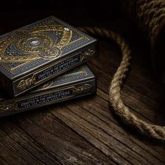
Love seeing interface designers delve into different projects.
Great copy—I love copy-driven designs
Microsoft dropped the ball on the IE rebrand. Had a chance to move to something completely new.
"Most enterprise software looks like a cheap 70's prom suit — muted blues and greys everywhere " buff.ly
Everything Frank Chimero does is awesome. frankchimero.com
Apr 2015
Designing a calendar app for millions

This is the most oddly designed story I've seen in a while—Stuck In Seattle bloomberg.com
Mar 2015
Just going to leave this here—Kindle Cover Disasters

Anti-Theft Lunch Bags make it look like mold is growing on your sandwich.
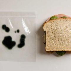
Feb 2015
Why designers should have the worst monitors on the market. everyinteraction.com
Designing even very simple games is deceptively difficult.
Could not agree more. Content should always come before design.
The @MailChimp awesomeness strikes again. This time with employee trading cards.

I don't know what is happening in this illustration, but it is awesome—Fools Rush In
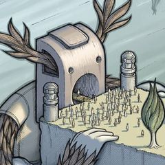
Bring natural light indoors. Really cool concept. buff.ly
An example of how very subtle product design decisions influence consumer perception. See Apple's green sms bubbles. buff.ly
A true piece of craftsmanship. The making of Monument Valley.

Did you know there are two types? A Tale of Two Zippers
Jan 2015
I love absolutely everything about this video—Retrowave

Real OGs make up their own lorem ipsum.
Cool collection of mid-70s corporate logos. I love stuff like this.
Interesting to see that Teehan+Lax is joining Facebook.

Talk about craft—Manufacturing a Beretta Shotgun hedonistica.com
The beautiful game concept work of Donglu Yu buff.ly
As a long-time Seagate fan, I'm disappointed by their new logo. Shame, I loved the old one.
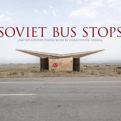
Fascinating design in unexpected places—The brutal, beautiful bus stop design of the former Soviet states.
Dec 2014
Kuwayama's Trade Marks and Symbols book was $99 before the Aaron Draplin video went viral, now it's $2,400...
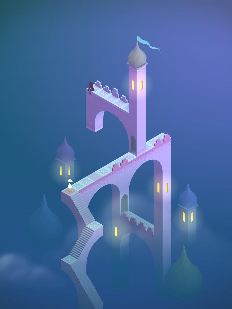
Monument Valley is a strangely beautiful game. monumentvalleygame.com
Whoa, honeycombs on Georgia Tech's helmets are awesome.
SaaS designers are focusing on rewriting mundane, inefficient, time-wasting tasks—Consumerization of the Enterprise

Nov 2014
Design Taxi featured Signal Tower this morning! It's been a good week of press. buff.ly
This is cool— Art from the Best Children’s Books of 2014
Great companies don't outsource core competencies. That includes design—Silicon Valley Killed the Design Agency

Oct 2014
So I spent this weekend working on an unofficial redesign of The Pandora One desktop player. What do you think?
dribbble.com
Interface design has three facets: Visual, UX and Conversion. Too much of one, and you neglect the others. It's a careful balancing act.
Seriously awesome illustration work. Love the one of Putin.

Beautiful redesign of U.S. currency, but it doesn't feel very American. It should be green and have serif fonts. buff.ly
How bad architecture wrecked citiesbuff.ly
@weare1910 love the mac and iPad environments on your site! Where did you find them?
Sep 2014
The era of radical concrete

I'm just going to upvote everything that doesn't have to do with Apple. I'm not a hater, but Apple-only design commentary is boring.
My interview with London designer and Marvel Co-Founder @mutlu82
Designed to Annoy: A theoretical look at inefficient cigarette packaging buff.ly
This is the most badass ping pong setup I've seen.
Aug 2014
Weekend project—a website icons licensed under CC Zero. If you're interested in contributing, let me know!
The square icon cost $1.99, so he asked for a discount
Plus, I just launched the new design for signaltower.co. Let me know what you think!
No, the logo does not need to be bigger. buff.ly
Jul 2014
I don't exactly understand the Foursquare rebrand. They pivoted away from social to be a Yelp competitor, but I thought the brand was solid.
Geat your heart out nerds—A look inside the Iron Man Mark VII heads up display.

Here's a classic. If the sign doesn't work, using another sign to point to it doesn't help—Signs on Signs

So this is cool—@AdamWhitcroft, one of my favorite icon designers is hosting a class on Skillshare. skillshare.com
So these are some pretty sweet icons.
What would a school shaped from scratch look like? A Peruvian businessmen charges Ideo with the task. buff.ly
My talk with former freelancers @ilikescience and @endtwist about how they joined forces to start a design agency.
May 2014
Design for the enterprise. buff.ly
This is a fantastic, detailed overview of a "design in the browser" workflow. buff.ly
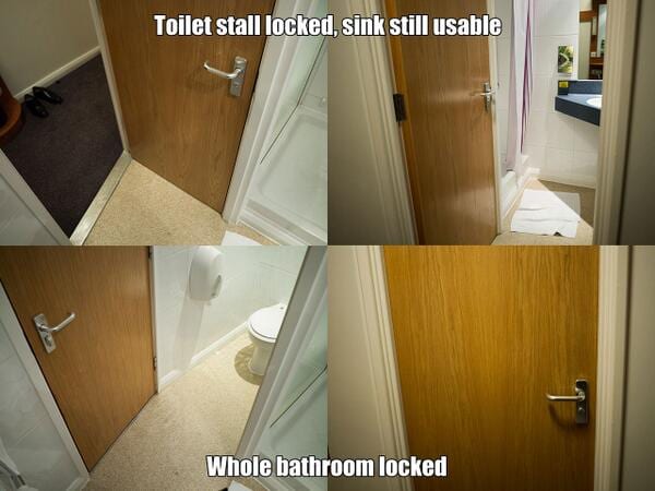
Genius hotel bathroom design. i.imgur.com
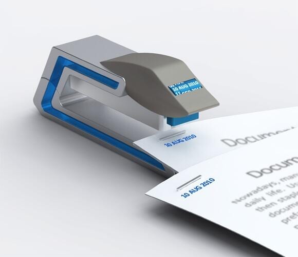
Genius. A stapler that staples and dates papers. i.imgur.com
I like the idea of a designer exchange program. It's couch surfing + travel + agency contract work.
Questions to ask when reviewing a design

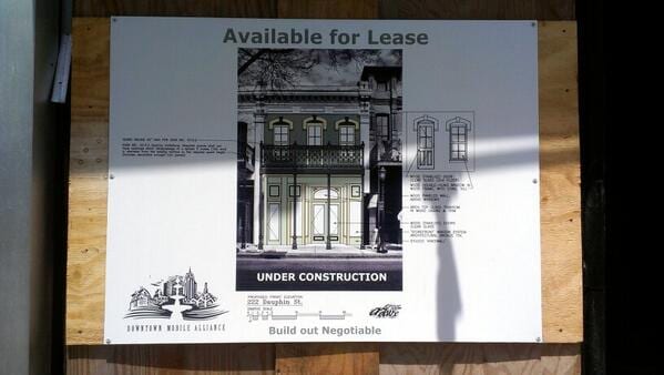
Just in case you missed it, my architectural rendering next to Mama's downtown.
Apr 2014
Damn, some people get really up tight about unsolicited redesigns. As long as it isn't mean-spirited, I don't see the issue.
The Harvard Law Review website is incredible harvardlawreview.org
Has Wikipedia ever considered a website redesign? buff.ly
Like 80s stuff? This is incredible.

Minimal Lego Southpark, Simpsons and Bert & Ernie. I love these ads.
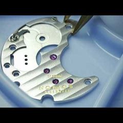
A meticulous and mesmerizing look over a watchmaker's shoulder.
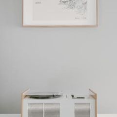
The SK series by Braun is the consumer electronics' Origin of Species.
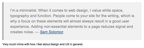
Thanks for the shout out @sudojosh
This Monument Valley game is gorgeous. Also, clever way to get people to share. apps.apple.com
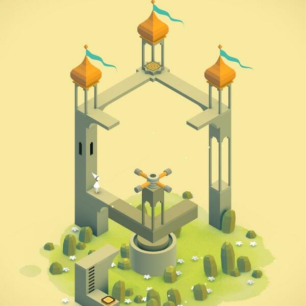
Monument Valley is one of the most beautiful games I've ever played. It's like an interactive MC Esher piece.
Whoa, 99% Invisible is a quality podcast—like NPR quality. Good suggestion @Wally_Hitchcock
Mar 2014
Really Good Emails—Some of these designs are incredibly good. reallygoodemails.com
The real primary colors—Your Art Teacher Lied
I love everything about this portfolio.

I love this playground concept. Kids should be out exploring and using their imagination. buff.ly
Great artwork, interesting looking game.

I don't care how much you've used the internet, you're not a designer.
There is nothing cheesier than corporate stock photography.
Feb 2014
A fascinating case study about connecting a washing machine to the cloud. vimeo.com
I love futuristic, dystopian artwork.

The product photography on @pushingatoms blog add so much to the articles.
Good design - a parking deck that shows how many spaces are left on each floor.
Did I write this? Why I left advertising to design software. buff.ly
You're told not to copy in school, but the real way to learn is through theft and iteration. Great article by @pjrvs
One of the better unsolicited Wikipedia redesigns I've seen
I love this—A Washing Machine for Men buff.ly
I don't want to support touchscreen desktops or laptops because I think the design is inherently flawed. Thoughts?
A Study in Brand Minimalism—I'm a big fan of the second and third-level versions. A ton of noise on most packaging.
Jan 2014
Just as @monteiro says, bad design can have horrendous consequences.
theindustry.cc relaunched recently. Does it seem odd to anyone else how most of the content is below the fold?
I've got some research to do—The best about pages.

I just realized that @TheAUPlainsman is using the logo I put together four years ago!
Dec 2013
I will say that IKEA shopping carts have incredible handling.
Fixed-pixel mockups no longer make sense. -@lukew #aeasf
When design is practiced without forethought or responsibility the end result is not creation, but destruction -@monteiro #aeasf
This is the talk I came here for. How Designers Destroyed the World by @monteiro #AEASF
Start with the smallest part of your design and build out from there. - @beep #aeasf
This conference is already off to a good start.
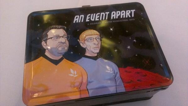
The nice folks at @MailChimp put together a coloring book. static.mailchimp.com
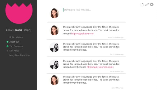
Sneak peak at a chat app I've been working on. Think I need to revisit some of the features. Already too complicated.
Nov 2013
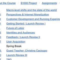
This course looks awesome. Wish I took a class like this—Entrepreneurial Design Syllabus
Looking for a designer for one of your projects? I'd encourage you to checkout scoutzie.com A lot of quality designers on there.

Shop, Drop (shadow) and Roll —target.com
Someone at target.com loves drop shadows.
Interface designers read this essay by @fchimero — What Screens Want
Each of these interviews keep getting better and better. @SignalTower 's got a great one coming up in a couple weeks.
@JoeVillanueva22 Glad you got an invite. I would have had your back if you needed one a couple weeks later.

One of the biggest challenges in the software industry isn't making something complex, but making it simple.
The redesign of The Independent is gorgeous.
Oct 2013
If you give a client free reign over the beautiful site you built for them, they will destroy it. Lesson learned.
Panic has a cool new office.
Sep 2013
Only course of action is to employ a similar across all logos-same texture, color, grayscale, etc...
Logos can be brilliant on their own, but together they smudge design styles. In the end it cheapens the appeal of each mark.
Few things destroy a beautiful website more than adding a collection of logos to a page.
Open and closed envelope icons for a design project.

I will say that the @Yahoo design team has done some great work lately. The Yahoo Weather App, and @Flickr redesign are fantastic.
I don't dislike the new Yahoo! logo, but I feel for the designers. Micromanaged and design by committee-they got both.
Aug 2013
readwrite.com has overtaken polygon.com as my favorite content website design, newsweek.com is a close second.

Looking over mockups this morning—In a months time there is going to be some seriously impressive digital work rolling out of Mobile.
The best iOS 7 Redesign Concept I've seen. I love the app icons with images in the background. buff.ly
Same thing with conversion testing — the worse visual designs tend to have the best conversion rates.
Jul 2013
Create your own hipster logo in 6 easy steps studiodelger.com
Like pop culture artwork? Check out my interview with Illustrator Alan Iwanowski-Pineiro signaltower.co
It seems that Tesla is the only company that has figured out that electric cars don't have to be ugly.
Working on a new interview layout for Signal Tower — images, videos and pull quotes revisited. Feedback appreciated. signaltower.co
Logo advice from will.i.am — India, A new type of font will emerge

It is one thing to print a metal @Mailchimp logo on a sweatshirt designlab.mailchimp.com It is another to do this dribbble.com
Want to post about that new "Flat Design" trend on Designer News? You might be beating a dead horse.
Jun 2013
Brilliant examples of landing page design.
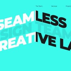
I'm throwing money at the screen, but nothing seems to be happening - Real Robots Ship dribbble.com
This is an interesting concept — Hourglass Street Light
3D Flat Icons... Really? buff.ly
My first @dribbble . My logo design for @signaltower . Be gentle. dribbble.com
It's interesting that most love the look of iOS7, but designers hate it.
The NSA's #PRISIM slides redesigned — by a designer. 17s.la
My interview with @LaCroixDesign — Discussions about working in the music industry, and how he became a designer.
Designing (and converting) for multiple mobile densities

May 2013
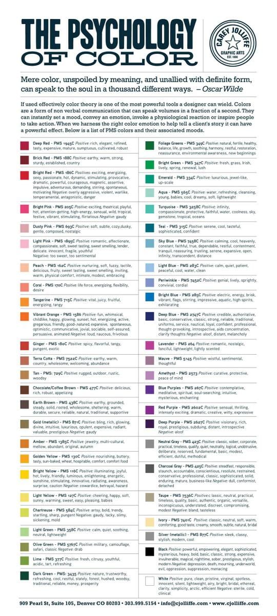
Color theory is one of the most powerful tools a designer can wield — The Psychology of Color i.imgur.com
Finished a great group of interviews. The hurdles of healthcare startups, path to becoming a designer, and more this week on @SignalTower
Almost flat design — How google subtly gives its buttons depth. i.imgur.com

Not a big fan of the esquire.co.uk redesign. It is difficult to tell what stories the pictures go with.
Feb 2013
Love this Yahoo! redesign by @DannPetty medium.com
For all my designer friends - So God Made a Designer Parody Video signaltower.co
Brilliant interview with one of my favorite designers, @idiot
Web Design Trends to Watch in 2013 signaltower.co
Designers it is 2013. You should not be using Polaroid photos in your designs.
Yes! Designing With Code teehanlax.com via @teehanlax

Jan 2013
"Designers Will Code" by @irondavy medium.com
Flat design conventions
Logo design for my new blog Signal Tower. Thoughts?
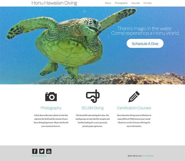
This guy is going to have the best looking SCUBA diving site on the internet.
Dec 2012
Oct 2012
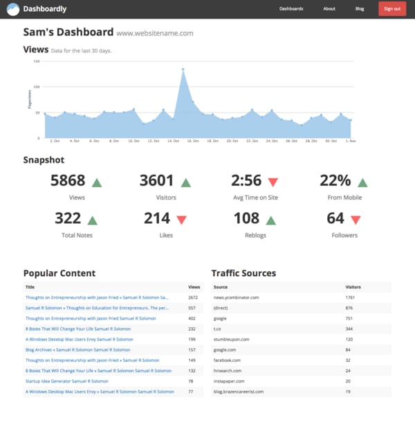
Design concept for a new analytics project built on Rails. samuelrsolomon.com
Mar 2012
I'm a fan of the new look of @FastCompany .com
@sdidonato Just stumbled upon your Kickstarter project. Just wanted to say the textures on Beyond Earth are awesome. Keep up the good work!
Jan 2012
How to create a #Windows desktop that will make Mac users jealous.

Trying some design outsourcing on Fiverr. Interested to see how this goes.
Dec 2011
New #infographic Burn, Beard,and Stache: The taxonomy and nomenclature of the bold and bearded. solomon.io
Nov 2011
Oct 2011
Manufacturing Jobs are not coming back. We should focus our strengths on design and innovation. fastcodesign.com
Sep 2011
I am a fan of the new @pandora layout.
Jun 2011
Mar 2011
Yes! 8-bit @ap_sims This is the best of your Twitter backgrounds.
Jan 2011
@AlexMPHarper Alex you need to learn photoshop. A lot of graphic design starts by hand. Check deviantart.com for inspiration.

Dec 2010
What classroom design should look like. bit.ly
Nov 2010
The Just-Right ride for city bike-sharing programs shar.es
Video: Ingenious iPod Nano watch created by Chicago designers. More than $250,000 raised for project via... tumblr.com
Video: Making media more ubiquitous and less invasive by better design. tumblr.com
Jun 2010
@google Not a fan of the search backgrounds. Part of the novelty of Google is the visual simplicity.