• Archive
  • Notes
  • Photos
  • Work
  • About
2026 2024 2021 2019 2017 2016 2015 2014 2013 2012 2010

In Defense of the New Instagram Logo

← Notes · Aug 14, 2026

The new Instagram logo is getting a lot of hate. Honestly, I think it's a pretty sharp upgrade, while keeping the character of the original.

Also nobody, under 30 knows how to read cursive anyways lol.
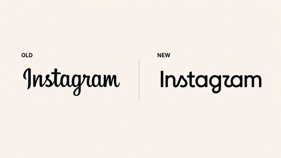
Side-by-side comparison of the old cursive Instagram wordmark and the new cleaner Instagram wordmark

Sam Solomon@SamuelRSolomon

The two things people hate most are the way things are and change.

View post ↗ (opens X)

Topics DesignSocial Media

Originally posted on X ↗ (opens X) Reply on X ↗ (opens X)

Atlanta, GA, USA
  • Email
  • LinkedIn
  • Instagram
  • X
  • YouTube
  • Links
  • RSS/Atom